25
Lately I’ve been so busy, I haven't had time for reading blogs--and I missed it! So over the weekend I did a little catch-up reading...and found two house tours that I just had to share here. Better still, they’re the homes of two of my favorite bloggers! I mean, house tours are always great, but it’s even more fun to get a peek into the home of someone who you “know” through their blog. First up, Bri of Designlovefest’s colorful living room (designed by Emily Henderson).
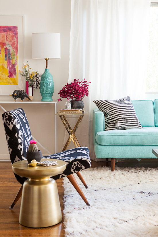
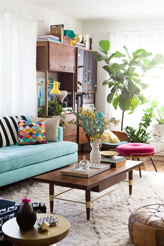
Bri mentioned that in the past, she would get about 75% done with decorating a room and then just stop...but this place feels really finished and grown-up. I know just what she means--I have a lot of energy for getting the first part done; then when it gets pretty comfortable and livable, I lose steam and the room just stays unfinished forever. We moved about a month ago, and I feel like our progress has been so slow! I want to make sure we don’t just say “good enough” but that we keep adding all the layers to make this home feel complete. I’m inspired by Bri's space! It truly does look pulled together and all grown up, from the plants to the cheerful furniture, cozy rug, and decorative accents.
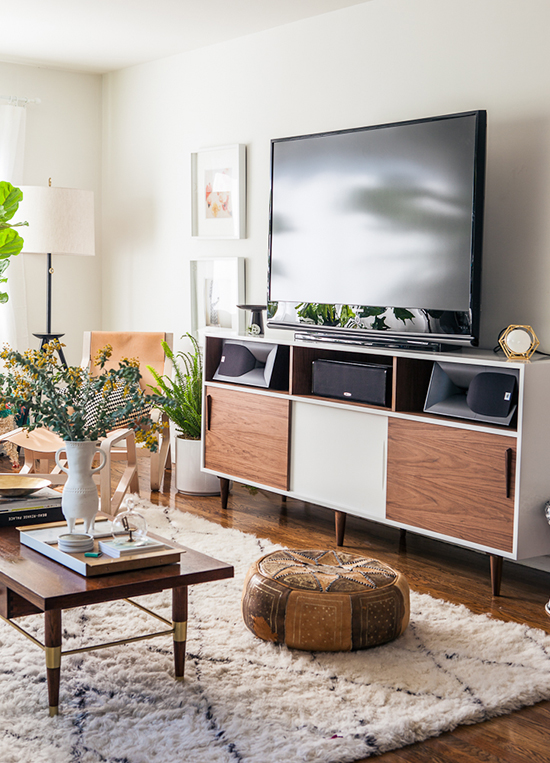
I’m obsessed with that leather pouf above. Now I must have one of my own! The layered rugs below are pretty sweet too.
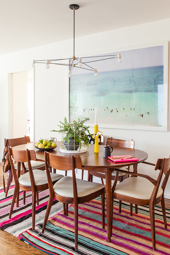
Next, let’s check out Jordan of Oh Happy Day’s super stylish apartment (as seen on A Cup of Jo).
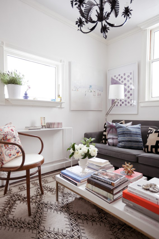
I love this graphic black and white rug! Below, decorating books (which one can never have enough of) on the World Market industrial cart I mentioned in this post. Jordan says that a small apartment actually feels more spacious and homey once you add books and art. It’s kind of counter-intuitive--you might think they would make it more cluttered--but see how great their place looks! And it’s only 500 square feet.
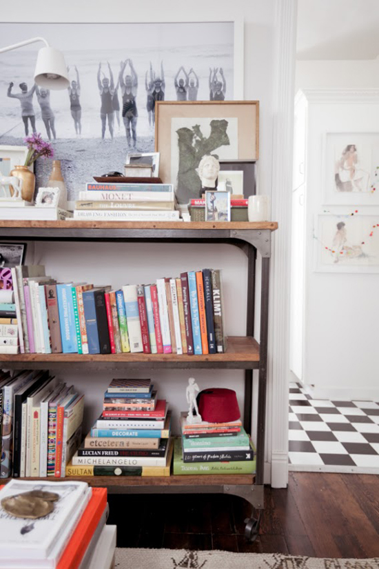
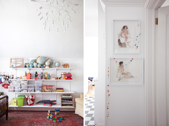
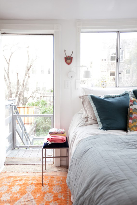
One thing I really like about both of these places is that they are beautifully designed, yet they feel decidedly like a home. You can tell that people actually live here. There are meaningful objects and artwork, injections of humor and personality. There’s depth, character, and layers of interest...and a sense that the more you explore, the more you’d find. I really like that! A home, with all it’s charming imperfections, is ever so much better than a showroom or an impersonal catalog spread. What do you guys think? Do you have a favorite between these two homes?
See more of Bri’s living room here and Jordan’s apartment here.



I just love Bri at Designlovefest's living room!! It's so bright and colorful and so pretty!
I like them both! MOSTLY, I love your description of the decor of a home. ..."There's depth, character, and layers of interest...and a sense that that the more you explore, the more you'd find." You are a great writer! :)
I love that living room with that blue couch! and I love that bedroom picture - so cozy!