11
The Home Depot provided me with product and compensation. The opinions I have shared about the products are my own.
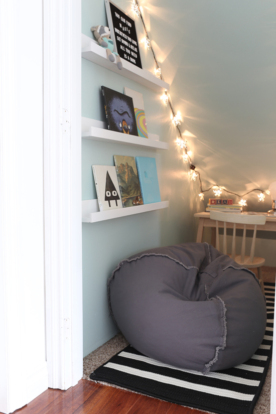
When we first moved into this house, we had some friends over and were giving them a tour. As I was opening doors and showing off various rooms ("this is the guest room, this is the laundry, the is the garage" etc.), I opened the door to the closet under the stairs and said "and this is just some random closet that we'll probably fill with junk." My friend immediately said, "Oh I know what you should do with that space!" and told me about a similar closet she'd seen on Pinterest that was turned into a kid's clubhouse. I loved that idea! I decided I wanted to make ours into a reading area, because I've always enjoyed finding cozy little nooks for curling up with a book. Right now we're the ones reading to Ian, but eventually I like to imagine him hanging out here with a good book. I was lucky to partner with Home Depot on this project, which really helped us to get it done. Our unused closet under the stairs (which I never expected to spend time in) is now transformed into a sweet, cozy book nook where we actually like to hang out!
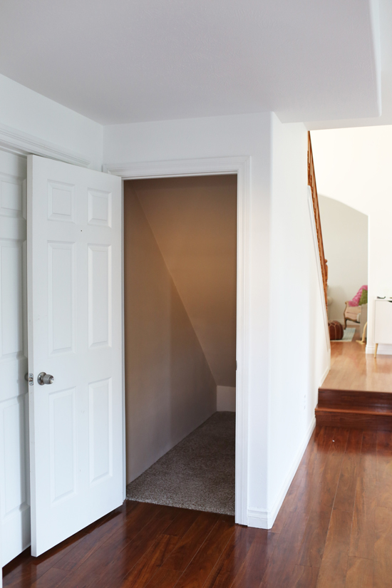
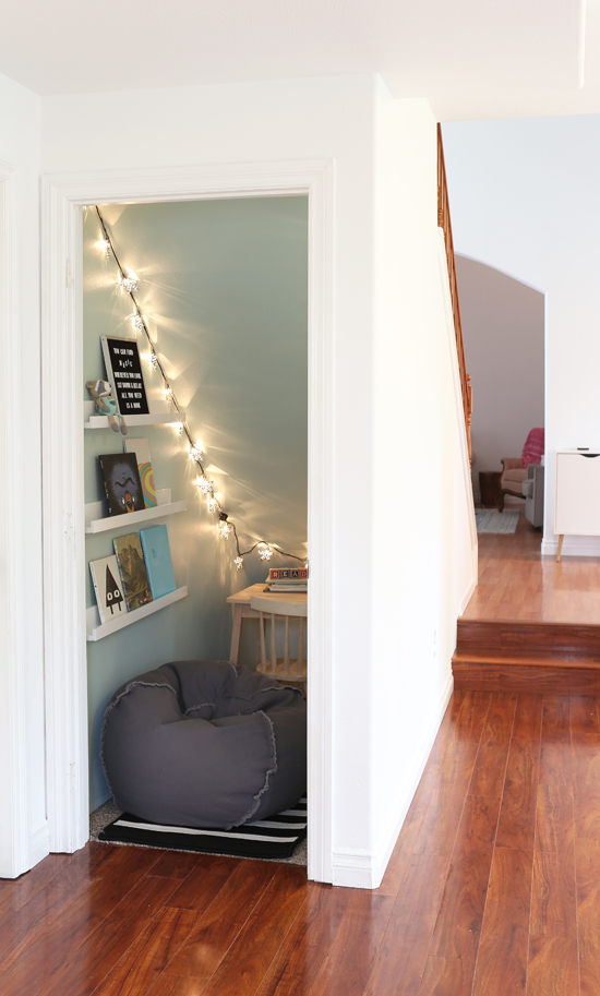
Above is the before--and this is when it was already all cleaned out. We'd started throwing random things in there--shower curtains from the previous owners, nearly-empty paint cans, and other junk. I could already see where this poor little closet was headed...but then it was rescued and transformed into THIS:
So much more inviting, right?
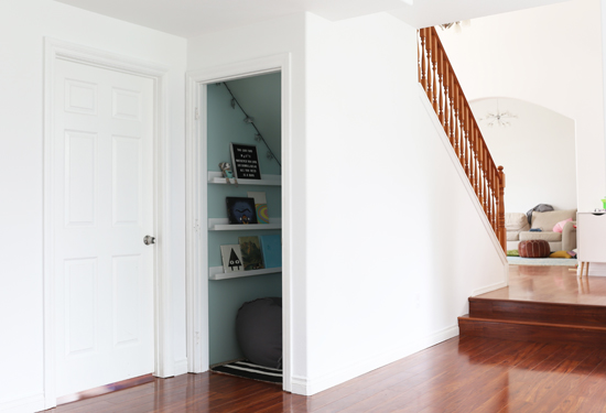
Here you can see where it fits in with the rest of the house. The closet sits in the family room, right next to the guest bedroom. In the background, you can see the staircase, the entryway, and the living room (I took these pictures before we rearranged it).
You may think it's weird that we already finished decorating this extra little closet when we still need to work on the big, important areas like the kitchen and living room. But everything in the big rooms is so EXPENSIVE, I'm scared of making the wrong decision and regretting it later. It just seemed so much more manageable to tackle a smaller project. And it felt really good to actually finish it! So if you're feeling overwhelmed by decorating your whole entire house, maybe try starting with a small space that feels super doable...and that might get you in the mode of decision-making and doing, instead of staying stuck in "analysis paralysis." I hope it works that way for us, anyways!
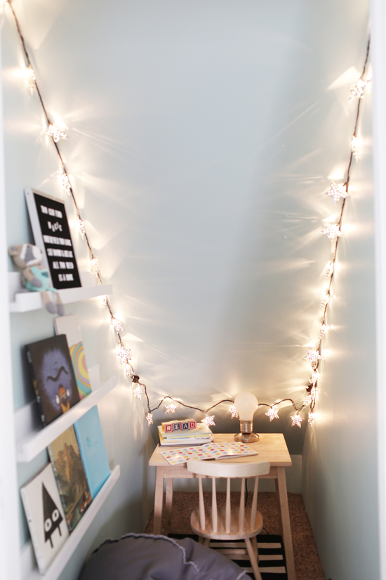
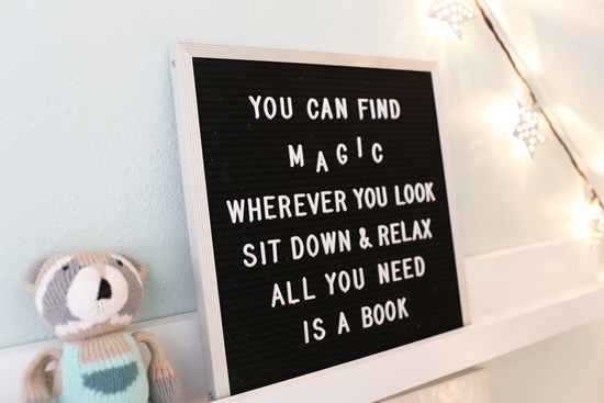
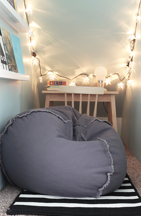
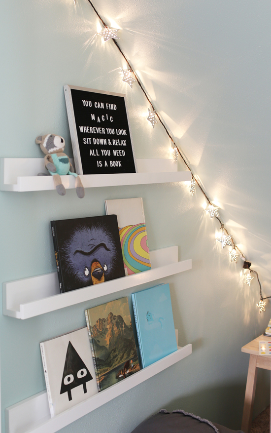
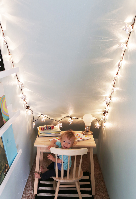
We started by painting the walls a soft mint green (Behr Whipped Mint). Then we laid down a black and white striped runner, and strung up some whimsical star lights. Next, we hung three 36" photo ledges on the wall and filled those with some of our favorite kids books and a Dr Seuss quote. Next, we brought in some furniture--a comfy, squishy beanbag chair, and a kid-sized desk + chair set.
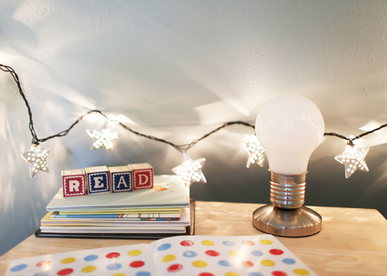
The lightbulb lamp was a final touch I couldn't resist. I think it's super cute and clever.
I love how this sweet little space turned out. It makes me smile every time I walk by, and Ian thinks it's pretty cool--especially with the string lights turned on. Even better, it's like we gained some square footage in the house, since it's an area we weren't using at all before!
Is there an area of your house that's unused and unloved right now? Think about how you can bring it to life! I've seen closets turned into home offices, awkward kitchen nooks become awesome pantries, and more. I'd love to hear if you've done any projects like that...or have any planned for the future. :)
03
This post is written in partnership with Leesa. They provided a free mattress for us to review. All opinions are my own.
Our guest bedroom is the first room in the house to be DONE! Or at least, done for now--I'm never truly finished. We had been slowly working on our to-do list without really focusing on any particular room, until Ben's sister and her husband told us they wanted to come visit. Our thoughts quickly went from, "Yay, houseguests!" to "Uh oh, the guest room is not even close to ready." We hadn't painted it yet, and we'd let it become a dumping grounds for all the boxes we were working on unpacking. And since we never had a REAL guest room in our last apartment (the second bedroom was so small, it could only fit a twin bed), we needed to get a bed and a mattress for them to sleep on...asap! Honestly, my sister-in-law and brother-in-law are really laidback people who would have been totally fine with an unpainted room and a mattress on the floor. But still, we wanted to get everything nice for them. Having people over is often my main motivation to get things done around the house, anyways...I'm not the only one, right?
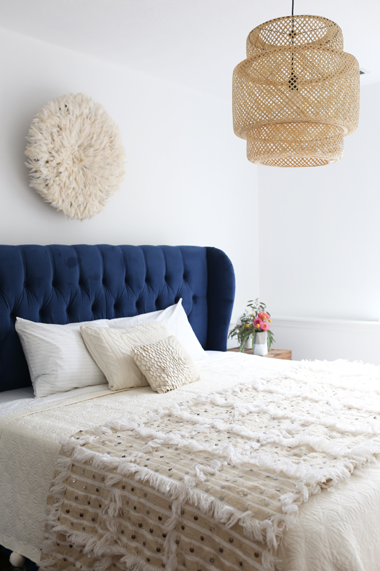
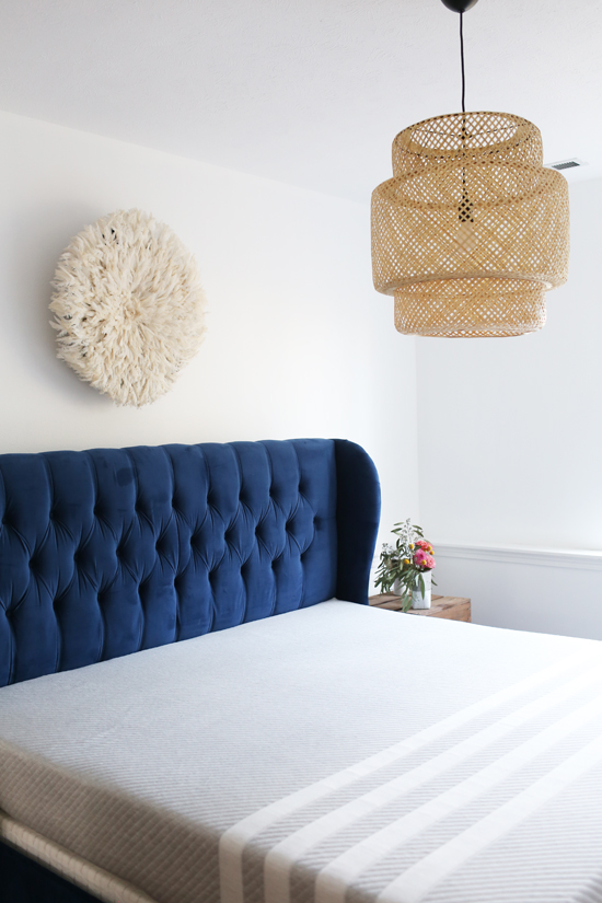
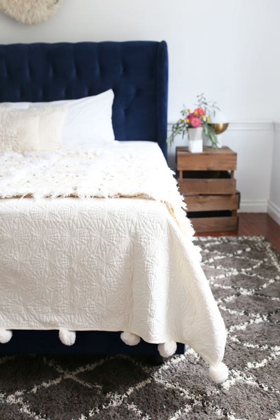
Ben quickly painted the room (white again, we're a one-note band) and then it was time to furnish and decorate! We already wanted to get a new bed frame for ourselves, so since our old bed is still in great shape, we decided to set it up in the guest room. I still love this bed, but was getting kind of tired of our own bedroom being so blue. However, I think a guest room is a great place for a colorful piece of furniture (or any bold choice). Since you don't use the room daily, you don't get sick of things as quickly.
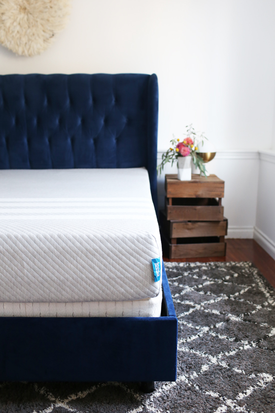
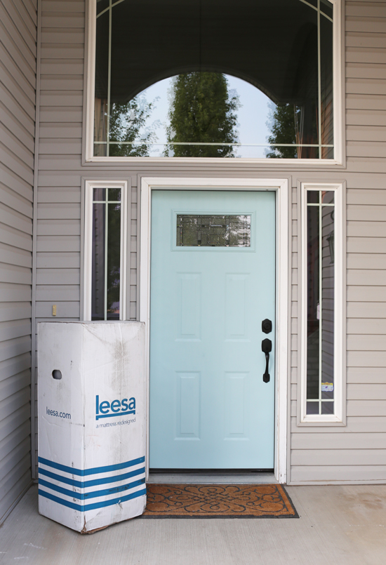
For the mattress, I wanted to get something really comfortable, but not ridiculously expensive. I had already heard good things about the Leesa mattress, so I was thrilled when I got the opportunity to review one. I love that it's 100% American-made, they give one mattress to a shelter for every ten they sell, and it gets delivered to your front door compressed in a relatively small box (that's a KING size mattress below!).
Plus it's so good-looking and commmfy! Once we laid down on it, we both had the same thought: okay, we got this for the guest room, but...should we steal it for our own bed??? We're seriously considering it. If you're shopping for a new mattress, my only complaint with our Leesa is that it had a strong chemical smell out of the box. I looked it up, and that's just a by-product of the manufacturing process...all the materials Leesa uses are certified CertiPUR-US(R) so it's nothing to worry about. I would just say, if you're preparing for houseguests, make sure it gets delivered with enough time to air out (it took a couple weeks until I didn't notice any smell). Other than that, I really love this mattress! There are three layers of foam: a 6” dense foam core that provides a firm, supportive base (a must for us--we're both firm mattress people); a 2" memory foam layer for body contouring and pressure relief; and a 2" Avena® foam top layer for cooling and breathability--yay for a memory foam mattress that doesn't sleep too hot!
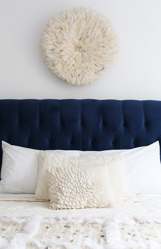
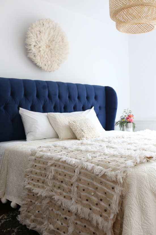
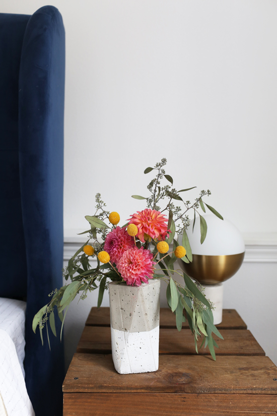
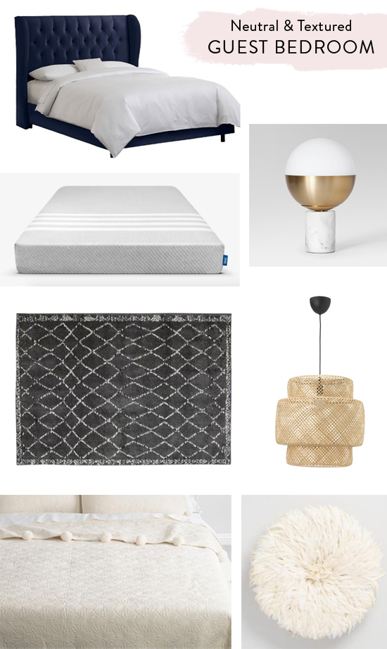
Since the bed itself is a deep, rich blue, I wanted to keep the decor light and neutral. I chose an ivory quilt with oversized pom pom trim, some simple striped sheets, and a few cozy throw pillows. When decorating with neutrals, using texture keeps it from being boring. A Moroccan wedding blanket across the foot of the bed and an ivory "juju hat" on the wall were perfect for this. We also brought in the wood crate side tables from our old living room to use as nightstands, and switched out the overhead light for a big woven pendant.
I also think rugs are super important for bedrooms, since they give your feet somewhere cozy and soft to start the morning (instead of landing on a cold, hard floor). I picked out this neutral, patterned rug from Mohawk, a brand we used in our old bedroom and loved. The rug is suuuper soft, especially with the addition of their premium rug pad underneath...and it's really affordable too. Plus it's also made in the USA! Win-win-win.
My sister-in-law and her family are coming this weekend, and we're super excited to show them around Spokane! It's their first time visiting us here, and I think fall is the perfect season to see Spokane. We're planning go apple picking, pumpkin patching, leaf peeping, coffee drinking, and all the fall things. I hope they'll have a good time, and I'm so relieved that we finished the guest room in time. Who wants to stay with us next??? We're ready for you! :)
Sources: Bed frame / Mattress / Bedside lamps / Rug / Pendant light / Quilt / Juju hat
27
This post is written in partnership with Dynamic Rugs. All opinions are my own.
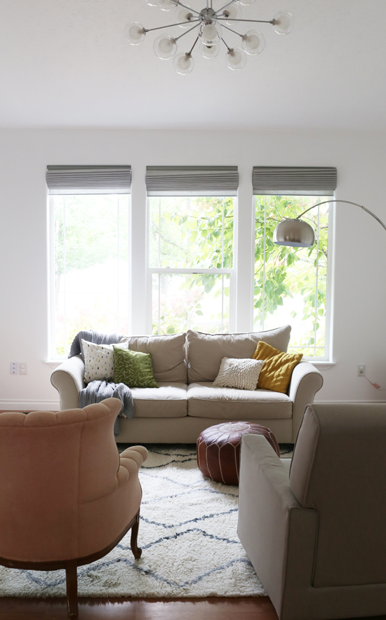
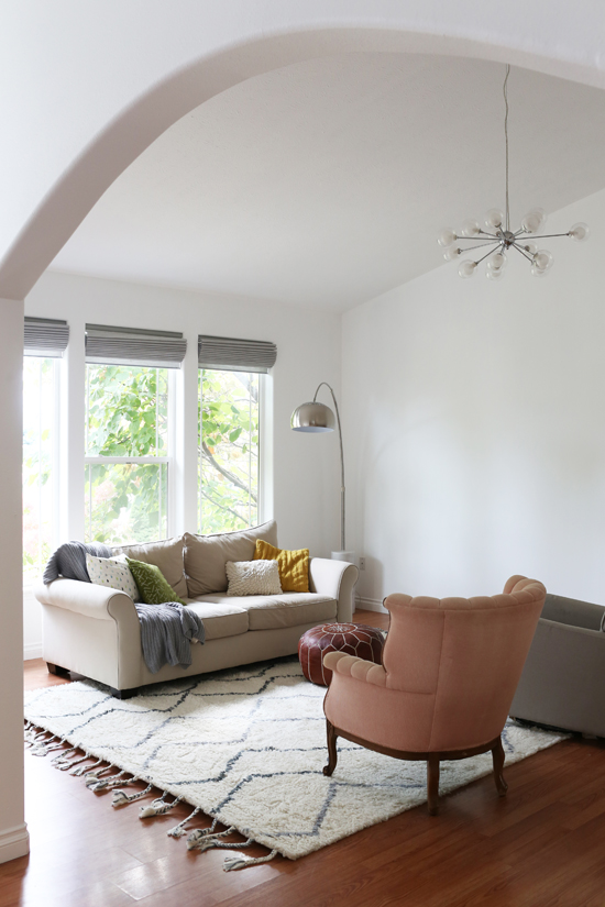
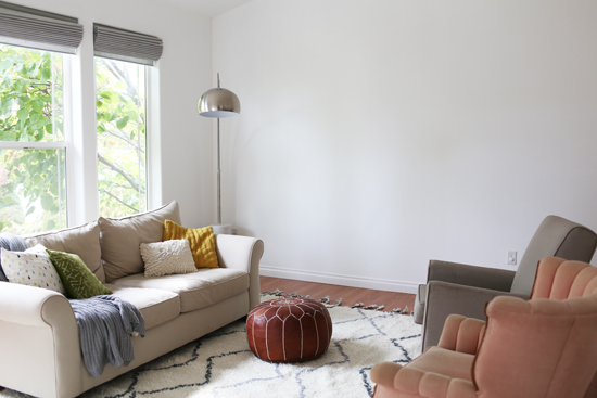
Our current living room is a fairly large space. If we place furniture around the edges of the room, you can't have a conversation without raising your voice to be heard. So I knew right away that it would make sense to break the room up into zones. Eventually, we're planning to have the living room in the front by the windows, and the dining room in the back. But we won't move the dining table until we remodel the kitchen and that's still several months down the road. So I've been struggling with what to do in the meantime (this is why I haven't hung up any art yet). I hate having this in-between, unfinished state, but I also didn't want to hang a big gallery wall for a temporary setup. Finally, I decided to try arranging the living room how I actually want it to be, so I can start working on furniture and decor for at least that "zone." It's a lot easier for me to figure out what to do when I can physically see the room coming together, instead of trying to imagine how it will all work in the future. For now, I'm planning to make the back half of the room a play area, until we're ready to turn it into the dining room.
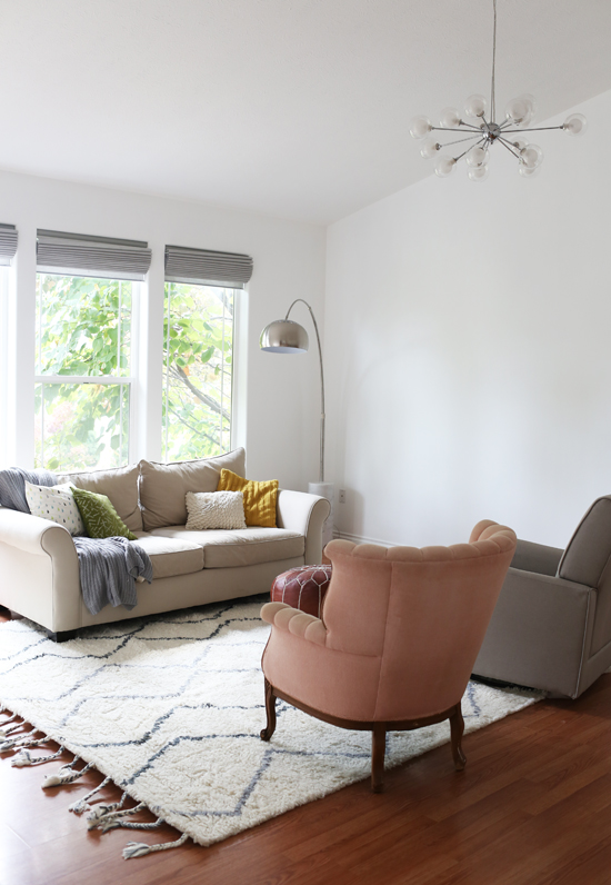
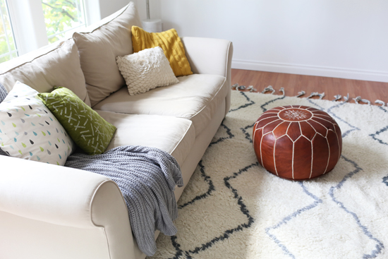
For the living room "zone", we put the sofa in front of the windows with two armchairs facing it. I'm generally not a huge fan of putting furniture in front of windows, but in this case I think it works since the sofa is fairly low so it doesn't block too much light. My dream is to eventually upgrade to an English roll arm sofa with a pair of matching armchairs...but for now, our old sofa and these mismatched chairs work as place holders! The arrangement is a lot more cozy and conversational now...definitely better than the old arrangement we had.
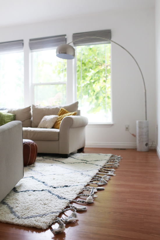
Besides the new arrangement, we also got a cozy new rug from Dynamic Rugs. It's the "Metro" rug, available from various retailers here. I really love it! It's soft and plush and 100% wool--perfect for fall. We've had similar rugs previously, and we keep coming back to this style. The neutral colors and simple pattern go well with anything, and the thick pile feels so good underfoot. The braided tassels are a cute touch, too.
We also put new Roman shades up, and they are prettyyy. I think these are my favorite window treatments we've ever had. We're still planning to hang some ivory drapes on either side as well, which I'm excited about. I'll do a post about the window treatment details when we're all done!
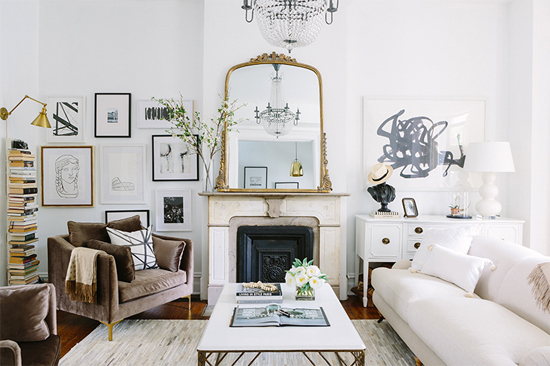
Now my next project is figuring out what to do with that big blank wall. I have two ideas. My favorite idea is to find a cool old mantel to anchor the room (I kind of miss having a mantel in the living room). Even if we don't have a real fireplace there, I think it would feel cozy and help to define the space. I love big ornate mantels like the one in this room, especially with a big gilt mirror above (Alaina's entire apartment is totally dreamy, btw, have you seen it?).
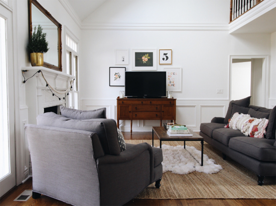
My second idea is to get a long sideboard or console table and arrange a gallery wall around it, similar to this room. Ideally it would something antique with character, because I think this room needs something old.
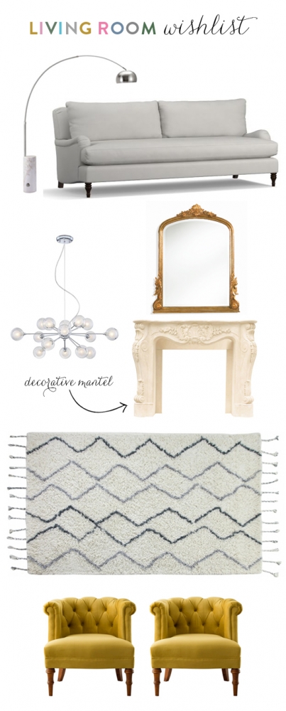
Living room wish list: floor lamp (already have) / sofa / chandelier (already have) / mirror / mantel / rug (already have) / armchairs
We also need a coffee table and side tables eventually, plus new plants, art and decor. I have a long wish list! It'll probably take us awhile to finish this room because duh, furniture is expensive. But the process is part of the fun.
What do you think I should do with the blank wall? Mantel & mirror, or sideboard & gallery wall? Or do you have another idea entirely??
22
Thanks to Micro Cotton for sending me these towels to review. All opinions are my own.
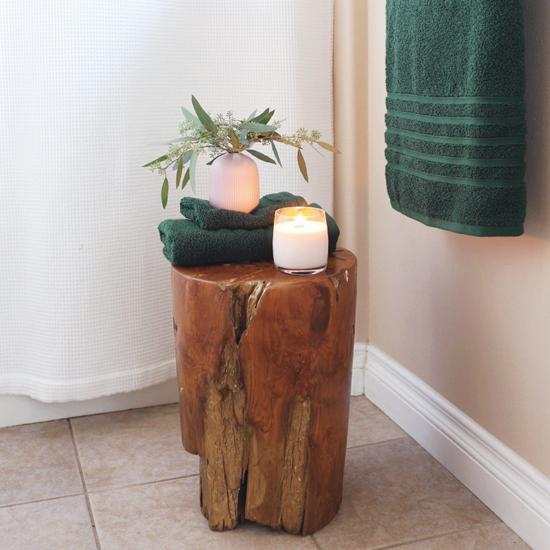
Happy Friday, and happy first day of fall! It definitely feels like the season has shifted here in Spokane. We've been fully enjoying taking walks in the cool, crisp air, eating warm soups and toasty bread, watching shows while it rains outside, and taking long hot baths at night. So ready for this season of "hygge" (that's a fun word to use). I wish we were remodeling our bathrooms this fall and getting a big soaker tub (my dream!), but unfortunately that's probably not gonna happen for awhile. In the meantime, I made our bathroom feel a little more cozy and luxurious by lighting a sandalwood scented candle, adding a vase of fresh eucalyptus, and getting some plush new towels.
Ok, these towels! They are the Hotel Collection Ultimate Micro Cotton towels from Macy's, and they are not your average bath towel. They're super soft, extra-absorbent, and they make you feel like you're at a fancy hotel. They're definitely not cheap (they retail at $78 for a set), but they're majorly on sale right now so it's a great time to stock up. AND I get to give some away!
The Hotel Collection comes in classic neutrals, soft pastels, and rich jewel tones that are perfect for fall. I have the "pine" color above, which is a beautiful deep green...and I also snagged some white ones since you can never go wrong with white towels. The winner will get one set (a bath towel, hand towel, and washcloth) in the color of their choice.
To enter, leave a comment on this blog post and tell me how you're updating your home this fall! I'd love to hear about your projects, whether they're big exciting remodels or small cozy changes. This giveaway is only open to US residents and closes on 9/29. I'll announce the winner on 9/30!
UPDATE: This giveaway is now closed. The winner is Latanya!

