25
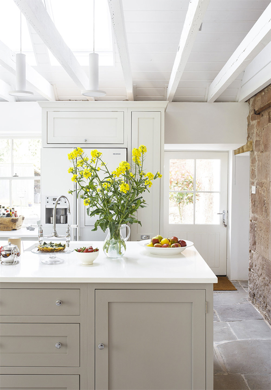
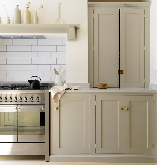
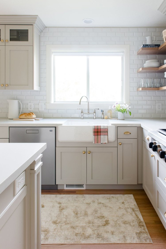
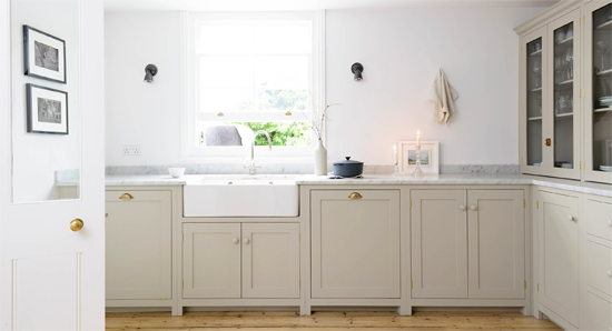
I think you all know, I'm super eager to get our kitchen renovation started. I've only mentioned it a time or thirty. :) But we still need to save more, so in the meantime I'm just pinning and dreaming. Honestly, as agonizing as it is, it's probably good that we have this waiting period. It gives us time to really consider all the options we have, and feel confident in the choices we make. One thing I'm debating right now is cabinet color. I've always loved white kitchens and I don't think they'll ever go out of style. After all, most of the new RTA kitchen cabinets come in white. So part of me thinks, duh, we'll do white cabinets, of course. But another part of me wonders if we should bring in a little contrast, since all the walls are white. We could either do that with a contrasting kitchen island, or with cabinets that have a little color to them. I've been drawn lately to this light taupe shade of "greige" (examples below). What do you think? Are these muted neutral cabinets more interesting than white ones? Or am I just noticing them because they're kind of trendy right now?
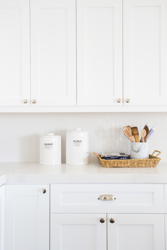
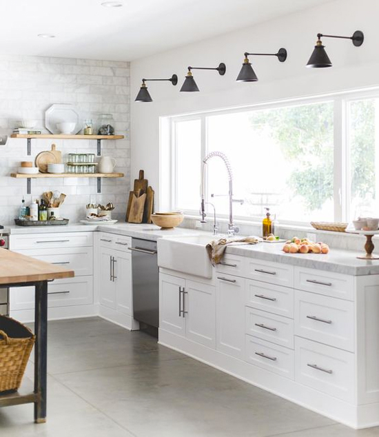
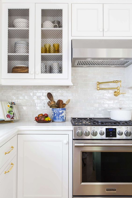
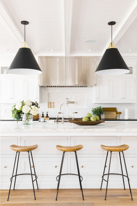
Favorite White Kitchens:
1. Studio McGee / 2. Heather Bullard / 3. Emily Henderson / 4. Studio McGee
Favorite Greige Kitchens:
1. Decor8 / 2. deVol Kitchens / 3. Studio McGee / 4. deVol Kitchens
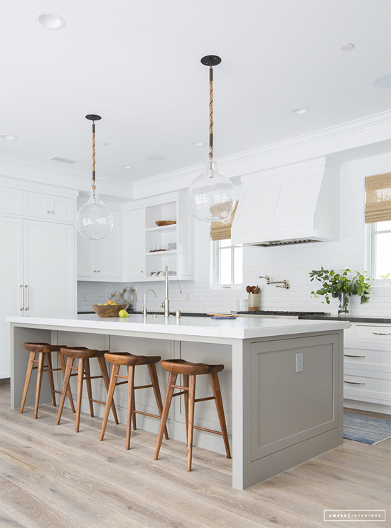
And here's a kitchen from Amber Interiors that marries the two: white cabinets with a greige island. I think this might be the sweet spot for me! Just a tiny bit of contrast.
What do you think: Is greige a trend, or a timeless neutral? Should I stick with crisp and classic white? Or should I do a mix?
P.S. Way more inspiration on my "Kitchens" Pinterest board, if you're interested. :)
18
I wrote a blog post for Apartments.com that went live yesterday, titled 10 Reasons You Need Some Indoor Plants. But I feel like a fraud sharing it because (sadly) almost all of our houseplants died during the move! So I really need to take my own advice and get us some new plants for the house. Because after all, I really believe what I wrote...plants improve your mood, add color, purify the air, and more. And in the winter (which is coming TOO SOON, I'm not ready!), indoor plants are even more crucial, since there's less greenery to enjoy outside. What are some of your favorite easy-to-care-for plants? And do you ever go faux, or are you all about real plants?
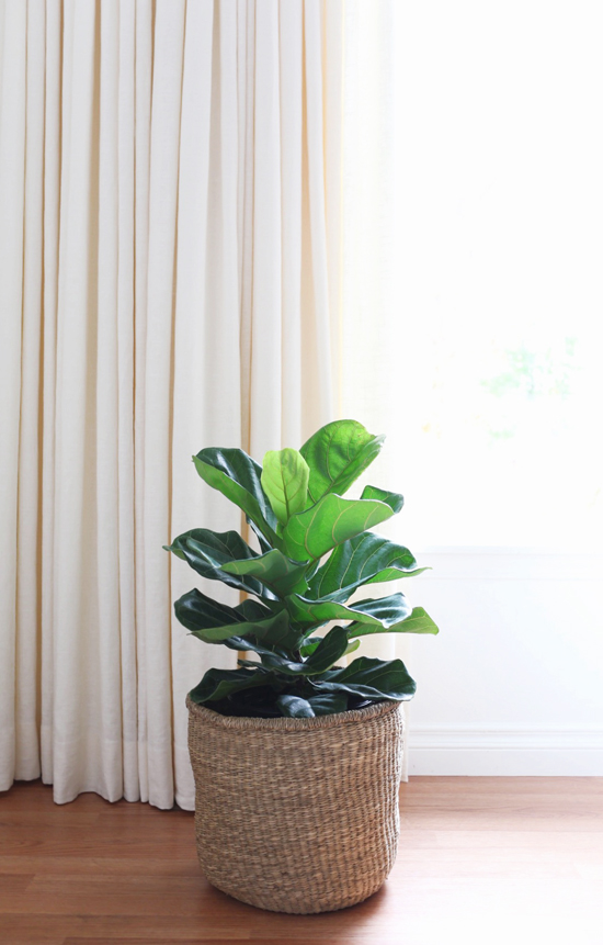
This fiddle leaf fig is the only plant I've gotten since we moved, and I have high hopes of keeping it alive (and getting it to grow)! Let me know if you have any tips. :) I was actually very tempted to get a faux one, but I decided to give myself a chance with a real one first. I've always loved these, trendy or not!
16
This post is sponsored by Bali Blinds. All opinions are my own.
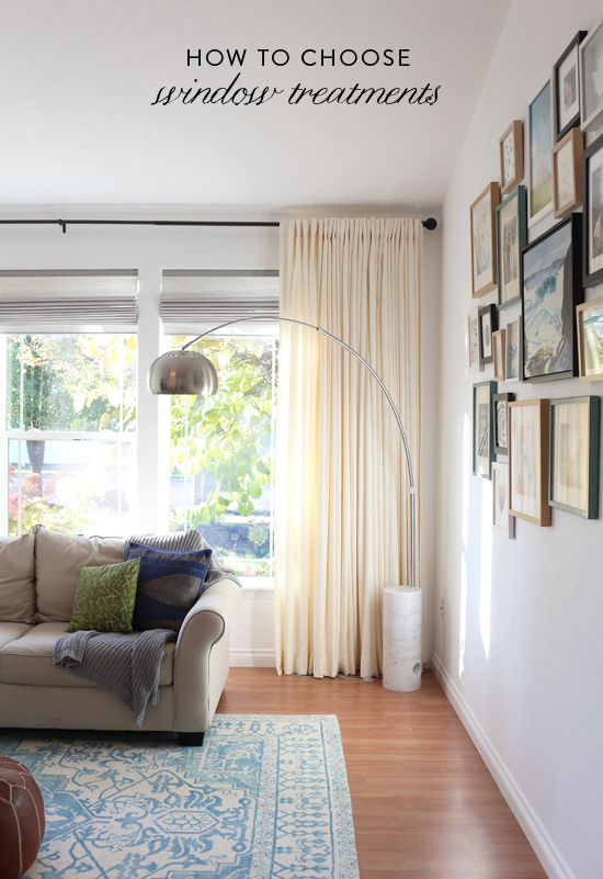
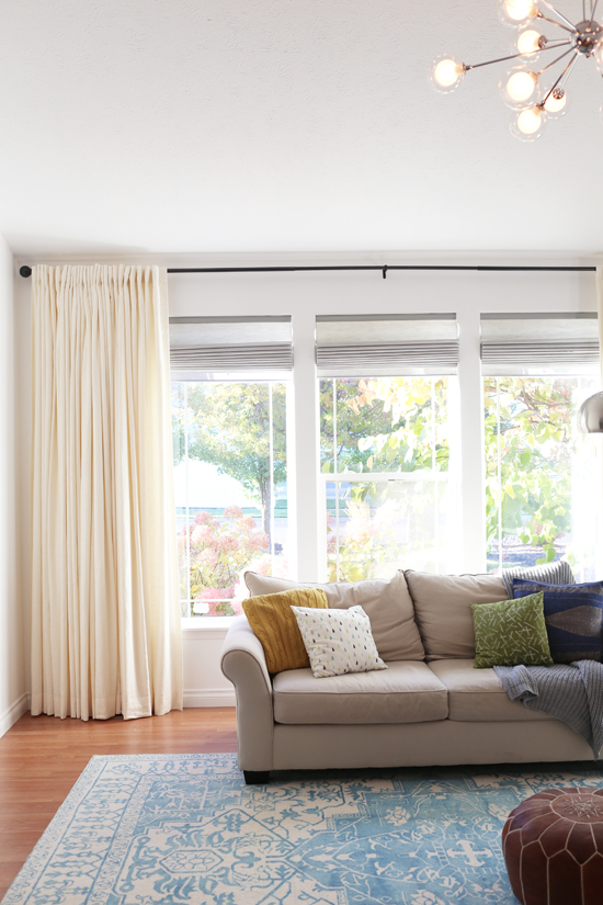
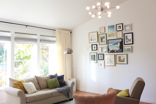
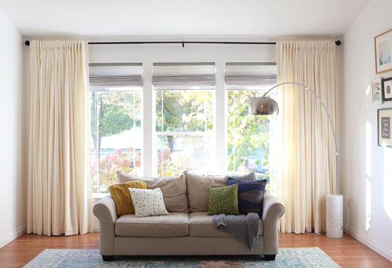
As promised, today I have pictures of our living room updates...with the gallery wall and window treatments DONE! I'm sooo happy with how they both turned out, but especially the new drapes layered over our Roman shades. They're beauuuutiful, if I do say so myself. Window treatments can be tricky to figure out. Similar to paint, you can fall in love with a color on a swatch, but it can feel totally different when you see it on a large scale. And custom window treatments are a big purchase, so it can be scary to feel confident with your decision. Which is why I wanted to share some of my tips for choosing window treatments for your home, in partnership with Bali Blinds. They've been our go-to source for several years now, and I would recommend them without reservation--their quality and service are amazing!
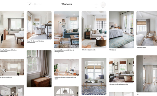
1. Find inspiration photos to narrow down your style. First, spend some time on Pinterest (or your favorite place for interior design inspiration) and find photos of window treatments that you love. Note what they have in common. Do wood blinds catch your eye? Are you drawn to natural, woven shades? Do you love billowy linen drapes? Or maybe your favorite rooms have a combination of these? Pay attention to the details like hardware, trim, and mounting style as well. I noticed that the rooms I was pinning tended to have long, white drapes hung very close to the ceiling, combined with neutral Roman shades that were mounted inside the window with no valance. I also noted that the curtain rods I liked were simple and basic, often in black. So that's what I chose for our living room! I absolutely love the results, so all that time spent gathering inspiration was totally worth it.
2. Consider the room it will be in. The type of window treatment you choose will likely vary based on the room it's meant for and the size of the windows themselves. We love the drapes in our living room, but we wouldn't choose them for the kitchen since those windows are smaller and have cabinets underneath (plus I'd be worried about drapes in the kitchen getting splashed with food!). Likewise, I love the look of Roman shades, but we wouldn't use them in every space. We have two narrow windows on either side of our front door, and something more low-profile would work better there. There's also function to consider. If you're designing a nursery, you might opt for blackout shades to make daytime naps easier...or if you're working on bathroom windows, maybe privacy is a top priority. Lastly, you should also consider the window treatments in the connecting rooms so there is a good flow throughout the house. You don't need to use the same window treatments in every room (in fact you shouldn't!), but you do want to make sure they mesh together, especially in connecting rooms.
3. Measure your windows, then measure again. Custom window treatments are usually non-returnable, since they're made to your specifications. So be very careful with your measurements, and make sure to double (& triple) check them! Don't assume two side-by-side windows are the exact same measurements--in our living room, the middle window is wider, which I didn't realize until I measured. Also, windows are often not perfectly even. Measure the width of your window in multiple places--at the top, the middle, and the bottom, just in case. Bali Blinds has some handy measuring guides that walk you through the process, so you can feel confident that you're getting it right.
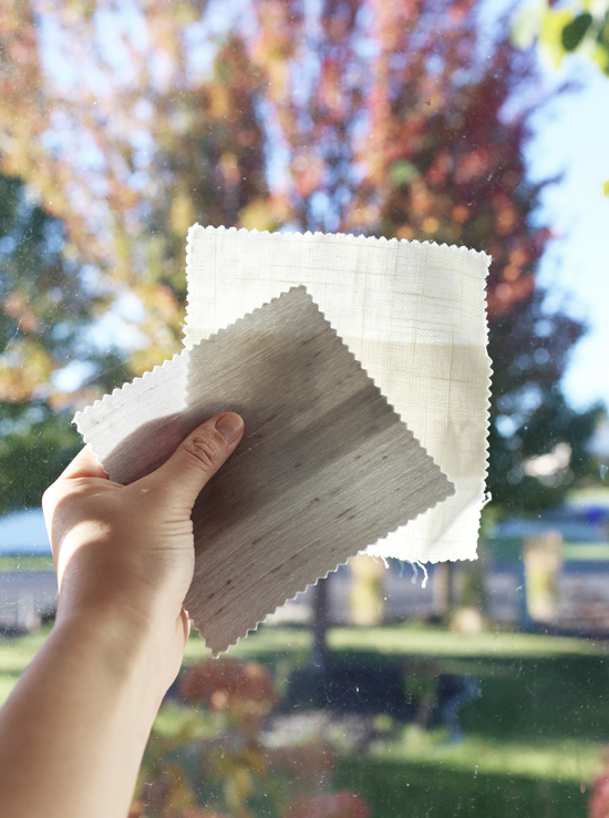
4. Get swatches! I can't emphasize this point enough. It's SO important to get physical swatches of the fabrics you're considering before placing your order. There were a number of fabrics I liked based on the thumbnail photos on the Bali Blinds website...but once I was able to see and feel them in person, I immediately ruled them out. They were stiffer than I imagined, more sheer than I wanted, or the weave was tighter than I expected. These type of things are hard to tell from an online photo. Getting a swatch will also allow you to see how the color blends with the other elements in your room (furniture, art, rugs, etc.) and you can hold it up to your window to see what it will look like with sunlight coming through. If you're considering a pattern, it's so important to see the scale of the pattern. And if you're planning to layer window treatments, you can make sure the fabrics you pick out will work well together. Plus, Bali Blinds offers free swatches so there's no reason not to! Comparing swatches made it easy for me to pick the fabrics for our drapes (Dover Snowfall, a beautiful ivory linen) and Roman shades (Fenton Glow, a soft grey with a subtle slubby texture). I love them both!
5. When in doubt, stay neutral. If you LOVE a vibrant color or a bold pattern, by all means--go for it. But if you can't decide what to choose, neutrals like white, ivory, grey, and natural wood are a good bet. You're less likely to get sick of them, they'll stand the test of time, and they'll appeal to more people when it's time to sell the house. I've learned over the years that I prefer neutrals and solid colors when it comes to big things like furniture, drapes, and wall color, and I can still add lots of color with art, pillows, and decorative objects that aren't as big of an investment.
Hope this is helpful! I know choosing window treatments can be intimidating, but if you get it right it can really make a huge difference in the room. I feel like our living room looks so much more finished, homey, and elegant now. And another plus--the fabric helps soften noise. With our vaulted ceilings, we noticed sound bouncing around when we first moved in. But installing the drapes totally took care of that issue (yay)!
Our window treatments: Back Tab Custom Drapery in Dover Snowfall / Classic Roman Shades in Fenton Glow / Black Ceramic Ball Rod Set
13
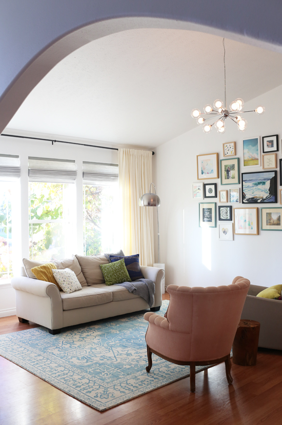
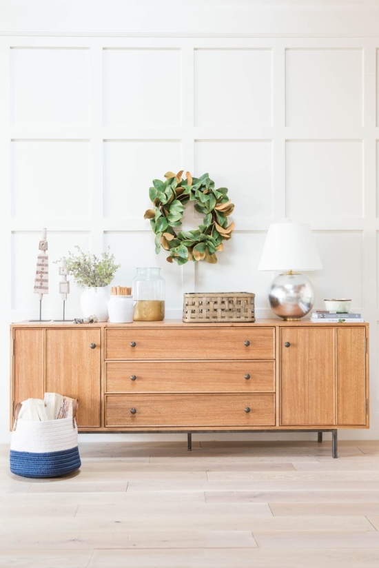
So, if you remember this post...we decided to go with the gallery wall for our living room! I still love the mantel and mirror idea, but we already had all the art for the gallery wall so it seemed like the more practical route. After all, a penny saved is a penny left to spend on our kitchen--you know the famous quote ;). I'll post pictures soon, but I'm really happy with how it turned out. It's similar to our old gallery wall, but I mixed in some different pieces too so it still feels fresh. And it's so nice to have some COLOR on our walls at last! Now, I'm on the hunt for the perfect credenza/sideboard/buffet/ console table/whatever you called it to go underneath. I haven't found "the one" yet, so I thought I'd post my inspiration and some of the pieces I've seen, and ask for your suggestions. Ideally, we'd find something vintage...but the selection on Spokane's Craigslist isn't as great as Seattle, and I haven't had good luck with prices at antique stores here. So I've mostly been looking online. But if you're in Spokane and you see one at Goodwill or a garage sale or whatever, please let me know!!!!!
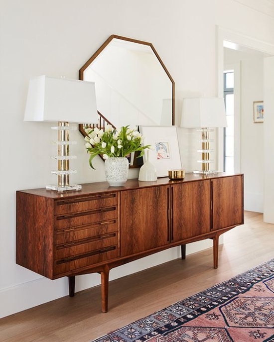
This credenza above is my dream piece, and of course it's vintage (via The Nest). That rug is beautiful too!
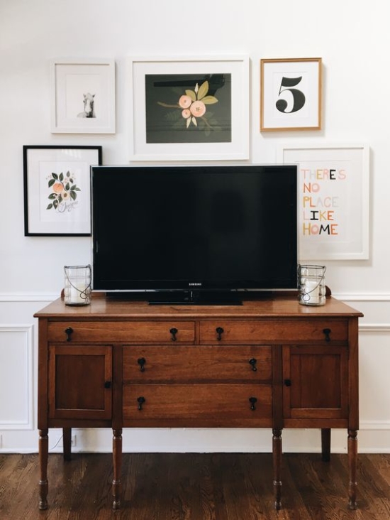
I also love this one, which is from the room I originally posted as an example of a sideboard + gallery wall. It's a little more traditional and a little less midcentury...and of course it's also vintage (via Garvin and Co.).
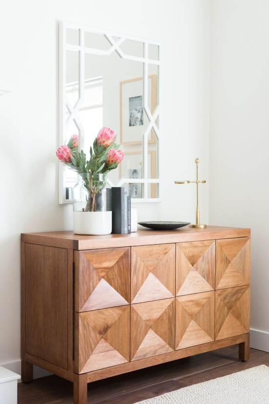
This one's new, but more expensive than I can spend. We're hoping to get a piece that's over 70" wide and the 3-door version of this is $3,072 (via Studio McGee).
Here's another one from McGee & Co that I love...also $3,000. :(
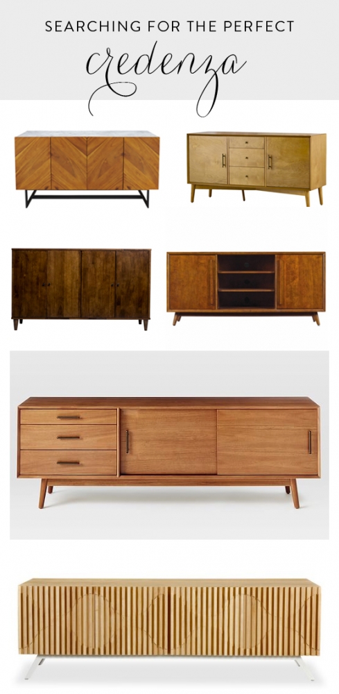
So, those are my inspiration. Maybe something midcentury, definitely something in a lighter, warm wood tone, and preferably something under $1000. Here's what I've found so far online:
The first four are under $1000, but they're shorter than I want. The last two are about the right width, but more than I want to spend. Tell me if you've seen something similar that I should check out!
1. 57" Suspend Console - $899 / 2. 57" Easmor Sideboard - $492 / 3. 55" Vilas Buffet - $554 / 4. 54" Leawood TV Stand - $300 / 5. 80" Mid-century Console - $1399 / 6. 63" Kardiel Semibreve Credenza - $1599
Also, what do you think I should do: splurge on a piece that will fit better in our space, save on something that's close enough, or wait and keep checking vintage stores and Craigslist in the hopes that something perfect will turn up?

