11
Thanks to Arhaus for sending me these products to review! All opinions are my own.
I've been loving the idea of cozy minimalism lately. It's not about paring your belongings down to the most sparse essentials (only one fork per person!). It's also not adopting some ultra modern style with no pillows or books. It's simply getting rid of the needless clutter that adds visual noise, so your home still feels like you, but with less individual items. One trick is to decorate with one or two large, beautiful items that you love, instead of a bunch of smaller items (especially if they're just random things you picked up from thrift stores). I've been going through and doing this in our home, and it really works. My house feels less busy and cluttered, and the decor looks so much more intentional and impactful.
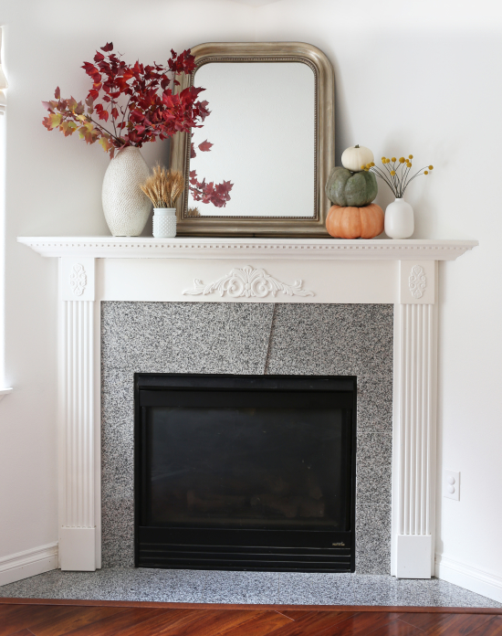
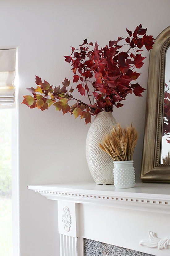
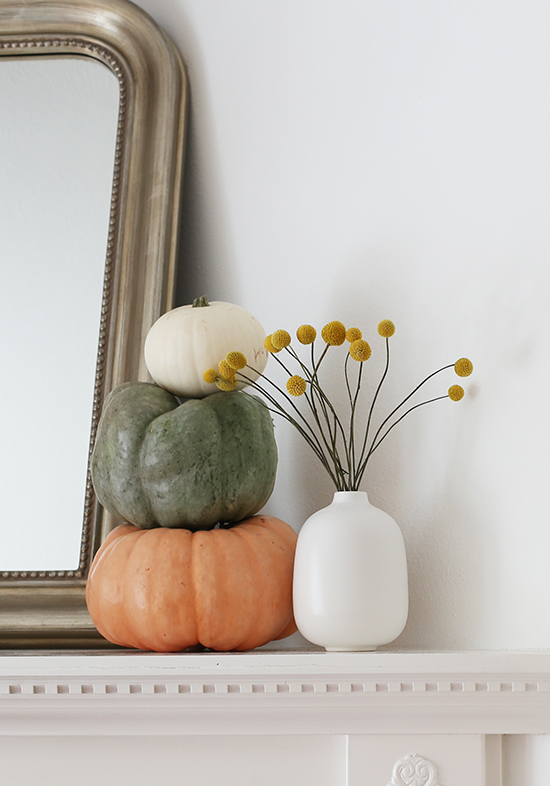
Exhibit A: I've never been able to get my mantel to feel "right." I've tried so many combinations of small tchotchkes grouped together, but it's always looked messy. I finally cleared away all the random little things, and replaced them with a gorgeous tall vase from Arhaus. I added some fall branches clipped from our yard and a vase of dried wheat. On the other side, I stacked some pumpkins and placed another vase with dried billy balls. It's just right: simple and uncluttered, but still cozy and homey.
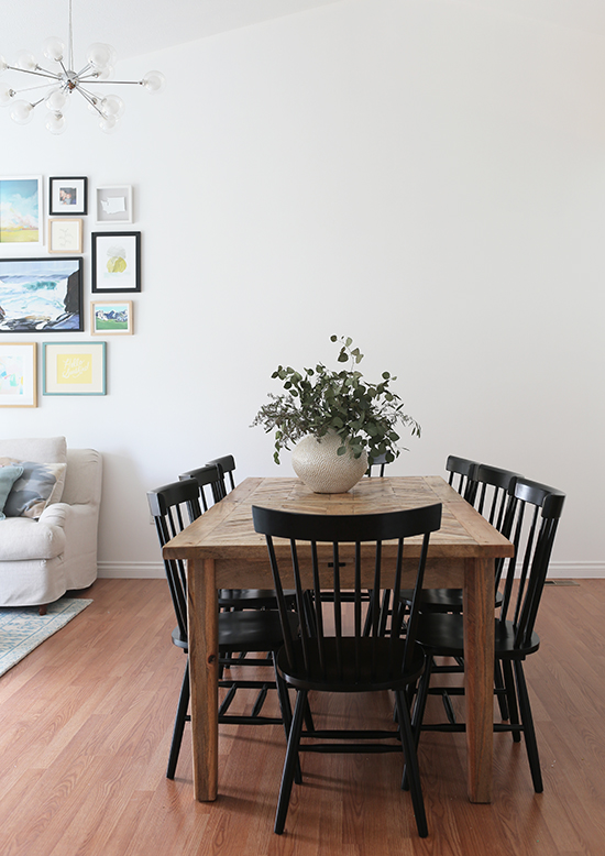
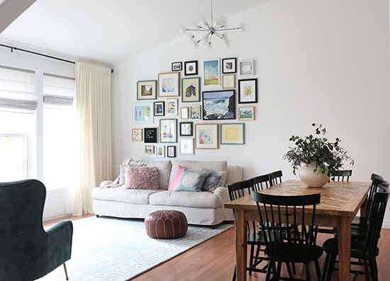
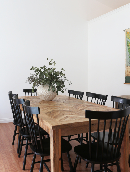
I did the same thing with our dining table. Instead of a bunch of candles or a grouping of little items, I put one huge chunky vase in the middle, stuffed with eucalyptus. It looks so much more substantial and high-end to me. And bonus, there's less items to arrange "just so" which makes it easy to maintain!
You may also notice that I changed our dining room! I mentioned my plans in this post, waaaay back in February. Seven months later, we finally got the black Windsor chairs and moved our dining room to the back half of the living room. Here, you can see how it all fits together. We're still planning to order a round table for our breakfast nook this month, and fingers crossed that it will be a keeper (you can see the first table we tried in this post). When everything is in place, I'll do a final update on our dining room situation. But I would say this room is 90% done! It finally feels RIGHT, hooray!
As for the "cozy minimalist" decorating trick...I'm doing the same thing with every surface in our house that tends to collect junk: nightstands, bookshelves, cabinets, kitchen counters, you name it. And you guys, it feels SO GOOD! Try it in your home! Clear away all the decorative clutter, leaving your surfaces clean and open. Then add in one large item, like a beautiful vase or lamp or sculpture (make sure it's a good size that fills the space well). If you feel like that's not enough, try adding one or two other items. On the bed, you could do one long lumbar pillow instead of a gazillion smaller decorative pillows. On the wall, maybe one large piece of art instead of a gallery wall that never looked quite right. You don't have to get rid of every collection of small items, but if there's an area that's always bugged you because it looked too busy, then it's the perfect candidate for this.
The nice thing about decorating with less stuff, is that you can get better stuff. If you're only buying one or two new things each season instead of fifteen little things, you can stay on budget without stocking up at Target and Ikea (nothing against those stores, it's just good to have other options so your home has a mix of high and low!). I totally recommend Arhaus for gorgeous decor that's substantial, excellent quality, high end, and still attainably priced. Some of my favorite items are below, and of course a pumpkin or some tall leafy branches work well for fall too!
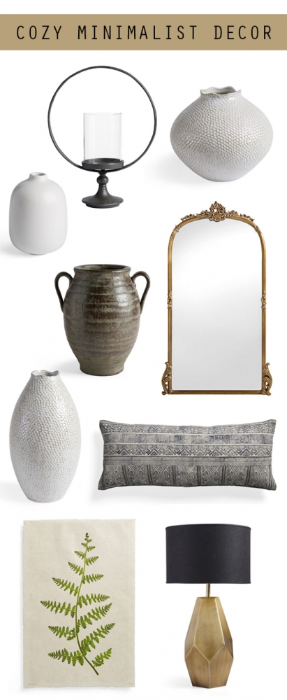
Sources: 1. Circle Pillar Holder - $119 / 2. Eva Round Vase - $99 / 3. Paloma Vase - $19 / 4. Amador Vase - $99 / 5. Amelie Mirror - $399 / 6. Eva Tall Vase - $69 / 7. Charcoal-Embroidered Lumbar Pillow - $69 / Botanical Fern Print (20 x 40) - $129 / 6. Bezier Gold Lamp - $159
Let me know what you think! Does "cozy minimalism" resonate with you? Have you decorated for fall this year? What do you think of the new dining room arrangement? And have you ever shopped at Arhaus? I'd love to hear from you.
01
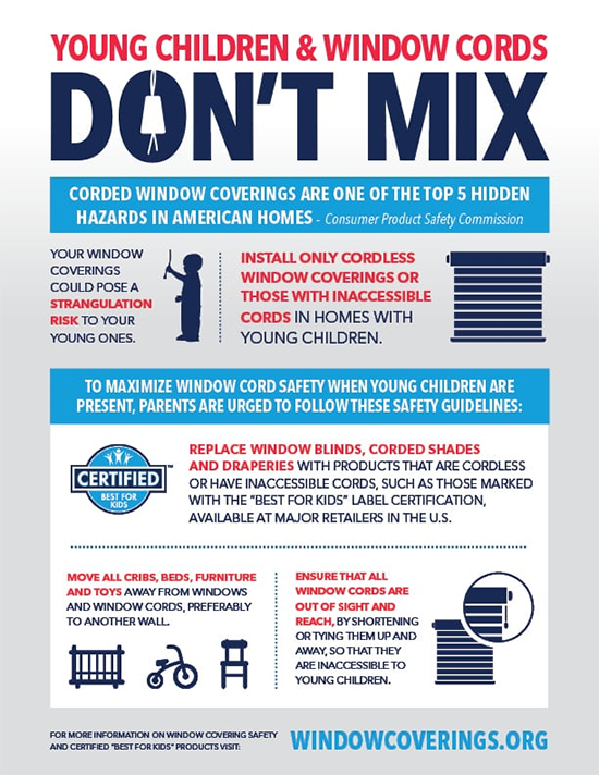
October?! Already? Who hit the fast-forward button on my life? It's hard to believe another year is winding down, but no complaints here. I am loving fall! The best food, the best clothes, and the best weather--plus, October is National Window Covering Safety Month. Ok fine, that doesn't conjure up the same cozy feelings of nostalgia as pumpkin patches and cider pressing and crisp morning walks through the crunchy leaves...but it IS very important. So I'm partnering with Bali Blinds to share some tips on how to child-proof your windows! I'm passionate about this topic, as the mother of two little boys who get into everything. Even if you don't have young kids yourself, this is good to know if you have children in your house on a regular basis. Not to be too dramatic, but it could literally be a matter of life and death.
1. Never place a crib, bed or other low-standing furniture near a window. Children love to climb and explore their surroundings. They can accidentally fall through an open window or window screen, or become tragically entangled in a nearby window cord. For safety's sake, place cribs and furniture on window-less walls.
2. Check your home for window coverings with dangling or accessible cords. The U.S. Consumer Product Safety Commission (CPSC) named corded window coverings as one of the top five hidden hazards in American homes. Exposed cords are a strangulation hazard to infants and young children. Identify any windows with dangling cords, and remediate them with the steps below.
3. If possible, replace older corded window coverings with today’s safer products. The Window Covering Safety Council (WCSC) recommends that you use only cordless window treatments in homes with young children. You can get cordless blinds that you lift yourself, or motorized blinds that are operated by a remote (ooh, fancy!). Look for products marked with the "Best for Kids" logo, as they have been tested by a third party lab and are certified safe for kids and pets.
4. You can order retrofit kits for FREE. The best option is to replace your corded window treatments altogether. But if that's not possible right now, you can get free retrofit kits from WCSC at windowcoverings.org. These kits includes cord stops and safety devices that will shorten and tie up your cords so they're out of reach. Bali Blinds will also send you free cord cleats, no matter where your blinds or shades are from.
5. Safety is important for every home. Don't assume this blog post doesn't apply to you if you don't have young kids right now. If you expect to have kids or grandkids in the future, if you host children on a regular basis, if you have pets, or if you're going to replace your window treatments soon anyways, it's a smart idea to buy Best for Kids certified window treatments, like cordless blinds or automatic blinds. They will give you the maximum peace of mind, and will add value to your home. Window treatments last for years, and your family’s safety is always a good investment!
Bali Blinds has partnered with The Window Covering Safety Council (WCSC) to help spread the word about safe window coverings. You can learn more here and here, and you can help share this important information by posting on social media with #cordlessforkids (feel free to pin or share the infographic below).
25
Thanks to Momeni for partnering with me on this post. All opinions are my own.
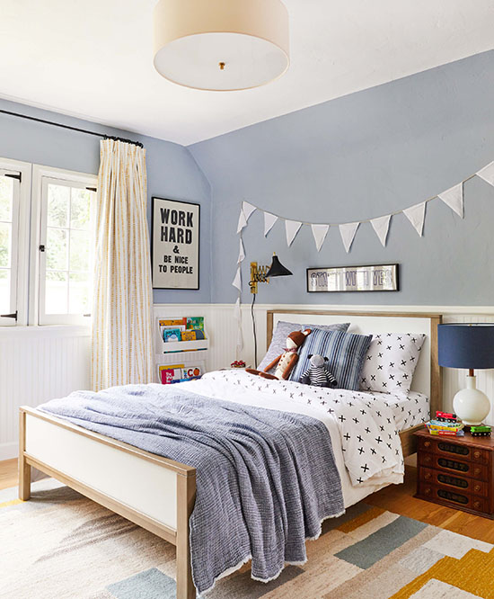
I am all over the place with house projects these days! I'm still not finished with our dining room, but I decided this was a good time to start working on Ian's room too. For the past few months, he's just had a mattress on the floor. Since he and Emmett are pretty close in age (21 months apart), I'm anticipating that I will have them share a room in the near future. So I designed the room with that in mind. At first, I was thinking two separate twin beds, like people normally do with shared kid's rooms...but then I had the crazy idea to start putting our house on Airbnb. I was inspired by The Grit & Polish (who I featured in this blog post). She rents her family's personal residence for weekends here and there, and they earn extra money from it. I'm super intrigued by that idea, so I started thinking of putting a king size bed in the boy's room, that will double as a secondary guest room. Ian will have it all to himself for now, and the boys can share the big bed when Emmett gets older (I might get them two separate small duvet covers, Scandinavian-style). If we do the Airbnb thing, I'm thinking of having a separate sheet set that's just for guests so it doesn't feel weird. Even though I'll obviously be washing the sheets, I just don't want my kids using the same sheets as random strangers. With all that in mind, my goal for this room was to have it feel like a fun, playful kid's space--but also sophisticated enough to host adults occasionally.
via Emily Henderson
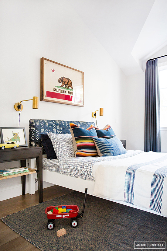
Here are a couple example photos that are similar to what I'm thinking: they're clearly a boy's room, but with a big bed instead of a twin. The main elements (like the rug, bed, and lighting) can easily feel more "adult" just by removing the stuffed animals and toys.
via Amber Interiors
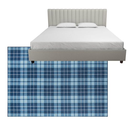
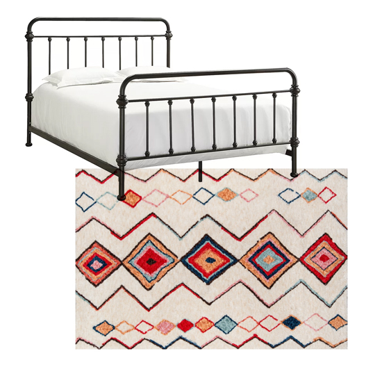
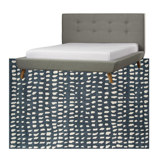
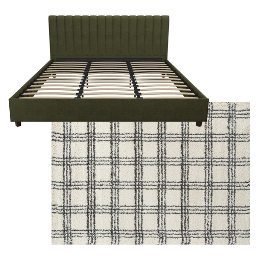
I figured the next step was shopping for beds and rugs that struck that right balance: kid-friendly and playful, but not for kids only. Let's be honest, I probably wasn't going to choose a race car bed and an ABC rug anyways. ;) I looked for a platform bed that was low to the ground so it would be easy for Ian to climb into by himself, and a rug with a cute pattern and good colors to set the tone for the room. Here are a few combinations I liked--all with rugs from Momeni. See if you can guess which one I'm going with!
Version 1: Vintage-style plaid rug / Channel tufted bed
Version 2: Colorful boho rug / Iron bed
Version 3: Cute navy rug / Tufted button bed
Version 4: Soft neutral rug / Green channel tufted bed
Which combo do you think I ordered? And tell me, am I totally crazy for wanting to put our actual home on Airbnb??? My idea is to put an exterior lock on our master bedroom and the garage, put all our personal items in those rooms, and vacate the house for the weekends we get booked. Would you ever do something like that, if you had two young kids? My parents think it's not going to work...so naturally, I'm determined to prove that it will! Haha.
19
I've had this post in my drafts for weeks! Finally hitting publish even though my writing isn't quite ready, because it's been too long since my last blog post, and these photos speak for themselves anyways! :) I found the mother-daughter design team Rehabitat through Instagram, and they are one of my favorite accounts to follow. Their interiors are consistently SO inspiring to me, perfectly toeing the line between modern and traditional. I used to looove antiquing and finding pieces with a worn-in vintage aesthetic--you know, furniture with chippy paint and old steamer trunks and floral paintings in brass frames. As trends have changed, I've also been drawn to the more modern/Scandinavian look that's gotten so popular. But I still love antiques too! I struggle with mixing all these different ideas and styles together in a way that looks purposeful, not scattered. Well, Rehabitat does it so well. Maybe it's because they're from two different generations, or maybe they just have that magic touch, but they seem to effortlessly blend traditional design with clean modern lines, in a way that looks warm, inviting, layered, and totally meant to be. I find myself "saving" almost every photo they post on Instagram, and referring back to them when trying to find the right balance in my own home. I have a feeling you guys will love their work as well!
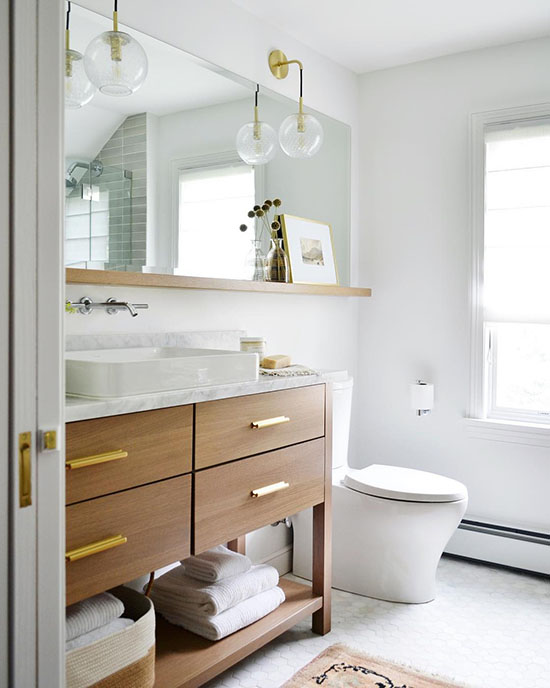
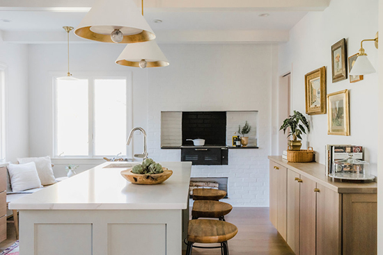
In this bathroom, I love the idea of extending the mirror past the vanity and putting a little ledge underneath it. I'm also a big fan of the mixed metals, the hanging sconces, and the vessel sink + wall mounted faucet situation.
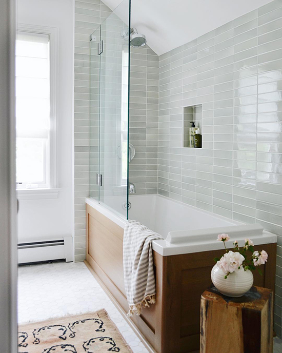
In the same bathroom (from a different view), I looove the glossy grey tile, laid in a modern stack and paired with the wood tub surround. It looks fresh and current, but timeless too.
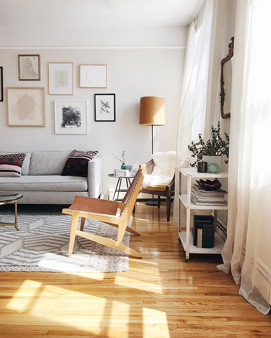
This living room is perfect to me. It looks homey, welcoming, comfortable, and relaxed--just the way a living room should be. Yet at the same time, it's so stylish and interesting, with lots of details that make you want to take a closer look. Cool people live here--but the kind of approachable, normal-cool people that I could be friends with. You know what I mean, right?
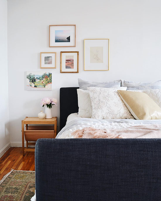
This bedroom is also one of my favorites. The perfect little gallery wall off to the side (they are the queens of gallery walls!), the vintage rug, the layered bedding. I would happily sleep there, please and thank you.
Beautiful, right?! A few things I've noticed they use consistently: white wall paint, warm natural wood, mixed metals, and soft colors, which allow them to layer lots of different elements and styles without it seeming hectic and overwhelming.
Which room is your favorite? Any details you notice?
All photos via Rehabitat, an NYC-based interior design team.

