01
This is a collaborative post. All opinions are my own.
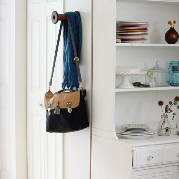
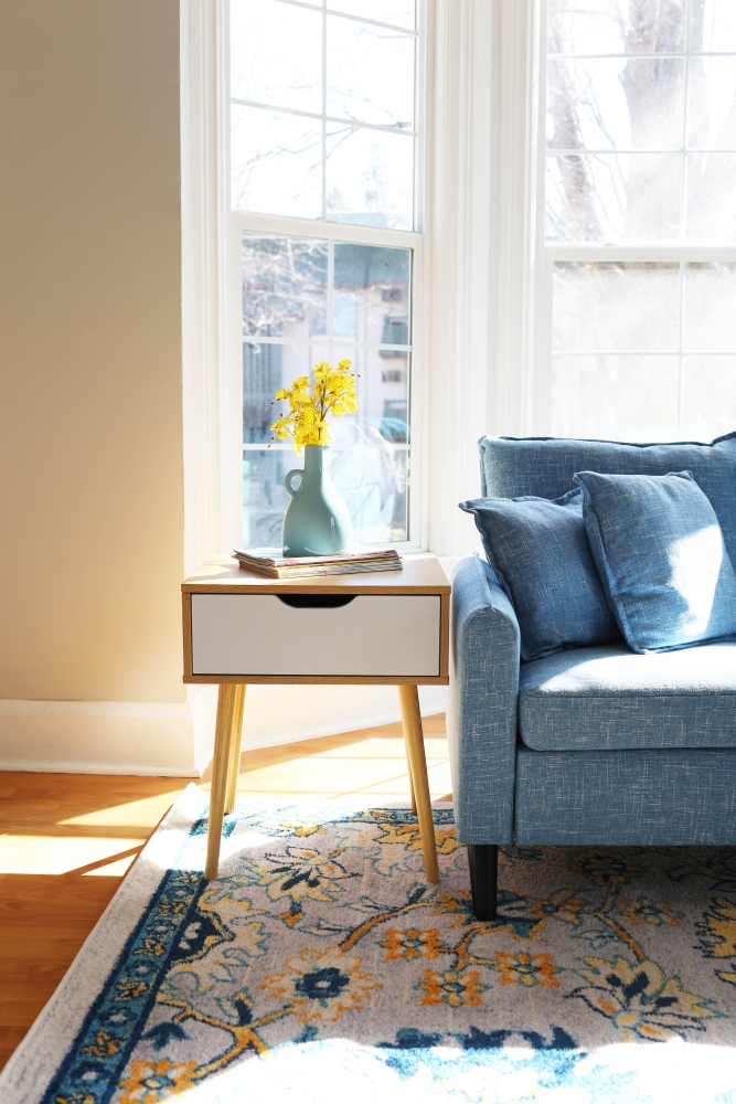
Ben and I were reflecting the other day on how we lived in a small, short-ceilinged basement apartment for FOUR years in Edmonds. In hindsight, I'm not sure how we did it; but at the time, our home didn't actually feel that tiny. I think it's because we made a lot of good design choices that made our small space feel larger. I mean, it never felt huge, but it was cozy and peaceful. Now that we live in a house that's more than twice the size of our old apartment (with tall, vaulted ceilings instead of short, 7 ft ones), I recognize that every type of home has its own design challenges. Small spaces are easy in some ways; there's less furniture to buy, less wall space to fill with art, and just less decisions to make. But they're a challenge too. One interior design mistake can result in a cramped, claustrophobic den that is anything but restful. Of course, there are few ways to make a small home physically larger, but they're expensive. So first, try these tips that will trick the eye into seeing more space. You can visually add "square footage" without actually changing the footprint of your house at all. These photos are all from my old home, our #edmondsbasement apartment. Although I would never want to live there with two young kids, I have lots of fond memories from this time and I'll probably always feel a little nostalgic about it. You'll see that almost all the photos are from our living room, because that was the only room in the house with decent sized windows!
1. Paint the Walls White
White makes spaces look much larger. It reflects light back into the room, making it appear brighter and more open. A continuous white paint job on the walls also tricks the eye into thinking a home is bigger than it is, because it isn't chopped up by different colors that make it obvious where each room ends.
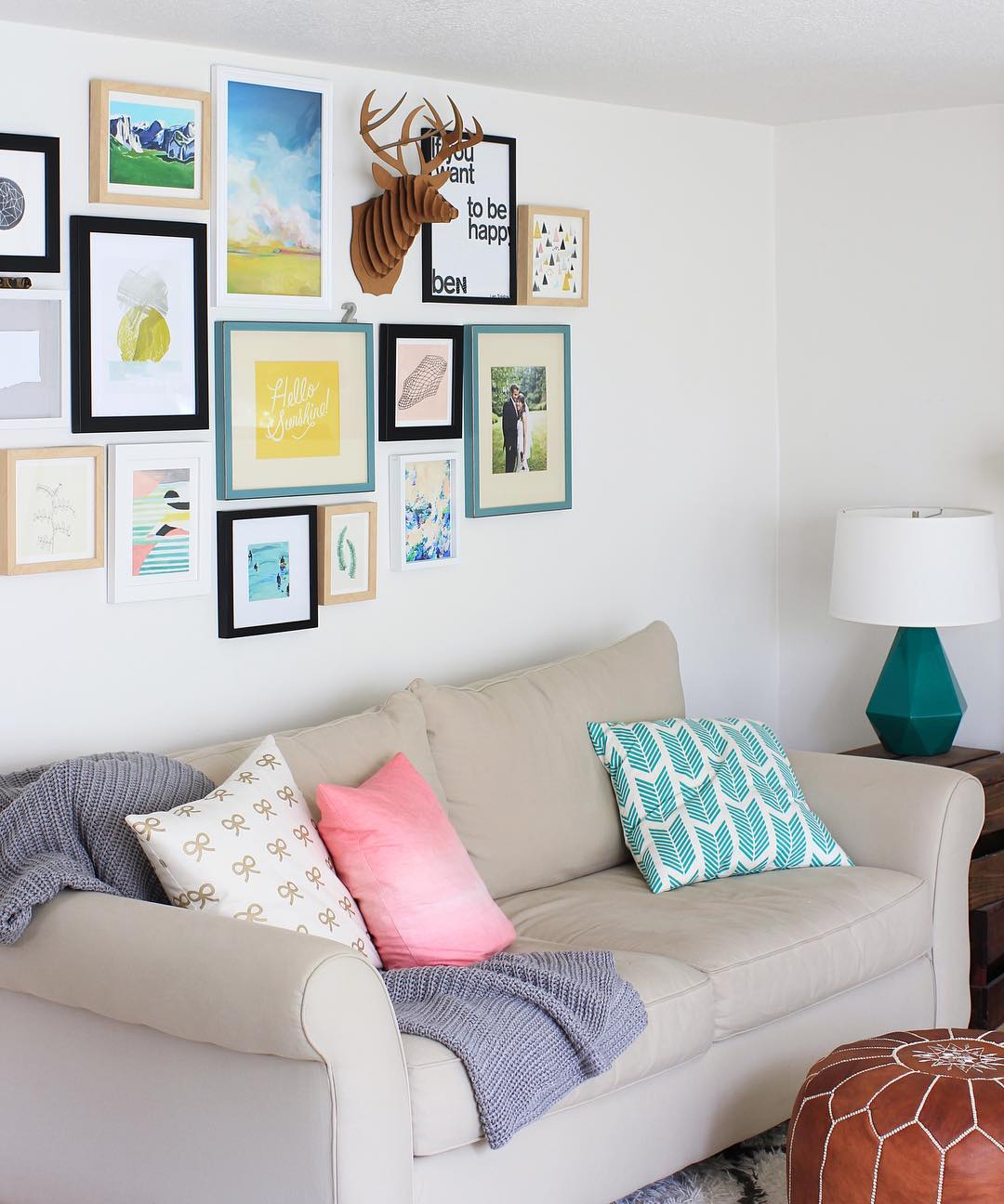
2. Limit Your Color Scheme
If you would rather not have an all-white interior, then try decorating in limited hues--especially soft shades that work together well, like mint green, pastel blue, and lilac. When your home already feels quite small, it makes sense to stick with tones, tints, and shades from the same color family. Contrasting colors break spaces up, making them feel smaller than they are. A monochromatic color scheme, on the other hand, is easy on the eyes, which means that you can take in the whole room without being distracted.
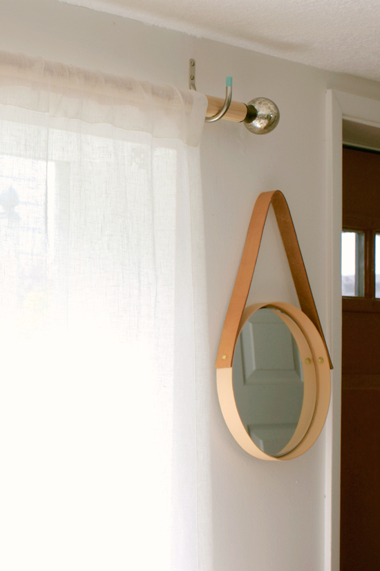
3. Add a Mirror
A well-known interior design trick is to add a mirror (or two, or three!). Mirrors instantly make a space feel larger, by bouncing light around and giving the illusion of depth, instead of the wall being a hard stop.
4. Keep The Windows Clean
Windows are actually a big plus for a small room, and should make it feel larger. But when they're covered in distracting dirt and grime that prevents natural light from getting into your home, they're more of a negative. Light is vital in making a room feel spacious, so make an effort to keep your windows clean.
5. Stick To Lightweight Fabrics
Even with sparkling windows, dark and heavy window treatments make it clear where your space stops. They also absorb natural light and weight the room down, thus making it appear even smaller. To keep rooms feeling spacious, you should choose light linen curtains instead, especially ones that match the color of the walls and run from ceiling to floor (adding visual height).
6. Clear Out Any Clutter
The more stuff you have in your home, the smaller it’s going to feel. If you want your space to feel bigger, take stock of what you have in each room and clear out anything you no longer want or need. A junk removal service, like Mr Cheap Rubbish Removal, will be able to take away the things that are broken or not worth anything. The items that have value can be donated or sold online or at a yard sale.
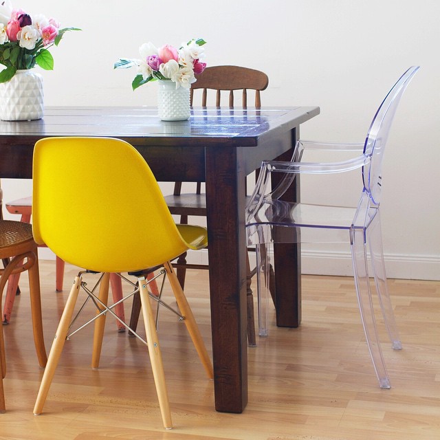
7. Choose The Right Furniture
These days, especially in a small house or apartment, most rooms serve several purposes. The living room, for example, might be used for entertaining, eating, relaxing, and working. When you’re low on space, however, fitting several different pieces of furniture for each separate need can be difficult. This is why you should opt for multipurpose furniture, like a storage ottoman, which can be used as a table or chair too. Choosing leggy furniture will give the illusion of more space, as you’ll be able to see the floor underneath. And I also like transparent pieces in small spaces, like a lucite coffee table or dining chair. They serve their function without taking up visual weight.
8. Mount On The Walls
Floor space is crucial in making rooms feel larger. The more of it you have, the bigger the area will appear. With that in mind, you should take as much stuff off the floor as you can. Instead of storing your television on a unit, for example, you could mount it to the wall. You could also put up a few shelves around the room, rather than using a large bookcase.
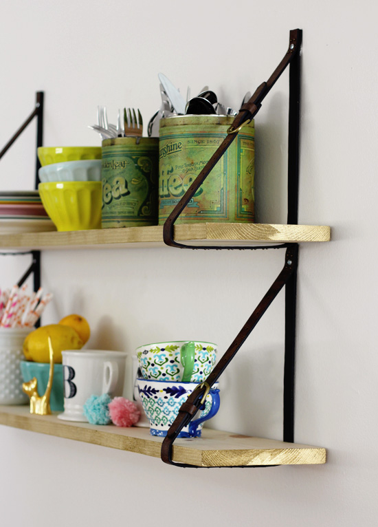
9. Leave Some Shelf Space
A shelf that's crammed full doesn't exactly give off airy, spacious vibes. You might think that in a small space, you should always choose small furniture. But a smaller bookcase that's completely filled looks busier than a larger one with some breathing room. The gaps will give the illusion of space, even though you’re technically taking up more of the wall.
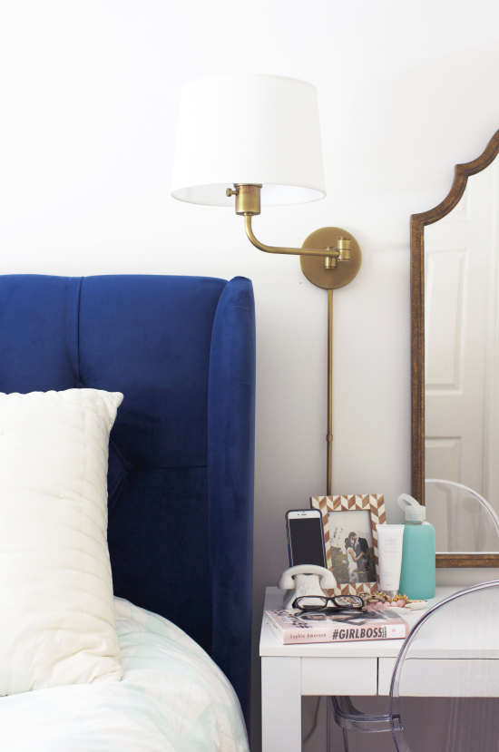
10. Plan The Lighting Carefully
Spaces look a lot bigger when they’re well lit. This is because our eyes are drawn to the light. While natural light is best, you can’t rely on it at all times of the day and year. The next best thing is to create multiple sources of light. If you only have one overhead light in each room, then you’re making a big mistake. This creates shadows, which will only make the space feel smaller. Using multiple sources dotted around the room will help to light up every corner. Wall sconces are especially nice because they don't use up space on your tables.
Bonus tip: Take Off The Door
If you’ve tried everything you can to make your home feel bigger, then consider taking off some doors to create more of an open concept. This will draw your eye out of the room, giving the illusion of more space. You'll want to consider how connected rooms flow together so they don't look choppy. Removing doors is not as drastic as it sounds--you can always keep the door and hang it back up if you change your mind.
Small spaces can be challenging, but hopefully these ideas will help you create a home that is cozy and comfortable, rather than cramped!

29
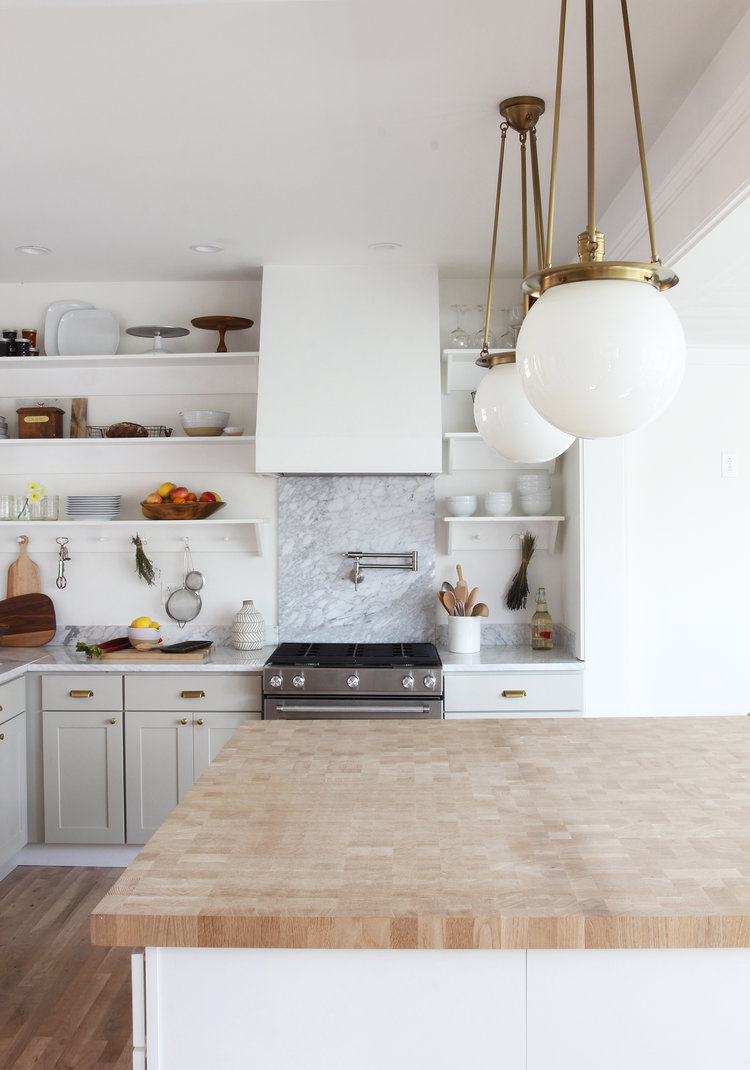
I'm starting this week with more kitchen talk...are you sick of it yet? Sorry. I have all these possibilities swirling in my head and writing them out helps me process and make decisions! In this post, I talked about a bunch of ideas we were considering for our cabinets. Well, I got a quote for painting them and it was a LOT ($2900, yowza). I could get more quotes, and I know it's possible to DIY the paint job, but I'm not sure I'll love the end result either way. Just being honest with myself. I also learned that refacing or getting new doors is even more expensive, in the $4,000 range (I haven't gotten an actual quote yet though). The other idea I tested was grey gel stain, which I think IS a doable DIY project. It's just...I don't know if I actually want grey cabinets. Plus any of those options means we're constrained to our current cabinets, which aren't the most efficient when it comes to storage. THEN as I was pricing things out, I came across two different types of white Shaker cabinets that are actually pretty affordable, similar to the cost of professional painting or refacing. Soooo my current plan is to get white Shaker cabinets for our pantry and island, since that's what we actually need in phase one. We'll leave the rest of the cabinets oak for now--unpainted, unstained, untouched. Then, when we can afford to get the rest of the cabinets, counters, and backsplash in one fell swoop, we'll do that (phase two). We would sell the old cabinets to make some money back, and our new cabinets would add resale value to offset the cost.
I know, another white Shaker kitchen...HOW ORIGINAL. ;P Too bad, I'm not a professional designer showcasing new trends. I'm creating a kitchen for our personal home, and Ben and I both happen to like light, bright, kitchens. White cabinets have always been my favorite, and they're classic, which means they're a smart choice for resale. Even with "budget-friendly" cabinets, it's still going to be a lot of money for us, so I'm not going to take a risk on something more "unique." We will probably go with one of these options, unless we can find something cheaper/better on Craigslist or a local store.
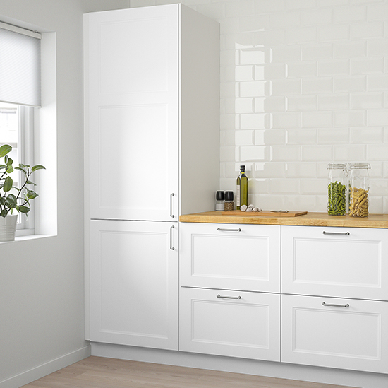
Option one: IKEA Axstad cabinets. These are a brand-new line at IKEA, and they are prettyyy: pure white with a double-layered Shaker style door, in a matte finish. For me, these would eliminate the "need" for Semihandmade doors, which would keep things simpler and save a little money. Pros: IKEA cabinets have great reviews and lots of options for inner storage. Cons: We'd have to assemble them ourselves, and we haven't seen them in person yet.
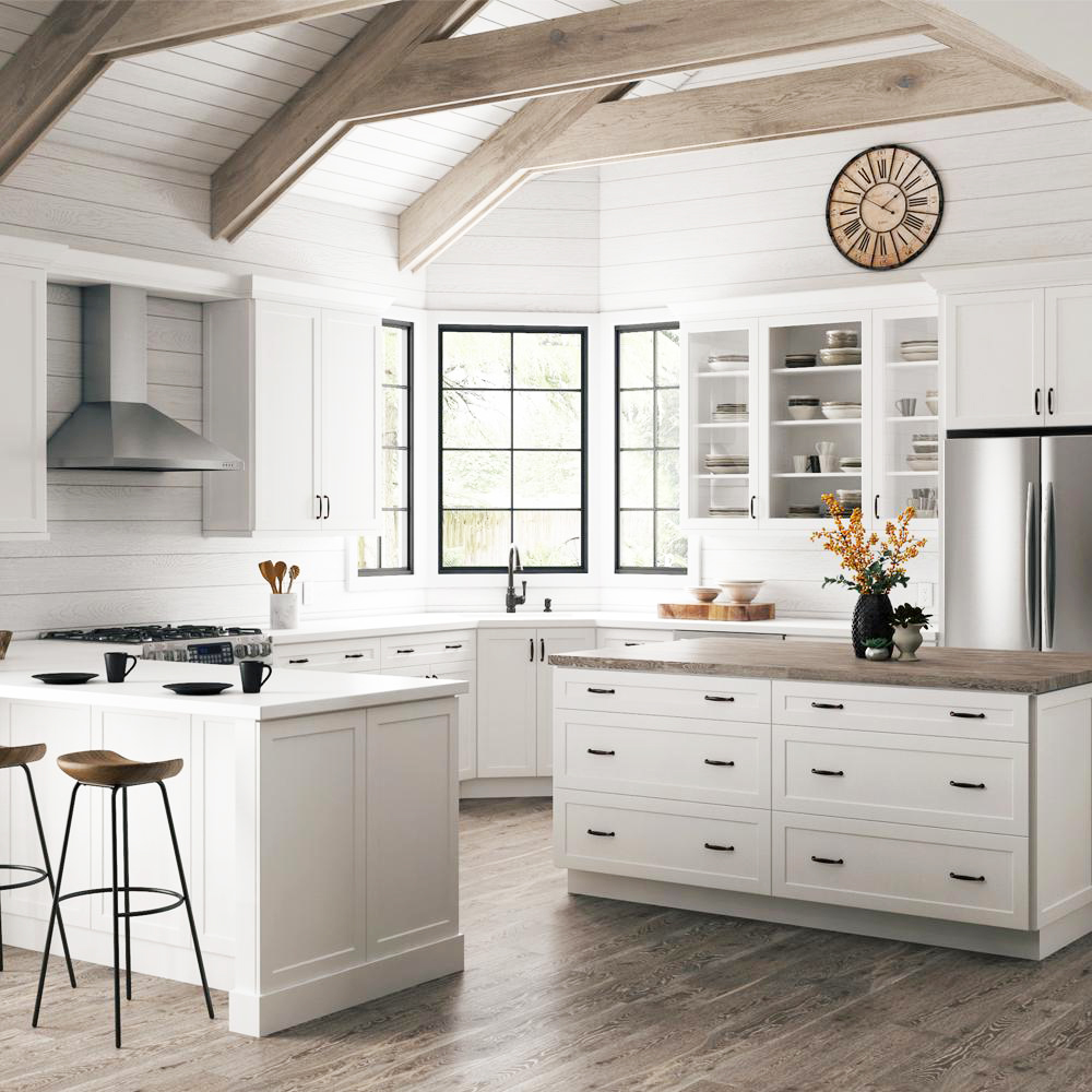
Option two: Hampton Bay Designer Melvern cabinets. We saw these at our local Home Depot, and really liked them. I did see some negative reviews for Home Depot's Hampton Bay cabinets, but these are the "Designer" series, so they should be a step up from the base level. They have some nicer quality features like dovetail drawers, soft-close, and drawer faces that fully cover the cabinet box. This photo is actually quite similar to what we're thinking for our kitchen in terms of layout (just no peninsula). Pros: Fully assembled, we've seen them in person. Cons: I can't find many reviews for the Hampton Bay Designer series. Quality could be iffy.
I still need to price out our kitchen in detail, but at a glance the pricing between these two is fairly comparable. So my question is, have you used either IKEA or Hampton Bay cabinets? If so, would you recommend them? What issues did you run into? Was assembling the IKEA cabinets a royal pain?
Which one of these would YOU choose?
27
This is a collaborative post. All opinions are my own.
I have a friend who recently got into home staging, and I've been having fun talking to her about her business. It's got me thinking about how staging a home to sell is very different from decorating it to live in. Staging is not about your own personal style--it's allll about making your home appear cleaner, grander, more spacious, and more expensive. After all, the point of selling is to get the most value you possibly can, right? You've got to remove your ego and let go of your emotional attachment to your decor. Then think objectively and critically about how to make your home appeal to buyers.
A home staged by my friend, Affordable Home Staging in Spokane. If you're local, you should think about hiring her!
1. Consider first impressions
When you're living in a home, you're likely to focus on the interior, where you spend most of your time. But when you're selling, the exterior matters a LOT. If you don't pay attention to curb appeal, someone may never even step foot inside to see all the work you've done there. People develop their feelings about a house very quickly (positive or negative) so it's also important to give them a good impression when they first walk into the home. Pay attention to the entryway and the landing of the home. Make it inviting, so it gets people excited about exploring the rest of the home. My stager friend adds cute touches like a chalkboard that say "Welcome home," to connect with people's emotions and make them feel at home. Other things that are important: make sure you have plenty of natural light coming through the windows, don’t clutter the entryway, and put away your coats and shoes. To stage the entryway, leave a bowl where put your keys and some simple decor, so it looks welcoming, tidy, and spacious.
2. Depersonalize the house
It's important for buyers to be able to imagine themselves at home in your house. And it's hard for them to do that when you have a huge family portrait of yourselves above the fireplace, your clothes stuffed into every closet, and your kids artwork all over the fridge. You don't have to move every personal item out, but it's a good idea to remove any personal family photos (especially large ones) and replace them with art that has mass appeal. It's also a good idea to thin out your wardrobe and only leave a few of your best outfits, so it looks like there's plenty of closet space. You can put the extra bins of clothes in the trunk of your car, just for the time being. As for your kids stuff, if it's a house that would likely appeal to families, there's nothing wrong with leaving out some toys and kids books that can help the buyers imagine their own kids enjoying the space--but again, be selective about what you leave out. If you're tempted to conduct your own viewing, don't be a weirdo and follow potential buyers around. Give them space to judge each room and discuss them with each other, and don't hover around interjecting your comments. It's even better if you can vacate the house altogether and have a third party like a realtor hold your open house and viewings.
3. Be scents-itive.
If you have ever been gone to an open house or viewing, you know how off-putting it can be when the home doesn’t smell very good. That subconsciously means the home isn’t very cared for and replacing things like the carpet and curtains will probably be necessary. So before you put the house on the market, open all the windows and doors to clear out the house's smells and get fresh air circulating. Put away visible signs of pets, which can be off-putting to some buyers (and can carry animal smells that you've gotten used to). Some people are sensitive to strong scents, so things like plug-in diffusers are not necessarily a good idea. Scent is very personal, and what might smell good to you, may smell terrible to someone else. Rather than a fake perfume-y scent, it's better to go for a real, universally appealing smell like freshly baked cookies or lemon. A great fresh smell throughout the home will be more inviting to the viewers and will improve the chances of them spending more time in the home.
4. Fix up any obvious annoyances
If you've lived in a house for awhile, you probably have a list of minor things that you've been meaning to get around to: fill in those nail holes, fix that creaking floorboard, tighten that loose doorknob, touch up that chipped paint. We get used to all these little things when we're living in a house, and we stop noticing them--but to someone who's new to your house, they might be alarming and a sign of poor maintenance, or worse, a structural issue. If you want a thorough list from an objective third party, you could order a home inspection before you put your house on the market. Or have your realtor or a friend come through with a fresh set of eyes, and tell them to be super critical and point out anything that might put buyers off (just don't get offended if they give you a long list! Remember, selling means removing your personal attachment to the house...it's all about the money.).
5. Update the decor
It's important for your house to look on-trend, clean, and up-to-date. Often, you'll get the most benefit by simply removing things like chunky, outdated pieces of furniture, a gallery wall of personal photos, or sentimental figurines that don't match today's style. Clearing things out takes a lot of time, but will pay off greatly in the home's selling price. If you don't want to spend money on updating your sofas and art, consider hiring a stager. They will have furniture they can bring in that's chic, stylish, and the correct size to make your home feel spacious. They'll also go the next step and add decor pieces to make your house feel welcoming and homey...things like magazines on the side tables, a cute coffee station in the kitchen, fluffy towels in the bathroom, and flowers in the dining room. All these things will help home buyers picture themselves living their best life, and give them a good feeling about your house.
23
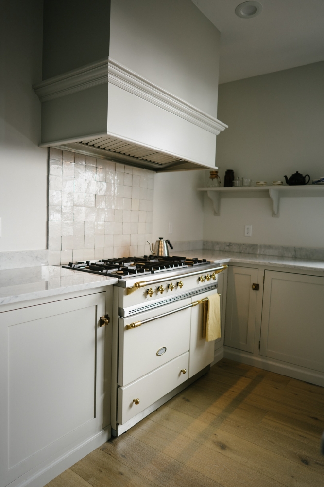
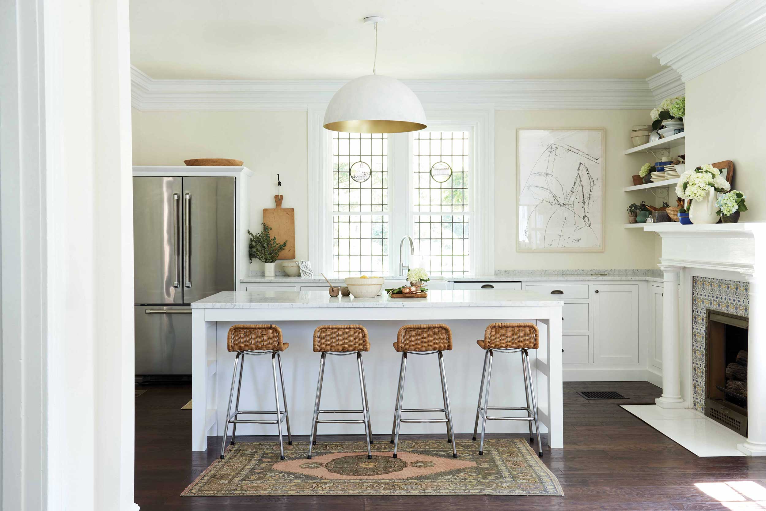
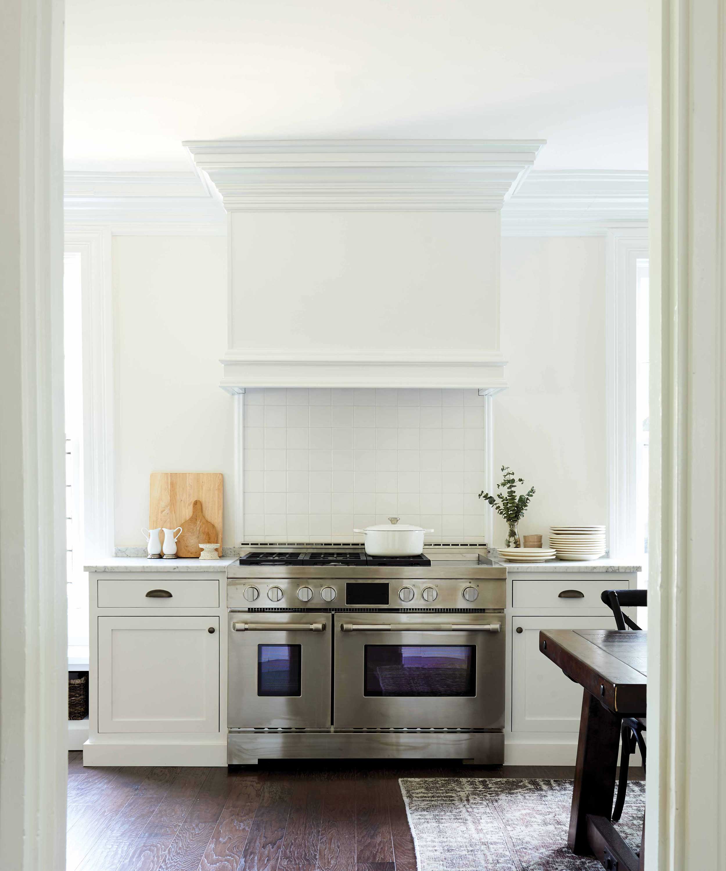
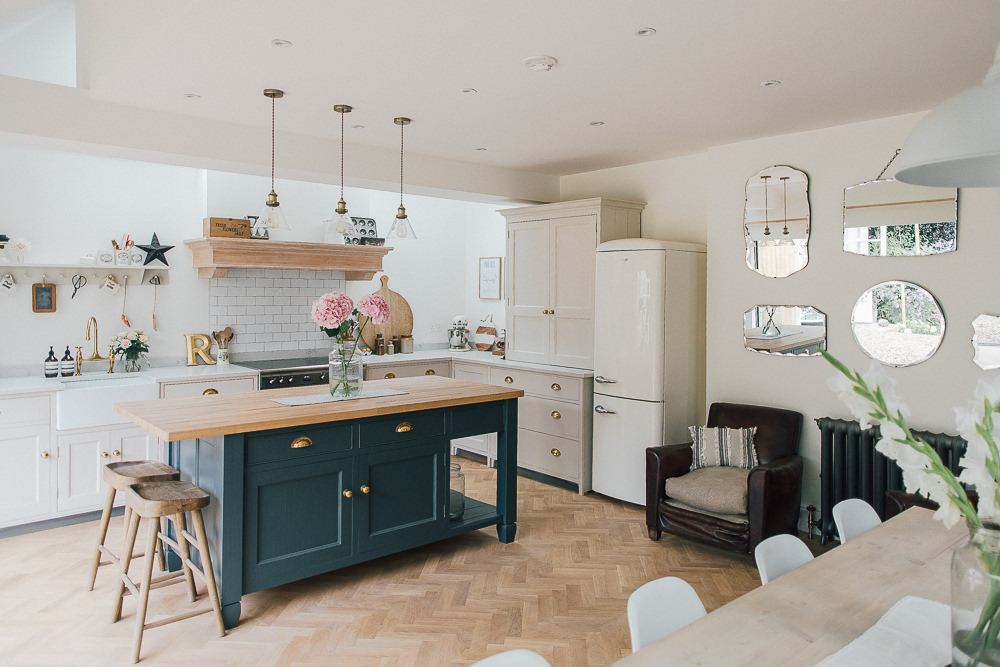
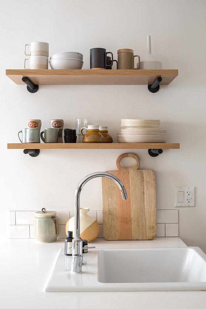
Trends are a funny thing. They go in cycles, and what was super uncool starts to look fresh and new again. It's true in homes as well as in fashion. The 4" backsplash used to be standard in homes, then designers started doing full tile backsplashes, and the 4" standard started looking outdated. But a full wall of tile has been "in" for awhile now, and short backsplashes are making a comeback. As someone who's planning a budget-friendly kitchen remodel, I'm glad to see this trend circling back around! After all, a full wall of tile that goes all the way to the ceiling is a LOT of tile, plus there's the labor and time to install it. And let's be honest, no one is actually splashing water and spaghetti sauce wayyy up there. See what you think about a simpler, shorter backsplash in the kitchen. Are you on board with this look? I've mostly been seeing slab backsplashes made of the same material as the counter, sometimes 4", sometimes a bit taller. Usually, there's a larger backsplash behind the range, where you need your walls to be more protected from grease and food. I've also seen a couple rows of tile instead of a full wall. It's budget-friendly for sure, and it also has a nice, simple, minimal aesthetic.
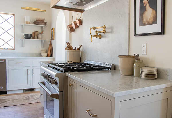
I started thinking about short backsplashes after I posted this house tour on Inside Spokane. It's a stunning, custom-designed house, and the kitchen includes upgrades like a gorgeous French range and marble counters. I don't think they chose this backsplash out of budget constraints--I think they just loved the clean and simple look.
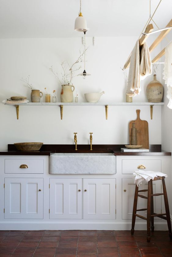
Here's a gorgeous kitchen from Devol. I've seen quite a few short backplashes in their portfolio, so maybe they're responsible for making the 4" backsplash cool again?
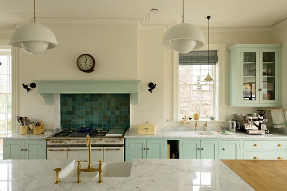
Love it paired with a statement backsplash behind the stove (also via Devol). One thing I like about the short backsplash is that it looks consistent and uniform even when you have windows, shelves, and cabinets at all different heights.
Here's another lovely kitchen, via Seeking Lavender Lane. The marble slab is larger behind the stove, which is both practical and beautiful. The kitchen has a very serene and old-world feel to it.
This kitchen design is by Leanne Ford, via Emily Henderson. Same kitchen below, so you can see how the short splash ties in with the stove.
And another DREAMY kitchen with an island that's the perfect shade of blue. I really love this one, via Rock My Style.
And if you're not convinced yet, here's one more beautiful kitchen by The Grit & Polish. I love those pendant lights too!
Overall, I think this looks better when the backsplash matches the counter for a seamless look, but it can be done with tile too. Here's a good example with two rows of subway tile, via Glitter Guide.
What do you think? Do these backsplashes look cheap, or is this one of those amazing things that saves money AND looks high-end? I'm hoping the latter.
Another benefit in my case, is that a short 4" backsplash would be below our windows. Since our windows aren't trimmed out on the sides, I've always thought a full wall of tile would look funny against them. See what I mean? We have a short tiled backsplash in our kitchen right now, so a 4" or 6" slab would cover that space perfectly. When we upgrade to quartz counters, I'm thinking this might be the way to go!
- Search
- Archives