21
A few weeks ago, I wrote a post with some bedroom inspiration and talked about my plans to whip our bedroom into shape. I haven’t gotten very far yet, but I did get some new bedding that I really love (yay)! We’re taking steps in the right direction. Today, I thought I’d share some of my tips for choosing bedding that you’ll love now and for years to come. After all, it’s a pretty big purchase that can make a world of difference in your bedroom! I rounded up some great bedrooms to use as examples, and some gorgeous duvet covers to help you achieve the look.
1. Splurge a little. I am all about budget-friendly decorating and creative, DIY options…but your bedding is not the place to skimp. Scratchy, low quality sheets are no fun to crawl into! I promise, you will not regret investing in some luxurious bedding that you really love. It’s worth starting and ending every day on a good note.
2. Check the thread count. Thread count refers to the number of horizontal and vertical threads in one square inch of fabric. The higher the thread count, the softer and more durable your bedding will be. Anything over 200 is considered high quality (and our new bedding, which has a thread count of 300, feels absolutely wonderful). But don't just grab the highest number you see! Apparently, 400 is about as high as a thread count can realistically get, yet some companies are claiming to have higher thread counts by counting not just each thread but each fiber in the thread. So if you see someone claiming to have 1200 thread count sheets, be skeptical.
3. Consider something with texture. I love white bedding--it makes it really easy to change up your look with new throw pillows, blankets, etc.--but Ben thinks that white is boring. Choosing bedding that has some texture to it, like ruching or pintucks, adds interest to a white bed…and as a bonus, it won’t show wrinkles either!
4. Mix patterns and styles. It might sound counterintuitive, but I think a bed always looks more chic and put together if it’s got some mix-and-match going on. Especially if your bedding is patterned already, I think it’s kind of boring to just use the matching shams and not mix in anything else. Some Euro shams in the back (in a different pattern or a plain color), throw pillows in front, and a textured blanket across the foot of the bed will make it seem finished. Switching up these “accessories” on occasion will make your bed feel fresh, new, and seasonally appropriate--without having to go out and buy all new bedding!
5. Look for duvet covers with ties in the corners. This is a small detail that I think makes a big difference. It’s a huge pet peeve of mine for the comforter to move around inside the duvet cover during the night, and it’s so irritating to try to smooth it out and get it all in place again. Find a duvet cover with interior ribbons in each corner, so you can tie the corners of the comforter in place. You’ll be grateful every morning when you make the bed!
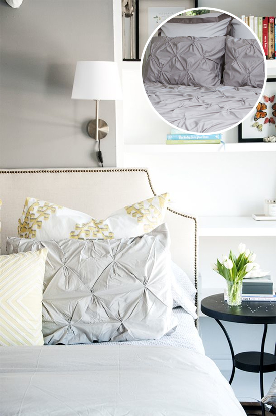
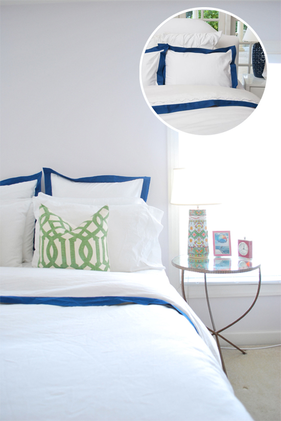
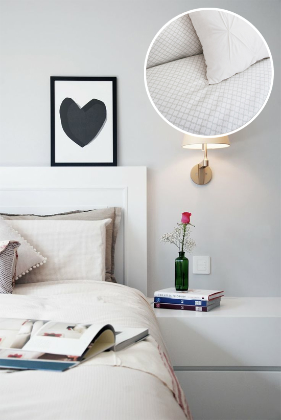
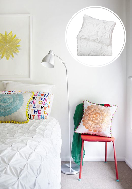
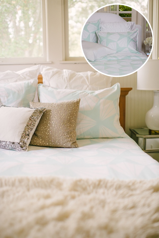
All of the bedding in the circles above are from Crane & Canopy, an online shop full of beautiful, high-quality bedding options--all 100% cotton, 300-400 thread count, and totally affordable.The bedding that Ben and I chose is actually one of the sets pictured! Can you guess which one?
1. The Linden Monaco Blue Border / 2. The Page Gray / 3. The Valencia White Pintuck / 4. The Taylor Mint Green / 5. The Valencia Dove Gray Pintuck
I’d also love to hear what kind of bedding you have, what you would get if you were to change it up, and if you have any tips for choosing bedding that I didn’t mention!
Sources for inspiration photos: 1 / 2 / 3 / 4 / 5
This post was written in partnership with Crane & Canopy, who sent me the luxurious Taylor Mint Green duvet! Did you guess it??

15
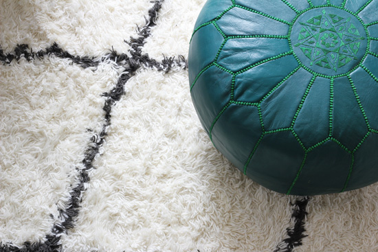
Today I wanted to share some photos of my new Moroccan pouf from Lulu & Georgia. I love it so much!! I’ve been wanting one of these for years, but they’re a bit on the pricey side so I've waited patiently until now. I know material possessions definitely are not the key to happiness, but I gotta say, now that I finally have one of my own, it really does make me a little happier every time I see it! We have it in front of one of our armchairs right now so we can use it as an ottoman, but I’m also planning to pull it to the side for extra seating when we have a lot of people over, and it can work as a little side table for books or a laptop, too.
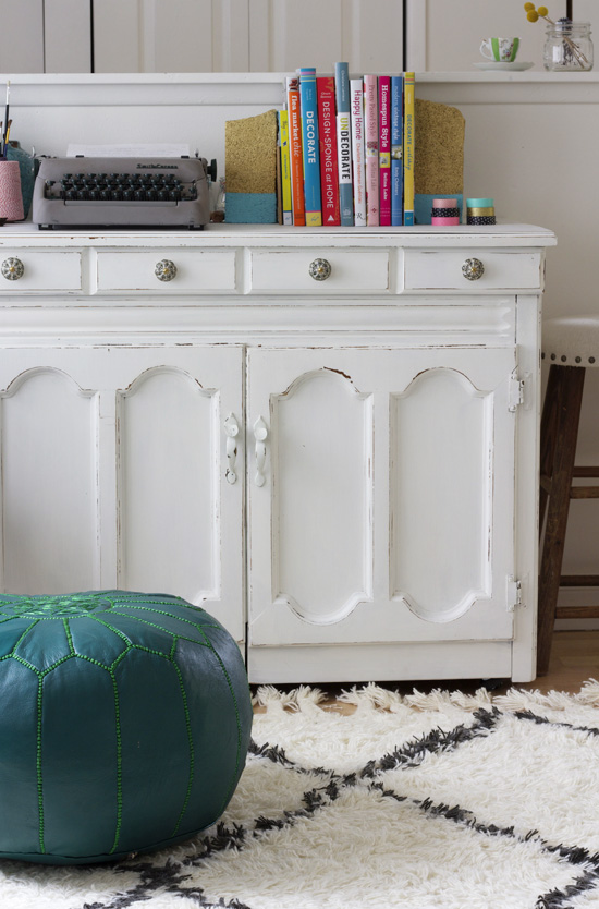
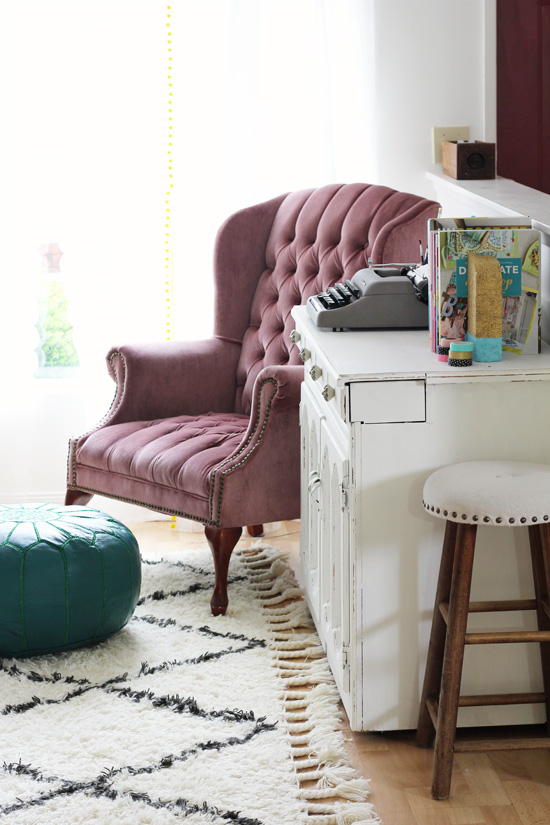
It’s so cute, right?? These Moroccan poufs come in a ton of different colors, so you’re sure to find one that will look good in any room. It was so hard to decide which color we wanted but in the end we went for teal. I think it was a good choice.
And, as if that wasn’t exciting enough, today Lulu & Georgia is giving one of you $100 to their shop. Yaaay! I rounded up some of my favorite items (including my pouf, of course)…but it was pretty hard to narrow down. They have so many great things you could spend that money on. Seriously, if you haven’t checked out Lulu & Georgia yet, you’re going to love it!
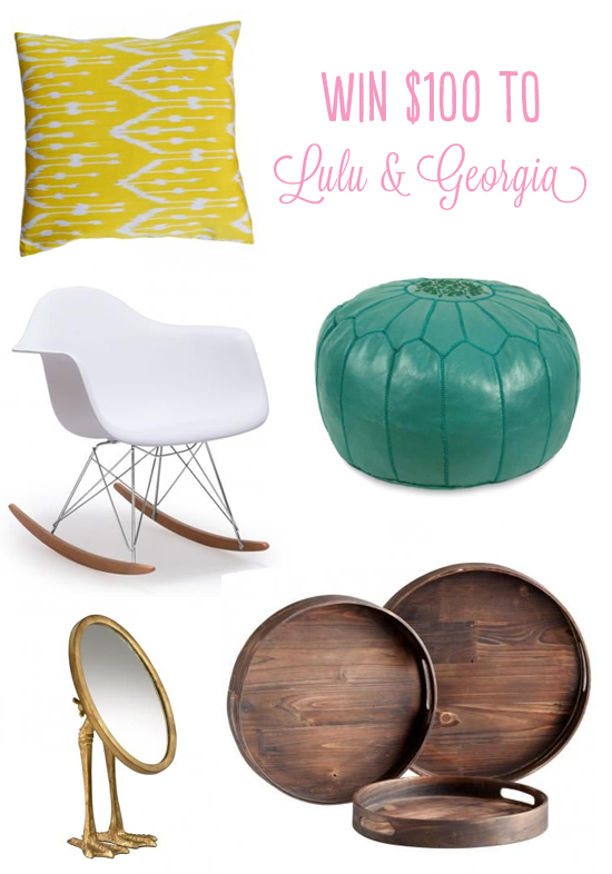
1. Kamile pillow / 2. Lullaby Rocking Chair / 3. Kenza Moroccan Pouf / 4. Webbed Mirror / 5. Sade round wood trays (these would be perfect on top of a pouf so you can set drinks and food on it!)
SO, you want to win that $100? Of course you do! Enter using the Rafflecopter below. Good luck, and happy shopping!
This post was written in partnership with Lulu & Georgia.
09
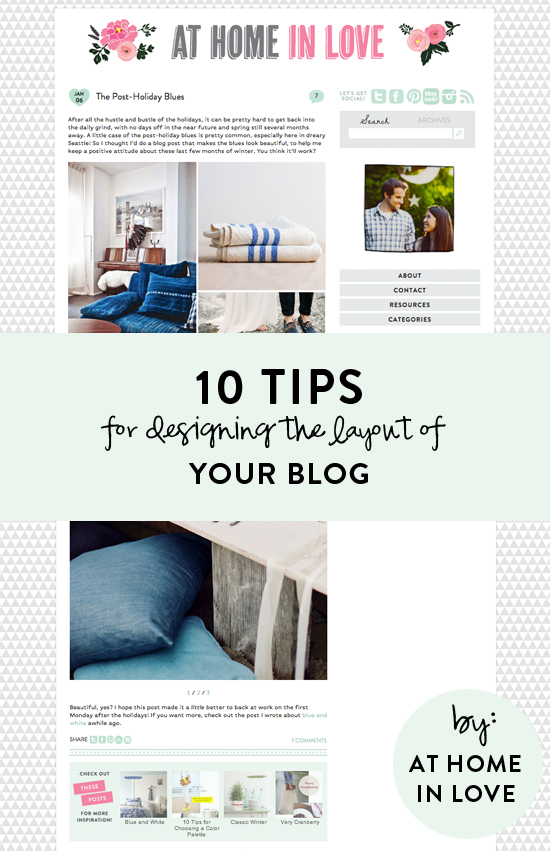
In my end of year recap, I asked for any suggestions you guys had for future posts, and one reader asked for tips about blog layouts. I thought that was a great idea! I actually get asked about how I designed my blog a lot, and although I don’t consider myself an expert on the topic by any means, I’m happy to share what I do know. I thought I'd start with 10 tips for designing a blog in general. I approached this as if I was giving advice to someone who was just starting their blog, but if you already have one, I think these tips could still help you to update it and make it even better. I want to do another post in the future about layouts for post content (like moodboards, adding type to photos, etc.) so let me know if there’s anything in particular you’d like help with in that area. And remember, all these tips are my opinion and not the gospel truth, so if your blog has something that I said was a no-no but you love it, don’t feel like you have to change it just because of what I said.
1. Start with your name. If you’re just starting to brainstorm ideas for your blog, start with a catchy name that hints at the topic you’ll be blogging about. Don’t pick anything too long or too hard to spell, and most importantly, look for a name is that is unique. If you think of a name that you like, type it in on checkdomain.com to see if it’s already taken. Look for the “.com” domain name--that’s what you want. If it’s already taken, I would not recommend trying to be tricky and doing a “.org” or putting in dashes, etc. I’d keep brainstorming til you find a name--and a domain--that will be uniquely yours. When I was picking a name for At Home in Love, I tried at least 30 different ideas before I settled on At Home in Love (seriously!). I also tested out the username “athomeinlove" on Twitter, Instagram, etc. to make sure it wasn't taken. It takes some time, for sure, but it’s worth it to keep your name, social media channels, and blog url simple and consistent.
2. Keep your background simple and uncluttered. You don’t want your blog’s background to be competing with your content, or distracting from it. When in doubt, a simple white background looks clean and pretty. Both The Daybook and Kelli Murray have simple white backgrounds, and they’re anything but boring! You can also do a background with a repeating pattern, like I have…but I’d keep the pattern and the color fairly simple and neutral. Anything too eye-catching or colorful might clash with your blog posts!
3. Use only a few fonts, and use them consistently. This is one of the biggest things that makes a blog design look really unprofessional, in my opinion: when there are about 10 different fonts just on the main landing page! Instead, I’d pick two or three fonts that you like and stick with those for your blog design.
4. Use simple fonts. Speaking of fonts, pick simple, easy to read fonts for your blog design. You might love fancy scripts or fonts that look handwritten, but if you try to use them in your body text, I guarantee you it will be really hard to read and you'll drive readers away. Nobody has time to try to decipher an entire paragraph. Even if you want to use a fancy font for the titles of your blog posts or in your sidebar, I'd caution you to pick a fairly simple one. Save the ones with lots of loops and flourishes for adding some short text to photos within your posts, or maybe to your header. For your body text, I'd recommend a sans serif (one that doesn’t have little lines at the end of each stroke). I have heard they're easier to read on screen than serif fonts. You can search for free fonts to use in your blog design at Google fonts. If you select the “paragraph” tab at the top, you can really tell a difference between different fonts’ readability. You can filter your options by serif, sans serif, display, and handwriting (in the drop down on the left).
5. Limit the number of colors you use. I keep mentioning simplicity, because it’s true--the simpler your blog layout is, the more the content of your posts will shine. That being said, you don’t have to keep your blog all white, black and gray. Just limit the number of colors you use to two or three (neutrals and white don’t count). For my blog, I picked pink and mint green because they are two of my favorite colors. I use those same two colors (and light gray) throughout the whole blog design. I do sometimes use different shades of pink and darker shades of green, but I always keep them in the same “family” so it looks consistent. Some great places to use color are in your social media icons, your header, and any place that you want to call attention to something. I would not recommend doing pink text on a black background or anything like that…I think white with black text looks the best and is easiest on the eyes. But it is good for links to be in a color so they’re easily distinguishable!
6. Size your photos to the full width of your blog posts. For example, the width of my posts is 550, so I size all photos to 550 pixels wide. It's really distracting to the eye if your photos are all different sizes. When they all line up with your text, it's a nice, clean line! If I find a photo I really want to use that is smaller than 550 pixels wide, I will mix it with other photos in a collage. Sometimes, if it's really close to 550 I'll just increase it's size, but if you try to stretch a photo that was 400 pixels wide to 550, it will be really blurry...which is worse.
7. Include a photo of yourself somewhere. I think it's human nature to want to see who it is behind the blog--I always look for an about page when I stumble across a blog I like! A lot of bloggers include a photo of themselves in the sidebar, which I really like, but at least make sure that you have an about page with a photo of yourself there. If you're hesitant to show your face, you could always do a fun illustration of yourself like this, or a photo where your face isn't showing. For instance, if you're a florist, you could do a photo of you in action like this or a photo of you holding a container of flowers like this!
8. Make sure your social media icons are easy to find. You'll definitely want readers to follow you on social media, so make it easy on them by putting icons that link to your different channels on the homepage--and preferably near the top. You don’t have to use little icons like the ones I have, but they’re very recognizable and don’t take up much space, so I think they’re nice. If you google “social media icons” or search for them on Pinterest, you can find a lot of cute options, many of them for free!
9. Make it easy to navigate your blog and find your content. At the basic level, you’ll need categories and a search bar so readers can easily find the content they’re interested in. Nobody should have to click “older” over and over again if they already know what it is they’re looking for. I also think archives are nice, especially when I come across a great blog that I’ve never heard of before and I want to see what they posted a year ago stalk them from the very beginning. Or if I’m looking for content that’s specific to a season or holiday, I can look for what was posted in Decembers past, etc. I also like features that suggest related posts with thumbnails (a free version of this is Linkwithin). A “scroll to top” button is also really nice, especially when I’m reading blogs on my phone. And “pin it” buttons on each photo are great, because they make it super easy to pin content from any computer. Basically, anything you can do to make it easier for your readers to find your content and keep clicking around on your site is awesome. Whatever you’ve noticed that you like on other blogs, see if you can find a way to implement that or something similar.
10. Extend your brand beyond the blog. After you’ve spent all this time choosing a color scheme, designing a pretty header, and selecting fonts, make the most of it by branding everything you can! All your social media outlets, your business cards, and even your email signature should have your “look” applied to them. Use the same photos, the same colors, the same fonts, etc. so they are easily recognizable as yours.
Whew, that was a lot of text and not a lot of photos! Sorry about that, but I just couldn’t figure out which photos to use for each point without it looking super repetitive. Tomorrow’s post will have lots of eye candy, I promise :)
I hope this post was helpful to you! Feel free to comment with your questions if there’s anything you’re wondering about that I didn’t address. I’ll do my best to answer them!
02
So, did you make New Year's resolutions? If so, I bet at least one of them involved saving money, right? Let's be honest...even if you're not a resolutions type of girl, just about everyone could benefit from a tighter budget after the holidays. Ben and I have a lot of things we're trying to save for this year, so we've already tightened our budget belt several notches (I wrote a post about it here). It's been good, and we're feeling really proud of ourselves--but still. Being on a restricted budget can be reaaaallly hard. So sometimes, little inexpensive treats can help you stay on track without totally crushing your soul. Here are some little luxuries that I love--they're all under $10!
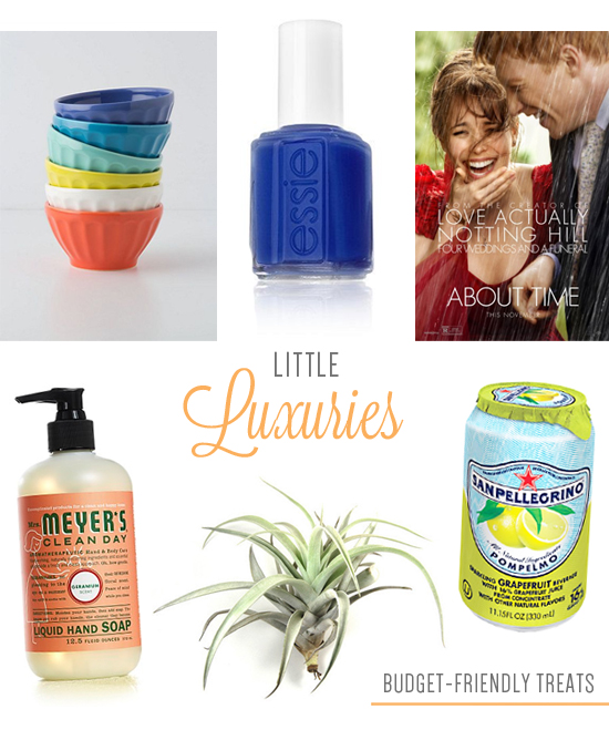
1. Latte bowls - I love these colorful bowls--and they’re only $5 each, which is not bad at all (I buy them individually in the store). We have a few colors, and I eat my cereal in them just about every morning--starts my day off pretty! / 2. Good nail polish. I used to always buy cheap $3 nail polish, and then get annoyed at how runny/clumpy it was. I finally started buying good nail polish (Essie and OPI are the two brands I buy now--both are still under $10). Painting my nails is sooo much more frustration-free! Totally worth it. And a new polish color can really put a spring in my step, even if I can’t afford to buy a whole new outfit. / 3. A movie from Redbox. Can’t beat a $1.50 date night! We recently saw The Internship, which we thought was funny, and Wolverine. The next one I’m really looking forward to is About Time (I love Rachel McAdams). / 4. Mrs. Meyer's Hand Soap - At $3.99, these are totally worth it to me! The labels are so pretty and well designed--and after I wash my hands, I find myself coming up with excuses to sniff my fingers (ha! anyone else?). Seriously--they all smell sooo good. / 5. Air plants. I really like having fresh flowers or plants in the house, but that’s kind of hard in the winter if you have a black thumb like me. I’ve been wanting to get an air plant for awhile (I posted about them here) and my friend Renae reassured me that they are really, reeeeaaaaally easy to keep alive. So I think I’ll take the plunge. After all, they’re not that expensive, especially compared to getting fresh flowers every week--these Harrisii ones are cute and only $6.50. / 6. San Pellegrino - There’s something about that foil top that makes these seem fancy to me…if you can call a canned beverage fancy. Grapefruit is my favorite flavor, but blood orange is a close second.
And of course, there’s something to be said for the simple pleasures that are absolutely free--hot towels fresh out of the dryer, climbing into a bed with clean sheets, convincing your husband to give you a back rub……you know.
What little inexpensive (or free) things do you treat yourself with?
- Search
- Archives