27
This post is written in partnership with Dynamic Rugs. All opinions are my own.
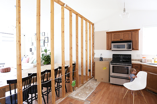
Our current living room is a fairly large space. If we place furniture around the edges of the room, you can't have a conversation without raising your voice to be heard. So I knew right away that it would make sense to break the room up into zones. Eventually, we're planning to have the living room in the front by the windows, and the dining room in the back. But we won't move the dining table until we remodel the kitchen and that's still several months down the road. So I've been struggling with what to do in the meantime (this is why I haven't hung up any art yet). I hate having this in-between, unfinished state, but I also didn't want to hang a big gallery wall for a temporary setup. Finally, I decided to try arranging the living room how I actually want it to be, so I can start working on furniture and decor for at least that "zone." It's a lot easier for me to figure out what to do when I can physically see the room coming together, instead of trying to imagine how it will all work in the future. For now, I'm planning to make the back half of the room a play area, until we're ready to turn it into the dining room.
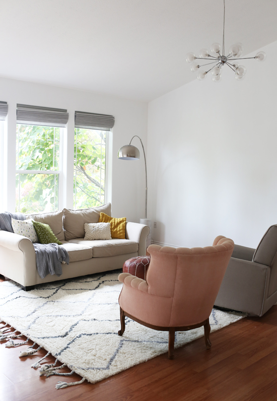
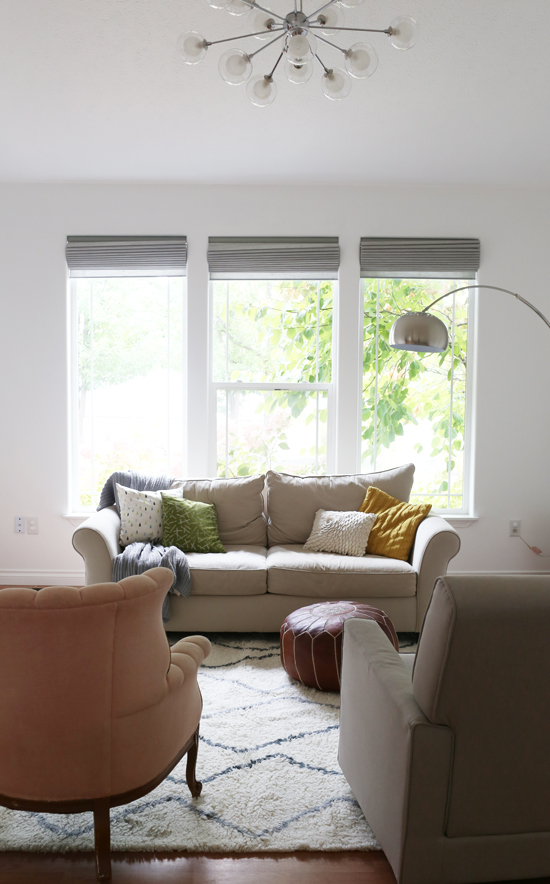
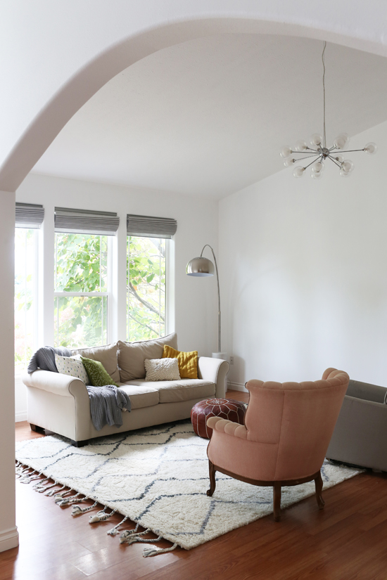
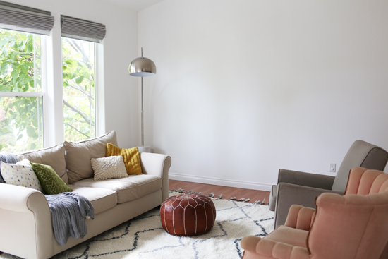
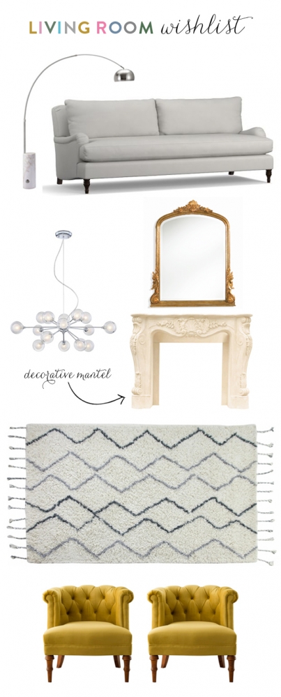
For the living room "zone", we put the sofa in front of the windows with two armchairs facing it. I'm generally not a huge fan of putting furniture in front of windows, but in this case I think it works since the sofa is fairly low so it doesn't block too much light. My dream is to eventually upgrade to an English roll arm sofa with a pair of matching armchairs...but for now, our old sofa and these mismatched chairs work as place holders! The arrangement is a lot more cozy and conversational now...definitely better than the old arrangement we had.
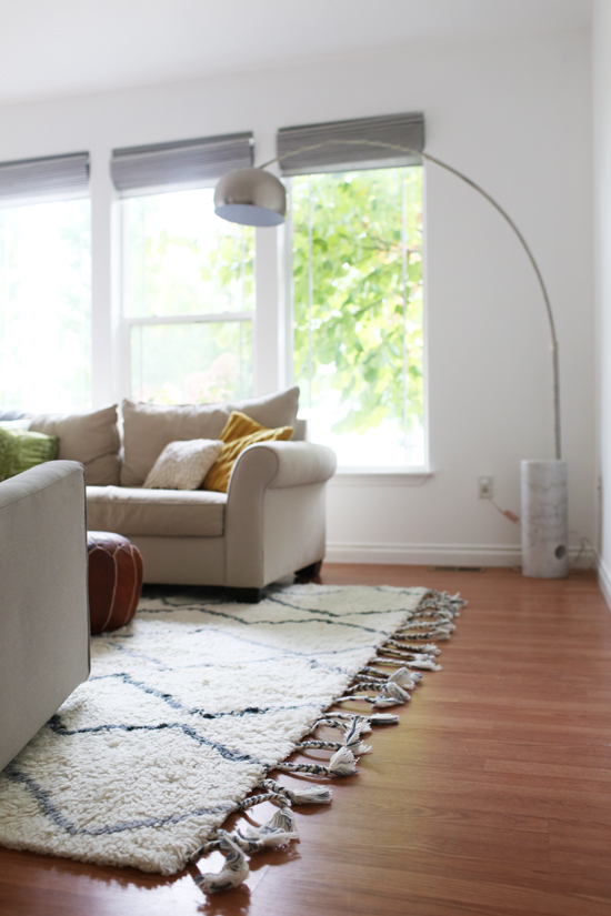
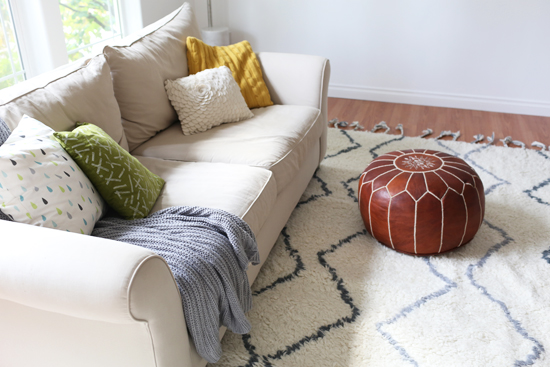
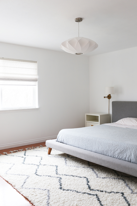
Besides the new arrangement, we also got a cozy new rug from Dynamic Rugs. It's the "Metro" rug, available from various retailers here. I really love it! It's soft and plush and 100% wool--perfect for fall. We've had similar rugs previously, and we keep coming back to this style. The neutral colors and simple pattern go well with anything, and the thick pile feels so good underfoot. The braided tassels are a cute touch, too.
We also put new Roman shades up, and they are prettyyy. I think these are my favorite window treatments we've ever had. We're still planning to hang some ivory drapes on either side as well, which I'm excited about. I'll do a post about the window treatment details when we're all done!
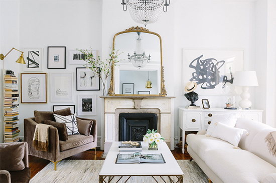
Now my next project is figuring out what to do with that big blank wall. I have two ideas. My favorite idea is to find a cool old mantel to anchor the room (I kind of miss having a mantel in the living room). Even if we don't have a real fireplace there, I think it would feel cozy and help to define the space. I love big ornate mantels like the one in this room, especially with a big gilt mirror above (Alaina's entire apartment is totally dreamy, btw, have you seen it?).
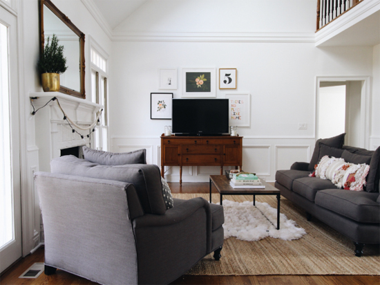
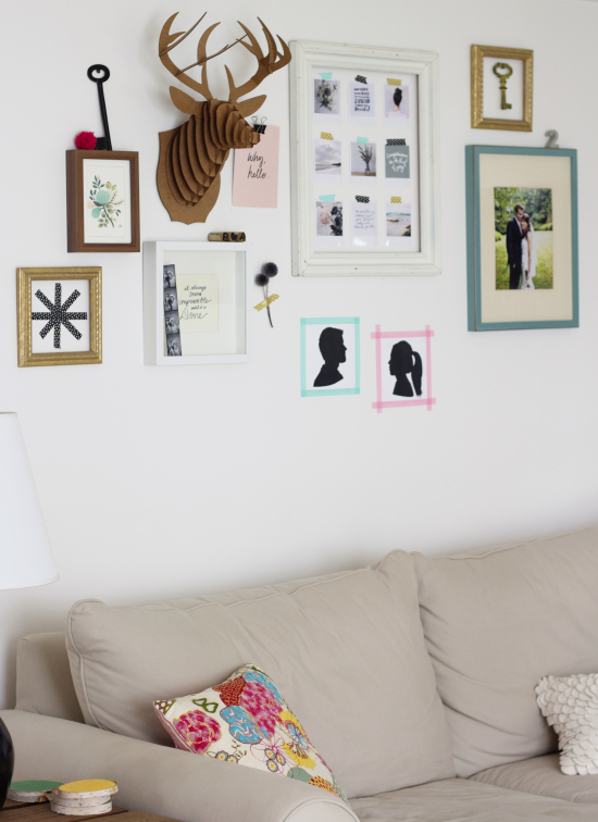
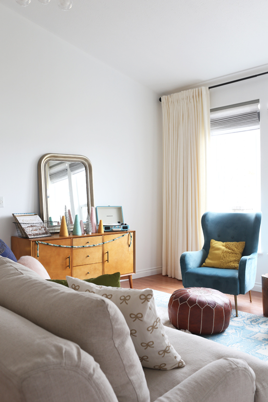
My second idea is to get a long sideboard or console table and arrange a gallery wall around it, similar to this room. Ideally it would something antique with character, because I think this room needs something old.
Living room wish list: floor lamp (already have) / sofa / chandelier (already have) / mirror / mantel / rug (already have) / armchairs
We also need a coffee table and side tables eventually, plus new plants, art and decor. I have a long wish list! It'll probably take us awhile to finish this room because duh, furniture is expensive. But the process is part of the fun.
What do you think I should do with the blank wall? Mantel & mirror, or sideboard & gallery wall? Or do you have another idea entirely??

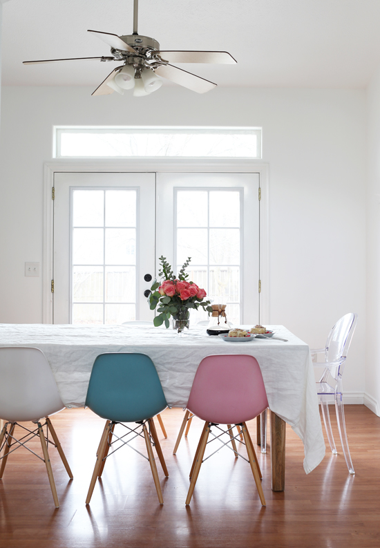

Where did you get the pink chair?
It was a vintage find...sorry I can't direct you to a link!