14
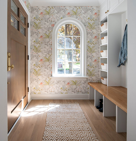
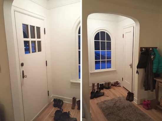
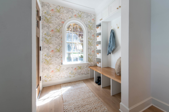
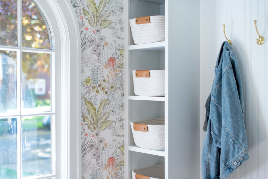
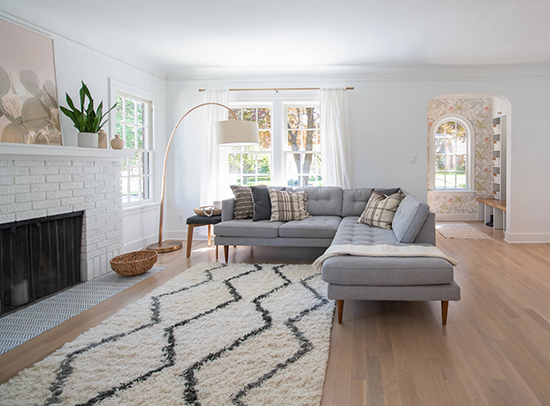
Happy Friday! This beautifully remodeled house is by Spokane interior designer Shaleesa Mize of Little Pacific Design. Shaleesa is so talented and has a great ability to blend trends with traditional elements for a look that is current and fresh, yet classic and timeless. I featured this house yesterday on @insidespokane but I love it so much, I couldn't resist sharing here too. It's a 1936 house that started with a dark, closed-off kitchen which didn't fit the family's aesthetic--and didn't allow them to keep an eye on their young kids while cooking. Shaleesa headed up the full gut renovation of the kitchen, which involved knocking down a wall to open up the kitchen to the rest of the house. She also updated the front entry, which went from a closed in closet to a bench with a more functional storage solution. I also love the wallpaper she added...it makes for such a cheery "welcome!" Photos are by Kayleen Michelle. Hope you enjoy!
Here's what the entry looked like before.
Annnnd after--so cute.
Shaleesa also styled the house with decor from her new shop, Pacific Design Co. which she launched this year. It features a high quality selection of products including pillows, art, and tabletop accessories in a modern, natural aesthetic. Shaleesa curated and carefully selected pieces that are handmade, sustainable, organic, and local or fair trade. It's all online, so everything is shoppable whether you're a Spokane local or not!
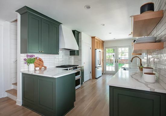
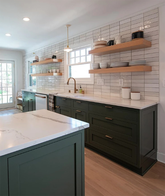
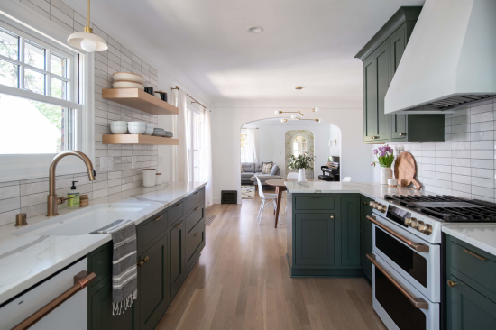
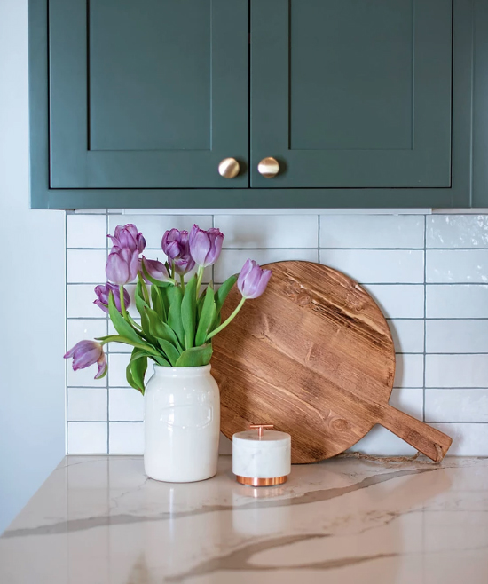
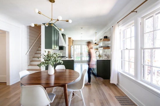
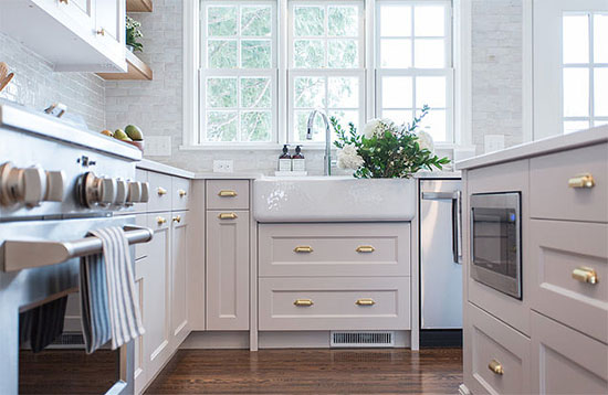
Ok, and that kitchen! HEART EYES. It's hard to pick favorites when the whole thing is this good, but I really love that they went green with the cabinets. Yes it IS kind of trendy right now...but in this perfect muted shade, mixed with wood cabinetry and balanced by neutral tile, I think it'll stand the test of time. Plus, the owners loved this color, which is really all that matters.
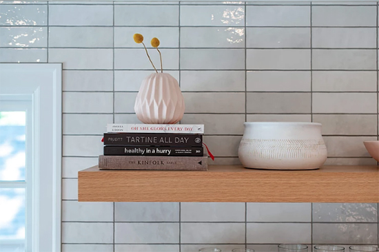
My other favorite part? The tile backsplash! I love that it's simple and understated like classic subway tile, but has variations in texture and tone that give it a lot more character. The stacked installation is also more unexpected, adding a little modern edge to the room.
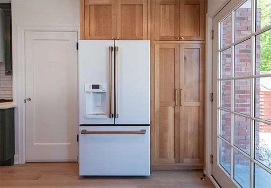
Ok, and one more favorite detail. The appliances! Have you seen these yet? They're the Café line and I keep seeing them in the kitchen remodels of bloggers and designers I follow. They're gorgeous, aren't they?? Love the matte white with brass handles as a beautiful alternative to stainless steel. Who knew white fridges would ever come back as the cool new kid?
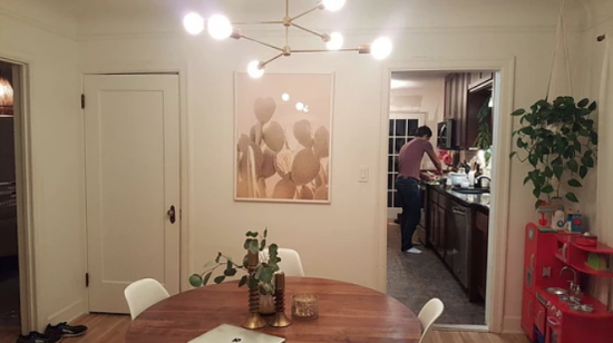
Because before & afters are always so fun, let's end with a before of the kitchen...
...and the after. Ahhh, so much more open and bright!
If you want to see more, check out Shaleesa's reveal and my interview with her on Inside Spokane.
Have a great Father's Day weekend!!!



Thank you so much for sharing here, too! It's always fun to hear other people's perspectives on the renovations that were done. So happy it was inspiring and eye-catching to you!
For sure! I love seeing your work and it is ALWAYS inspiring. But this home was particularly my style. :) Loved everything about this renovation!