19
I've had this post in my drafts for weeks! Finally hitting publish even though my writing isn't quite ready, because it's been too long since my last blog post, and these photos speak for themselves anyways! :) I found the mother-daughter design team Rehabitat through Instagram, and they are one of my favorite accounts to follow. Their interiors are consistently SO inspiring to me, perfectly toeing the line between modern and traditional. I used to looove antiquing and finding pieces with a worn-in vintage aesthetic--you know, furniture with chippy paint and old steamer trunks and floral paintings in brass frames. As trends have changed, I've also been drawn to the more modern/Scandinavian look that's gotten so popular. But I still love antiques too! I struggle with mixing all these different ideas and styles together in a way that looks purposeful, not scattered. Well, Rehabitat does it so well. Maybe it's because they're from two different generations, or maybe they just have that magic touch, but they seem to effortlessly blend traditional design with clean modern lines, in a way that looks warm, inviting, layered, and totally meant to be. I find myself "saving" almost every photo they post on Instagram, and referring back to them when trying to find the right balance in my own home. I have a feeling you guys will love their work as well!
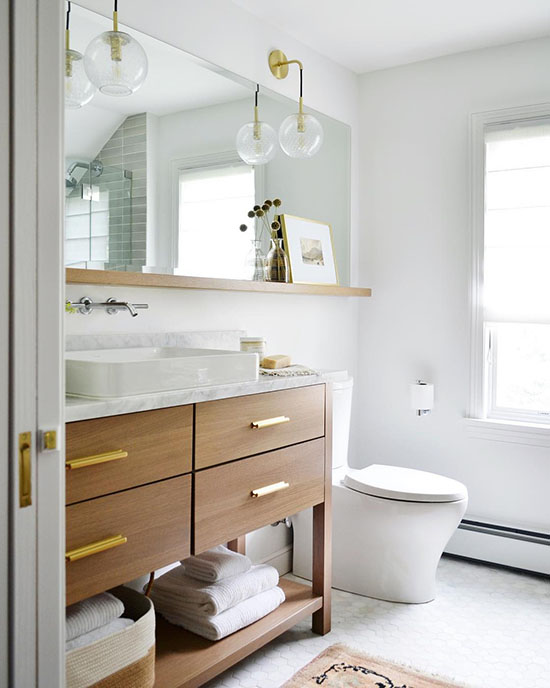
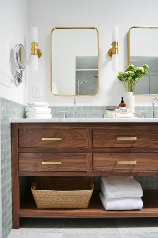
In this bathroom, I love the idea of extending the mirror past the vanity and putting a little ledge underneath it. I'm also a big fan of the mixed metals, the hanging sconces, and the vessel sink + wall mounted faucet situation.
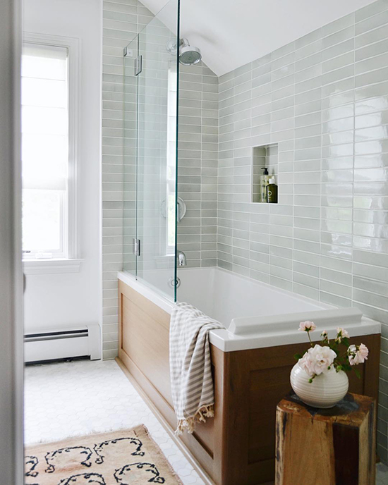
In the same bathroom (from a different view), I looove the glossy grey tile, laid in a modern stack and paired with the wood tub surround. It looks fresh and current, but timeless too.
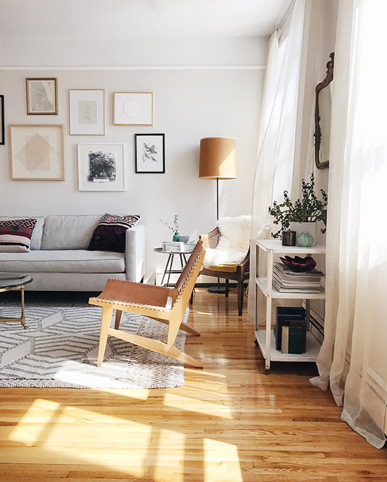
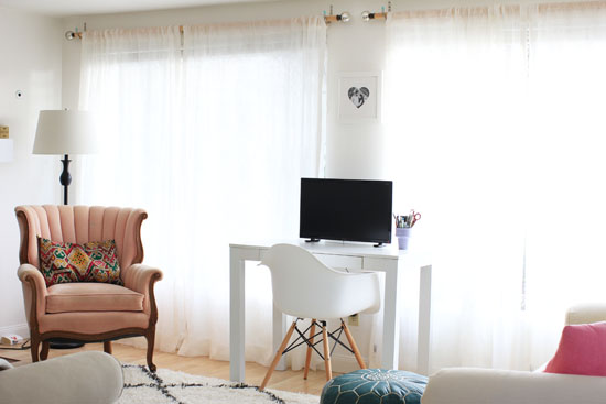
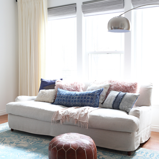
This living room is perfect to me. It looks homey, welcoming, comfortable, and relaxed--just the way a living room should be. Yet at the same time, it's so stylish and interesting, with lots of details that make you want to take a closer look. Cool people live here--but the kind of approachable, normal-cool people that I could be friends with. You know what I mean, right?
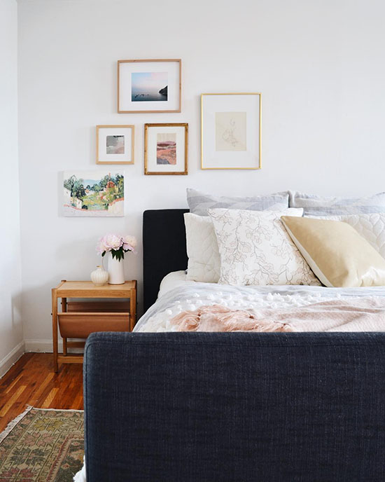
This bedroom is also one of my favorites. The perfect little gallery wall off to the side (they are the queens of gallery walls!), the vintage rug, the layered bedding. I would happily sleep there, please and thank you.
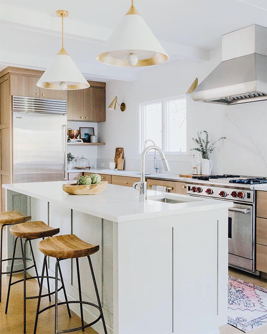
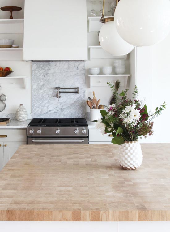
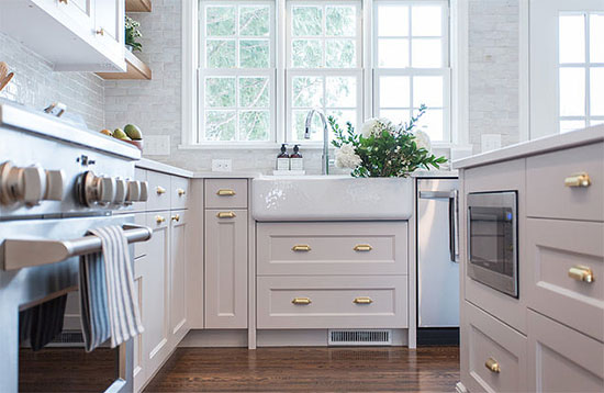
Beautiful, right?! A few things I've noticed they use consistently: white wall paint, warm natural wood, mixed metals, and soft colors, which allow them to layer lots of different elements and styles without it seeming hectic and overwhelming.
Which room is your favorite? Any details you notice?
All photos via Rehabitat, an NYC-based interior design team.


I'M IN LOVE AND I DON'T CARE WHO KNOWS IT!
Could you please tell me where the glossy grey tiles in the bathroom came from?
Gilly
I don't actually know, sorry! I think they look similar to this tile by Bedrosians, but I don't think they're exactly the same. Very pretty tile...I hope you track down the right one! https://www.bedrosians.com/en/product/detail/cloe-tile/?itemNo=DECCLOGRE28G
What is the wood of the first vanity? Adler?