23
Trends are a funny thing. They go in cycles, and what was super uncool starts to look fresh and new again. It's true in homes as well as in fashion. The 4" backsplash used to be standard in homes, then designers started doing full tile backsplashes, and the 4" standard started looking outdated. But a full wall of tile has been "in" for awhile now, and short backsplashes are making a comeback. As someone who's planning a budget-friendly kitchen remodel, I'm glad to see this trend circling back around! After all, a full wall of tile that goes all the way to the ceiling is a LOT of tile, plus there's the labor and time to install it. And let's be honest, no one is actually splashing water and spaghetti sauce wayyy up there. See what you think about a simpler, shorter backsplash in the kitchen. Are you on board with this look? I've mostly been seeing slab backsplashes made of the same material as the counter, sometimes 4", sometimes a bit taller. Usually, there's a larger backsplash behind the range, where you need your walls to be more protected from grease and food. I've also seen a couple rows of tile instead of a full wall. It's budget-friendly for sure, and it also has a nice, simple, minimal aesthetic.
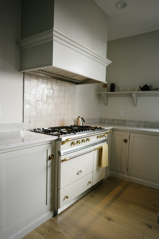
I started thinking about short backsplashes after I posted this house tour on Inside Spokane. It's a stunning, custom-designed house, and the kitchen includes upgrades like a gorgeous French range and marble counters. I don't think they chose this backsplash out of budget constraints--I think they just loved the clean and simple look.
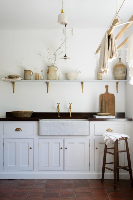
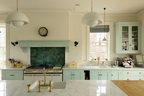
Here's a gorgeous kitchen from Devol. I've seen quite a few short backplashes in their portfolio, so maybe they're responsible for making the 4" backsplash cool again?
Love it paired with a statement backsplash behind the stove (also via Devol). One thing I like about the short backsplash is that it looks consistent and uniform even when you have windows, shelves, and cabinets at all different heights.
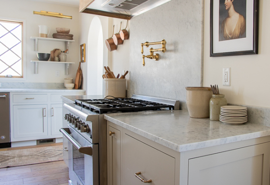
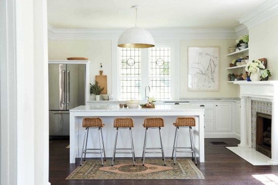
Here's another lovely kitchen, via Seeking Lavender Lane. The marble slab is larger behind the stove, which is both practical and beautiful. The kitchen has a very serene and old-world feel to it.
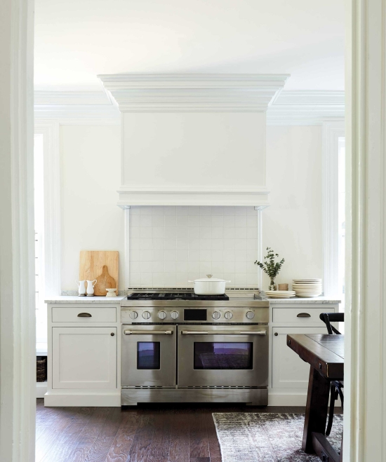
This kitchen design is by Leanne Ford, via Emily Henderson. Same kitchen below, so you can see how the short splash ties in with the stove.
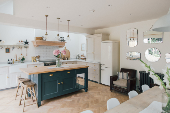
And another DREAMY kitchen with an island that's the perfect shade of blue. I really love this one, via Rock My Style.
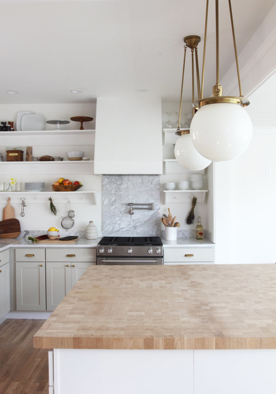
And if you're not convinced yet, here's one more beautiful kitchen by The Grit & Polish. I love those pendant lights too!
Overall, I think this looks better when the backsplash matches the counter for a seamless look, but it can be done with tile too. Here's a good example with two rows of subway tile, via Glitter Guide.
What do you think? Do these backsplashes look cheap, or is this one of those amazing things that saves money AND looks high-end? I'm hoping the latter.
Another benefit in my case, is that a short 4" backsplash would be below our windows. Since our windows aren't trimmed out on the sides, I've always thought a full wall of tile would look funny against them. See what I mean? We have a short tiled backsplash in our kitchen right now, so a 4" or 6" slab would cover that space perfectly. When we upgrade to quartz counters, I'm thinking this might be the way to go!


We just remodeled our kitchen and did a backsplash to the bottom of the upper cabinets. We had a short backsplash for years and I hated it. It's too short for handling water splashes, grease splatters, etc. I will never go back.
A backsplash to the bottom of the upper cabinets does make the most sense! It's a natural place for the tile to end, and it fully covers the space where splashes will actually occur. Good to know that you hated the short backsplash!
Thank you for sharing these lovely examples! And, if one changes one's mind it's not too difficult to run the backsplash all the way up at a later date.
Thank you for this post! I saw a designer on Youtube mention this was a trend and was looking for more examples. She also said people are putting ledges just on top of the short backsplash where you can put decor, spice rack, etc. I forget her name. I am happy to see this post. I am trying to update my kitchen on a very limited budget. It already has the short backsplash. Thinking of leaving it and adding a ledge made of wood and possibly some zelige tile behind the stove. Thanks for the post!
Hi, I am a kitchen designer in Xenia, OH (near Dayton). I can't remember when I first learned about "short splashes" but I love the concept and recommend them to clients. It's more sleek and streamlined than the old 4" style. Also works well if you want to do another material on the wall, for instance beadboard, pressed tin....etc. Thanks for posting this blog that I can show my customers!...."Yes, this is a real thing!" Thanks, Kelly
Thank you for this 2019 blog article on short splashes. Not sure if you see new comments years later, but I'm curious what your thought is on a simple, white (matched to cabients) subway tile installed above a 5.5" soapstone short back splash? I've seen it done that way, with wood paneling, or just with drywall as in your images. My cooktop will have a full height of soapstone to the vent hood, but I'm not sure what to do about the other areas. I've seen it done all of the ways I mentioned. Decided as much as I like the "English"-looking wood v-groove, the rest of my walls are not paneled, so I think it'll look out of place. Tile or no tile with short splash in a small kitchen? Thank you.