17
Ok, now that the cat's out of the bag, let's talk about nurseries!!! Once we found out I was pregnant, one of the first things I got excited about was decorating the nursery (besides actually meeting our baby, duh). No surprise there, right? I've always loved nurseries and have been filing away ideas on Pinterest for years. I've noticed that there are two types of nurseries I'm really drawn to--calm, neutral nurseries with soft and muted colors, and bright, cheerful ones full of color and pattern. Obviously, the two are at opposite ends of the spectrum, so I thought I'd put together some inspiration photos to help me visualize.
The Neutral Nursery
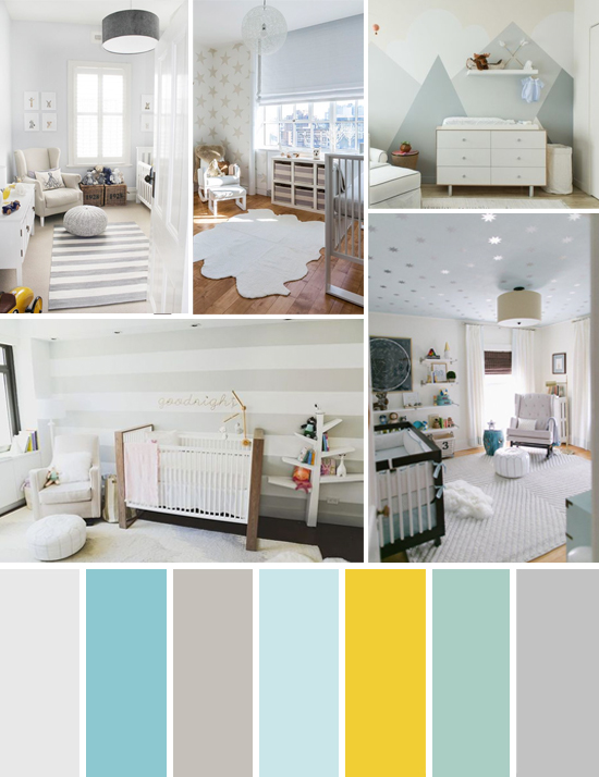
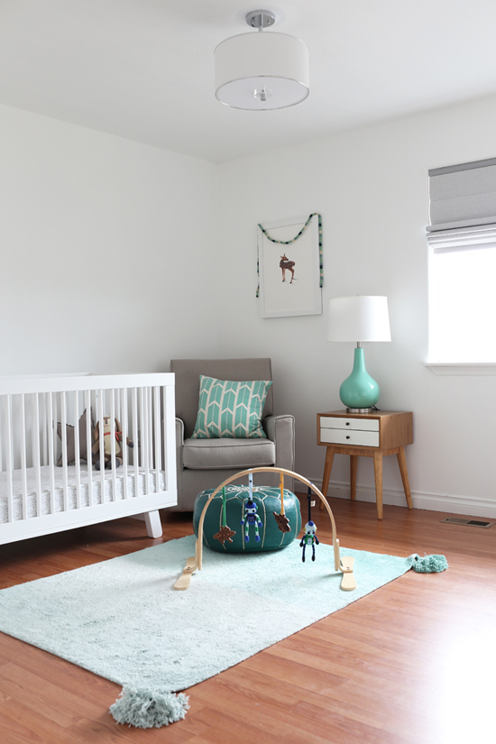
Let's start with neutral nurseries. These have gotten popular over the last few years, and seem to go hand-in-hand with the Scandinavian design trend that is very prevalent now. I like the way they look--very soothing and restful. But I've read that babies need color for stimulation and development. I think the solution there would be to add some color with accessories, but keep the big pieces neutral--which is probably what I'd do if I went this route, anyways. Here are some beautiful examples of what I'm talking about!
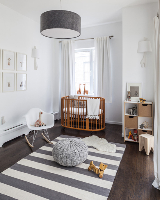
This room is lovely, although it's grey and white color palette is a little too restrained for me. I love the animal theme, though! I've noticed those Sharon Montrose animal prints in a lot of nurseries--they're darling.
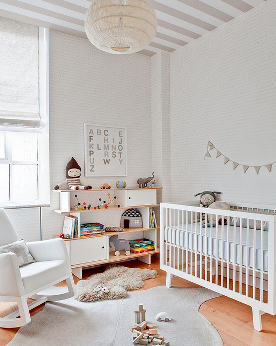
One reason for a neutral nursery might be if you're waiting to find out the gender, or don't want your room to be too gender-specific. This room could totally work for either a boy or a girl.
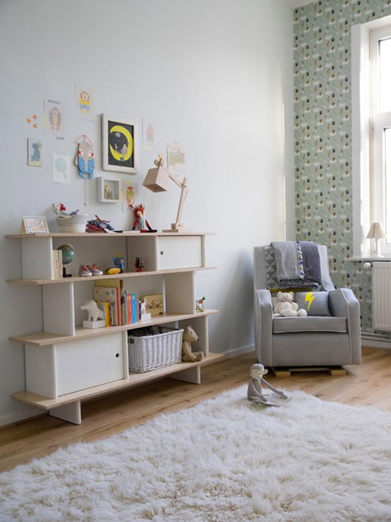
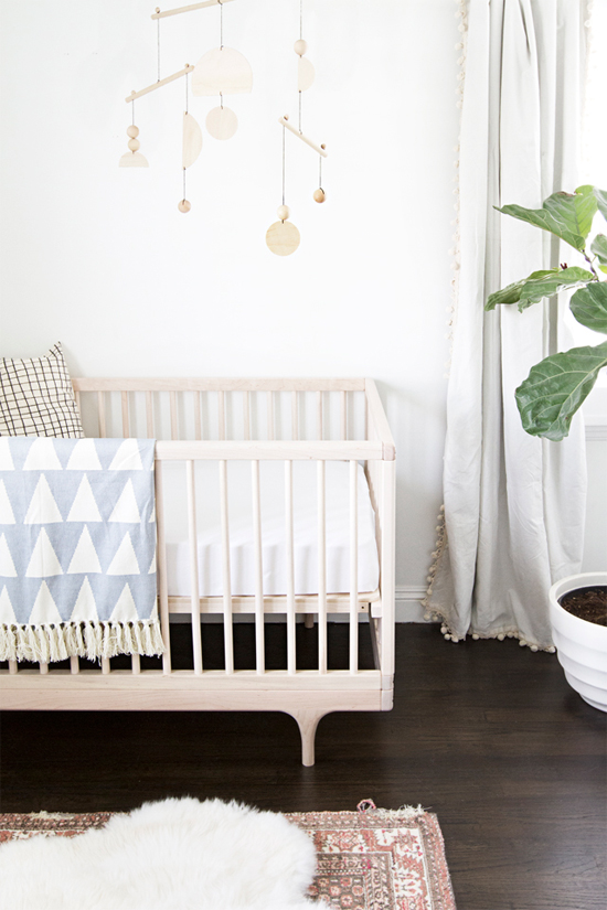
Another nice thing about neutrals is that they're usually more versatile, so they'll continue to feel age-appropriate as your baby gets older. You could also repurpose nursery decor in other rooms of the house without it feeling too babyish. I could easily see that rug, throw blanket, pillow, and drapes in a living room.
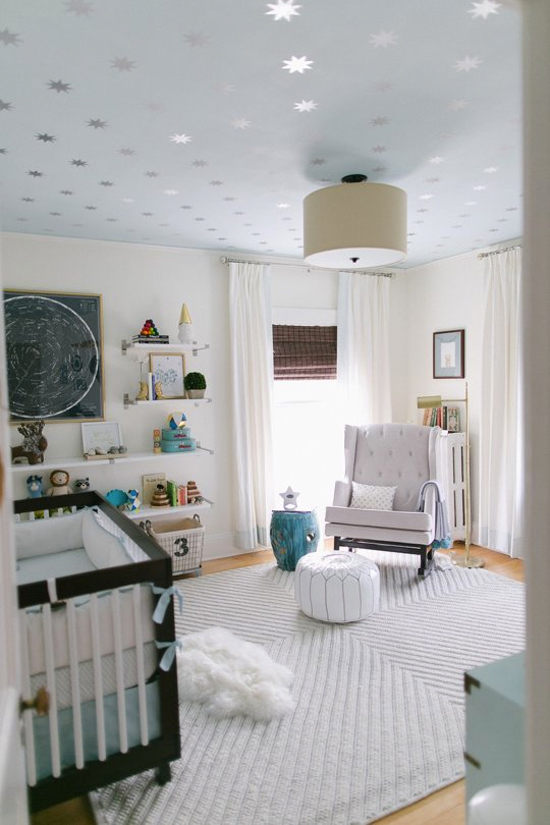
Last but not least, I love this room! It feels like you're floating on a cloud. The addition of pale blue and aqua makes it more interesting, without taking away from the soft, serene vibe.
The Colorful Nursery
As much as I like how a neutral nursery looks, there's something to be said for a nursery that's fun and bold and full of happy colors. After all, if there's ever a place to try out some whimsical colors and designs, it's in a kid's room, right?? As with any room, too many bold colors and patterns would get overwhelming...so I'd make sure to mix in some neutrals to give the eye a break. Here are some of my favorite examples of cheerful, colorful nurseries.
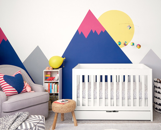
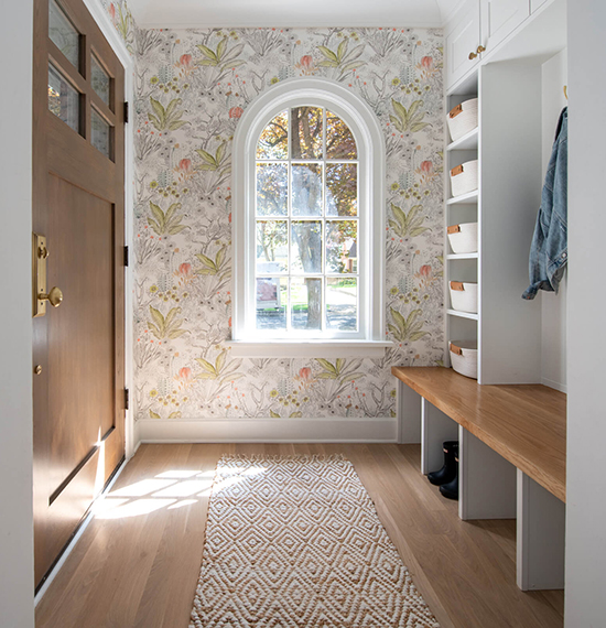
Nurseries are the perfect place to do something creative on the wall, like these painted mountains or the whimsical animal wallpaper below. If we stay in our rental, I'll probably keep the walls white or do removable decals, but if we buy a house I'd love to try something fun like this! I've always wanted to do a bold accent wall, but it never felt right for a living room or dining room.
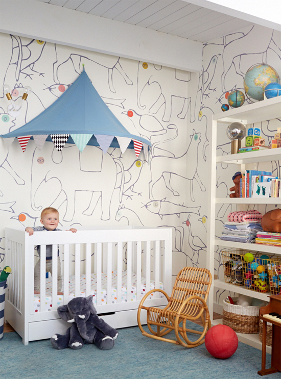
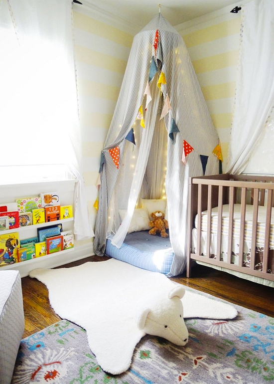
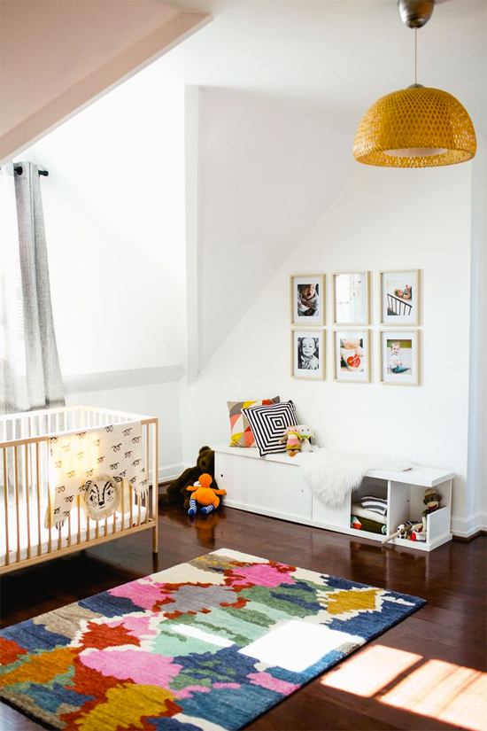
Colorful rooms can still be gender-neutral too! I love the examples above and below--I think they'd be great for a boy or a girl (or a shared space).
What do you prefer? Mostly neutral or mostly colorful?

I think a few years ago I would have gone neutral, but I'm really loving the pops of color!
Lovely lovely rooms. I've just settled in my heart for me who loves the photo's of all white...calm neutral, The Scandinavian part of me, what I always love to LIVE in is full of color. (although it's thought out color and sometimes a bit monochromatic.) I told Jim I would love white. He reminded me our second home was painted all white, pure white with loads of windows. I kept telling him I felt so cold there. SO a bit of lovely green tea paint and I was warm again :). Anything you choose to do will be lovely AND it can be adjusted as time goes on.
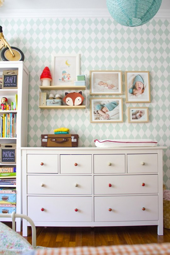
PS my favorite is photo 6...the mint green patterned wall with those lovely photo's and that cute round green lampshade. :)
I love that mint green wall too!!!
I really like both options. We just did our little ones room nuetral. 2 reasons, 1 we didn't know the sex, and 2 we just moved into our new house and I didn't feel like trying to decorate too quickly. I like to enjoy it more and make it special. Anyway I have a picture of the nursery on my Instagram account if you want to see. J_spa84. It came out really sweet. But now that we had a girl I think I would like to add in some color. I'm thinking very pale pink walls and maybe big bold flower curtains, chandelier. Just super pretty and feminine. I also really love white walls. So you could easily do white walls for a more nuetral look and add in pops of color and if it feels like too much take out the color. But I agree about the whimsy. It's a great place to do bold fun wallpaper. I guess it also depends on if u will buy a house sooner or later, and what you'll need to do to return it to your landlord.
Ok, I just checked out your nursery and it is SO CUTE!!! I love the sweet and subtle polka dots on the wall. I can definitely see it with some girly touches added in, as well! Darling. And yeah, I wish I could KNOW how long it will take us to find a house. I'm an optimistic person, so I'm thinking that it's not worth messing with the walls here...we'll see.
Love these! The crib in the first photo is stunning. It's weird for me to shop for cribs before I'm even preg... right? Love the animal theme too!
NOT WEIRD. Or if it is, I'm totally weird too because I already had a bunch of stuff picked out before I got pregnant! And agreed, that first crib is super beautiful and unique.
i love the moutain backdrop. I NEED DAT.
It's awesome, right?!
also the rug on the last pictures is awesome.