25
Do you guys remember the post I did back in May about a gorgeous bedroom makeover with Decorist? I seriously loved those before and after photos (such a big difference!), so when Decorist offered to let me try out their services myself, I wasted no time in saying “YES!" I’ve been procrastinating/struggling with our bedroom, so that’s the room I picked to get some help with. I just got my two design solutions back, and I wanted to share my experience with you and get your opinions on what I should actually implement. Oh, and if you have a room that you could use some help with, be sure to read through to the bottom of the post; Decorist is giving away a mini-makeover to one of you…woohoo!
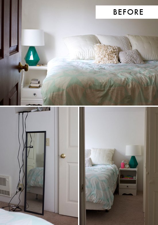
So, here’s how the process worked. Once I’d signed up for my mini makeover, I filled out a short questionnaire about our style, colors we liked, what we wanted to keep from the current room, and what we were hoping to achieve. I also sent over dimensions and some “before” photos of the room itself (above). Here is what I said: Our bedroom is 12 ft x 12 ft. It only has one small window so it’s fairly dark, and I don’t like the beige carpet (but it’s a rental, so that can’t be changed). Overall, I feel our bedroom is plain and boring, because we really haven’t taken the time or money to do anything with it. There’s nothing on the walls, no bed frame, etc. so it feels pretty unfinished. The area where I get ready in the mornings is really ghetto. I just sit on the floor in front of a $5 floor mirror from Ikea. I’d like to have this area be more organized with maybe some lidded baskets or a dressing table/side table of some kind (no curling iron cords snaking up the wall!). Overall, I want the bedroom to feel more cheerful, considered, and finished.
We like our duvet cover and bedside lamps. My favorite colors are pink and mint green. His favorite color is sky blue (which I also like). I’d like to mix in some wood or natural tones with some soft pastels as well as bright and cheery colors. I want it to feel happy, but also restful. We’d love to get a headboard or bed frame (I’m partial to tufted, upholstered ones, but it doesn’t have to be), and I like midcentury style nightstands.
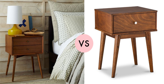
It took about two weeks from the time I submitted my information to when I got my boards back. My designer (Audrey) did a great job of finding pieces that fit my style and my budget. For example, I’d sent her this $299 West Elm nightstand as an example of what I wanted, and she found this super cute and very similar one at Target for $91.99! I also really loved some of the creative ideas she gave us, which I probably would not have thought of on my own. For example, in the first design board (below) she suggested using a Parsons desk as a dressing table on one side of the bed with a nightstand on the other side. I’ve never really considered doing mismatched nightstands, but it makes so much sense! Especially since our bedroom doesn’t have space for a lot of furniture.
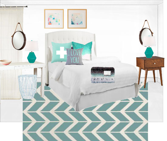
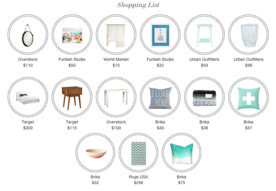
Besides the design boards, which helped to visualize what the room could look like, Audrey also provided shopping lists. Each item is clickable, so it will be really easy to shop once I'm ready to make some purchases:
Here are her notes for the first design board:
Headboard: I love your idea for a tufted upholstered headboard. This one from Target blends a tufted style with a wingback shape, and the neutral color allows your fun textiles and accessories to shine.
Vanity & Stool: No more starting your day on the floor! I’ve included a couple of console tables that can serve as nightstands on one or both sides, or they can stand alone as vanity tables. A clean white Parsons desk is a timeless and versatile piece that you can use in a variety of ways over the years. I’ve also included a stool that can double as a surface for extra books or can be used as a chair when you’re getting ready. I love that it can slide right under the console to save floor space when not in use.
Nightstands: Your nightstands could definitely be keepers, but in case you’d like additional surface area I’ve added a few more options. This mid-century piece is affordable and stylish, and it incorporates a wood tone like you’d been seeking.
Rug: When layering a rug over carpet, it’s best to pick a smaller size that provides a nice accent while not looking like shrunken carpeting. This 5x8 find has a large-scale geometric pattern that adds color to the space without feeling too busy.
Accessories: I’ve added tons of cheery accessories in your favorite colors to brighten up the space and give it life. Mirrors will reflect light around the room and be useful at the vanity area, and breezy white curtains are always in style.
And here is the second board she gave us:
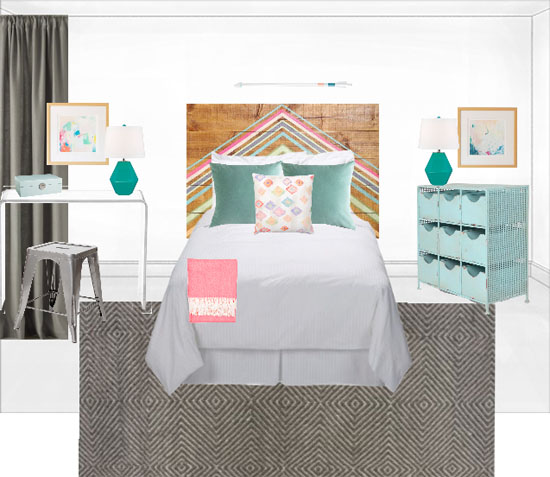
Headboard: This Urban Outfitters piece is a bit of a splurge, but it’s also quite the statement! The colors are gorgeous and the wood background adds that natural and rustic touch you’re looking for.
Vanity & Stool: An acrylic console takes up no visual weight and leaves plenty of room for baskets below. The silvery industrial stool adds a new style to the space and a nice metallic accent.
Nightstands: This blue piece is has loads of storage and brings in a happy new color.
Rug: Here we have another 5x8 option, this time in a deep gray that really grounds the space and keeps the colors from feeling overwhelming. The subtle pattern and wool texture also add interest without feeling too busy.
Accessories: Again we have colorful accessories that coordinate well with the headboard and your gorgeous prints. These gray West Elm curtains go nicely with the rug and will provide extra light filtering when you need it.
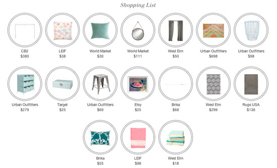
Overall, I was really happy with how the process went and with the suggestions that Audrey made. I haven’t really been using the desk we got for my “home office” (turns out, I still prefer to blog on the couch while watching Netflix…), so we already moved it into the bedroom for me to use as a dressing table. YAY! It was a simple solution that has already made a world of difference. We’re now deciding what other elements from these boards to keep, and which ones to disregard. What do you think??? Which board is your favorite, and what pieces do you like best?
One of the best things about using Decorist is that we’re still in total control of our room makeover. We’re free to mix and match elements from the two different boards, purchase them on our own timing, and add/subtract anything we want! So if we want to buy everything now and have it be done, we can do that. But if we’d prefer to spread out our purchases over the next few months, we can totally do that too. There’s no pressure to buy everything all at once.
If this process looks like something you’d like to try (and I do fully recommend it), it’s your lucky day! Decorist is giving away a room makeover to one of you!! Click here to enter the giveaway. Good luck!
AND if you’re ready to get started now, they’re offering a special promo code for At Home in Love readers: $10 off a mini-makeover using the code decoristathome.
So, you know that room that you’re always embarrassed to show people when you give them a house tour for the first time? No more excuses! Let’s get that room in shape!
Thank you to Decorist for partnering with me on this post.





I am really interested in this, but a huge element I need help with is furniture placement around the room... not just a mood board. I need to know where to put the pieces. Will that information be included? Also curious on pricing!
Hi Liz! You can read more about what the mini-makeover includes here: http://www.decorist.com/designer-services/
It costs $169!
this is awesome! will be thrilled to see what it turns out to be!
ladies in navy
Thanks, Kelsey!!
I'm secretly glad I'm not the only one without a headboard on my bed!
Hahaha, yep. We’ve been married for four years and we STILL don’t have a headboard…
So glad you got off the floor with your morning routine;)! Just keep your hair "tools" in a lidded basket that are easily pulled out and put away. She gave you some awesome ideas. I like things in both. The second more playful, the first more formal. So glad you can pick and choose and stay within budget. I love both carpets, but the second one with grounding your design I like best.
Haha, yeah it was about time. I am totally planning to get a lidded basket!
Wow, this is so great, and I really like both plans so much. The second headboard is amazing. What a statement piece! But overall, I think I actually prefer the first design, which seems a little more calm and serene. I always think that's nice in a bedroom.
Thanks for your feedback, Kerry! I’m also a little more drawn to the first board. We’re thinking of getting that headboard, but maybe in a color or grey instead of ivory.