13
I know I still haven't posted pictures of the house we bought! I'm in the process of trading in my camera, so all I have so far are some dark iPhone photos. We're currently working on painting all the common areas white, which is taking longer (and way more paint) than I thought it would. Lesson learned: if you're going white on top of a dark color...double the amount of paint that the online calculators say you're gonna need. Especially if you're hitting the ceilings too. I think this process has confirmed that we're glad we didn't get a major fixer-upper, because even painting is getting us overwhelmed, exhausted and impatient. Can we be done and move in already?!? Haha.
While I'm waiting, I've been collecting lots of inspiration. It's fun to look through my old pins with the lens of what we're actually working with, and see what could be possible in our own house. It's definitely not "there" yet, but I see the vision. All these photos are more to do with space planning, and less with the actual decor.
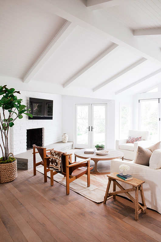
Living Room: The best thing about our living room is the tall vaulted ceiling and big windows. I think it would be cool to add some faux box beams to emphasize the ceiling, kinda like this house photographed by Jessica Comingore. But I can't decide if this is just a trend or if we'll actually like the beams long-term. Is it silly to add beams when they're not really needed for structure?
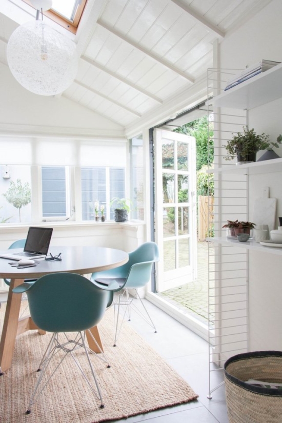
Dining Room: We currently have two possibilities for the dining room. One is a small space connected to the kitchen, more like a dining nook. It could fit a round table (similar to this space via Decor8), which would be perfect for family dinners.
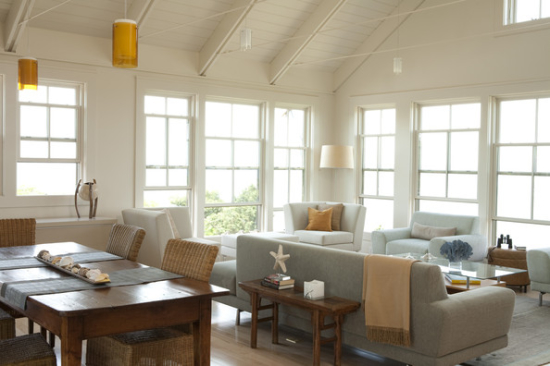
However, we already have a large rectangular dining table and I like using it for bigger dinner parties and game nights. So our other option is to put that table in the same space as the living room. We eventually want to open up the kitchen, so it will make more sense then (like a big great room), but it might be kind of weird until we do that. I'm thinking about doing both options--a small dining nook/kitchen table AND the bigger dining table for when we have people over. But I also want to eventually have a kitchen island with barstools. Is that too many eating areas???
Image via Lonny
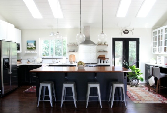
Kitchen: Which brings me to the kitchen!!! This is the space I'm most excited to remodel. It's going to make such a big difference. Right now, our kitchen is closed off by a half wall, which we want to tear down. That will open the kitchen up to the living room, and make it so much more spacious and light. This kitchen by House*Tweaking is similar to the layout that I'm thinking...an L-shaped kitchen with an island. We also have dutch doors off to the right that open to the backyard.
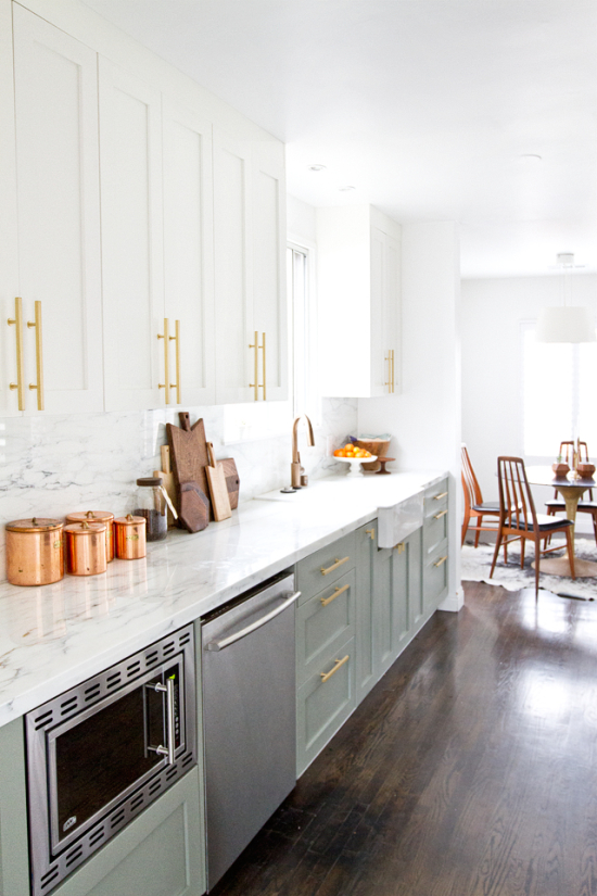
As for style, I've always loved white kitchens, but since the whole house will be painted white...maybe we need to paint the island a color? Or do darker lower cabinets? I love the combination of white, soft green, and marble in Sarah Sherman Samuel's kitchen.
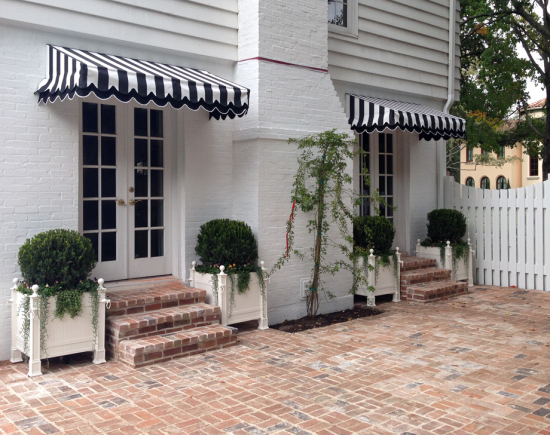
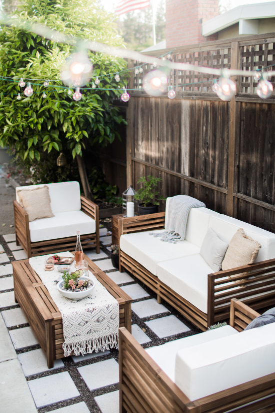
The backyard: This is another space I'm extremely excited to make our own. It's our first ever backyard!!! It's actually a pretty good backyard with cherry trees, lilacs, lavender, peonies, and more plants and trees that I don't recognize. But there's also some weird landscaping with a lot of rocks, and a Trex deck that's been torn up by the previous owner's dog. Eventually, I would like to make a brick or concrete patio that leads out from the dutch doors, then put an outdoor seating area, an outdoor dining table, and a hot tub on it. And hang some string lights of course!
Brick patio via Baldridge Landscape, modern concrete patio via Hej Doll
Those are some of the main spaces I've been thinking about so far (all the common areas). We also need to set up the laundry room, furnish the bedrooms, and (eventually) renovate the bathrooms. So there's a lot of work ahead! It's gonna be fun...


I love your taste!!! I can not wait to see how to redo your whole house. Seriously, everything you put on here looks like a dream. And I think the faux beams are beautiful, so go for it!
Awwww, thank you so much Caslyn!!! You are so nice and I seriously REALLY appreciate that you're still reading this blog even though I have been the laziest blogger ever this summer (who am I kidding, this year). :) I hope we can turn our house into something resembling these inspiration photos. And I'm glad you like the faux beams! I do too.
I LOVE the counter height chairs in the picture of the island lighting and view of hood. What brand, style?
I think I would take any island (kitchen or actual). :)