09
In my end of year recap, I asked for any suggestions you guys had for future posts, and one reader asked for tips about blog layouts. I thought that was a great idea! I actually get asked about how I designed my blog a lot, and although I don’t consider myself an expert on the topic by any means, I’m happy to share what I do know. I thought I'd start with 10 tips for designing a blog in general. I approached this as if I was giving advice to someone who was just starting their blog, but if you already have one, I think these tips could still help you to update it and make it even better. I want to do another post in the future about layouts for post content (like moodboards, adding type to photos, etc.) so let me know if there’s anything in particular you’d like help with in that area. And remember, all these tips are my opinion and not the gospel truth, so if your blog has something that I said was a no-no but you love it, don’t feel like you have to change it just because of what I said.
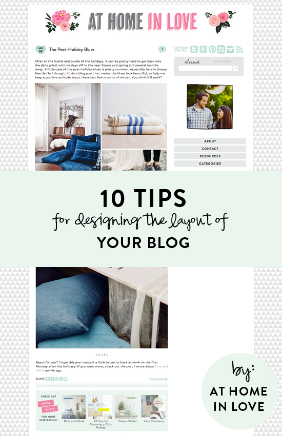
1. Start with your name. If you’re just starting to brainstorm ideas for your blog, start with a catchy name that hints at the topic you’ll be blogging about. Don’t pick anything too long or too hard to spell, and most importantly, look for a name is that is unique. If you think of a name that you like, type it in on checkdomain.com to see if it’s already taken. Look for the “.com” domain name--that’s what you want. If it’s already taken, I would not recommend trying to be tricky and doing a “.org” or putting in dashes, etc. I’d keep brainstorming til you find a name--and a domain--that will be uniquely yours. When I was picking a name for At Home in Love, I tried at least 30 different ideas before I settled on At Home in Love (seriously!). I also tested out the username “athomeinlove" on Twitter, Instagram, etc. to make sure it wasn't taken. It takes some time, for sure, but it’s worth it to keep your name, social media channels, and blog url simple and consistent.
2. Keep your background simple and uncluttered. You don’t want your blog’s background to be competing with your content, or distracting from it. When in doubt, a simple white background looks clean and pretty. Both The Daybook and Kelli Murray have simple white backgrounds, and they’re anything but boring! You can also do a background with a repeating pattern, like I have…but I’d keep the pattern and the color fairly simple and neutral. Anything too eye-catching or colorful might clash with your blog posts!
3. Use only a few fonts, and use them consistently. This is one of the biggest things that makes a blog design look really unprofessional, in my opinion: when there are about 10 different fonts just on the main landing page! Instead, I’d pick two or three fonts that you like and stick with those for your blog design.
4. Use simple fonts. Speaking of fonts, pick simple, easy to read fonts for your blog design. You might love fancy scripts or fonts that look handwritten, but if you try to use them in your body text, I guarantee you it will be really hard to read and you'll drive readers away. Nobody has time to try to decipher an entire paragraph. Even if you want to use a fancy font for the titles of your blog posts or in your sidebar, I'd caution you to pick a fairly simple one. Save the ones with lots of loops and flourishes for adding some short text to photos within your posts, or maybe to your header. For your body text, I'd recommend a sans serif (one that doesn’t have little lines at the end of each stroke). I have heard they're easier to read on screen than serif fonts. You can search for free fonts to use in your blog design at Google fonts. If you select the “paragraph” tab at the top, you can really tell a difference between different fonts’ readability. You can filter your options by serif, sans serif, display, and handwriting (in the drop down on the left).
5. Limit the number of colors you use. I keep mentioning simplicity, because it’s true--the simpler your blog layout is, the more the content of your posts will shine. That being said, you don’t have to keep your blog all white, black and gray. Just limit the number of colors you use to two or three (neutrals and white don’t count). For my blog, I picked pink and mint green because they are two of my favorite colors. I use those same two colors (and light gray) throughout the whole blog design. I do sometimes use different shades of pink and darker shades of green, but I always keep them in the same “family” so it looks consistent. Some great places to use color are in your social media icons, your header, and any place that you want to call attention to something. I would not recommend doing pink text on a black background or anything like that…I think white with black text looks the best and is easiest on the eyes. But it is good for links to be in a color so they’re easily distinguishable!
6. Size your photos to the full width of your blog posts. For example, the width of my posts is 550, so I size all photos to 550 pixels wide. It's really distracting to the eye if your photos are all different sizes. When they all line up with your text, it's a nice, clean line! If I find a photo I really want to use that is smaller than 550 pixels wide, I will mix it with other photos in a collage. Sometimes, if it's really close to 550 I'll just increase it's size, but if you try to stretch a photo that was 400 pixels wide to 550, it will be really blurry...which is worse.
7. Include a photo of yourself somewhere. I think it's human nature to want to see who it is behind the blog--I always look for an about page when I stumble across a blog I like! A lot of bloggers include a photo of themselves in the sidebar, which I really like, but at least make sure that you have an about page with a photo of yourself there. If you're hesitant to show your face, you could always do a fun illustration of yourself like this, or a photo where your face isn't showing. For instance, if you're a florist, you could do a photo of you in action like this or a photo of you holding a container of flowers like this!
8. Make sure your social media icons are easy to find. You'll definitely want readers to follow you on social media, so make it easy on them by putting icons that link to your different channels on the homepage--and preferably near the top. You don’t have to use little icons like the ones I have, but they’re very recognizable and don’t take up much space, so I think they’re nice. If you google “social media icons” or search for them on Pinterest, you can find a lot of cute options, many of them for free!
9. Make it easy to navigate your blog and find your content. At the basic level, you’ll need categories and a search bar so readers can easily find the content they’re interested in. Nobody should have to click “older” over and over again if they already know what it is they’re looking for. I also think archives are nice, especially when I come across a great blog that I’ve never heard of before and I want to see what they posted a year ago stalk them from the very beginning. Or if I’m looking for content that’s specific to a season or holiday, I can look for what was posted in Decembers past, etc. I also like features that suggest related posts with thumbnails (a free version of this is Linkwithin). A “scroll to top” button is also really nice, especially when I’m reading blogs on my phone. And “pin it” buttons on each photo are great, because they make it super easy to pin content from any computer. Basically, anything you can do to make it easier for your readers to find your content and keep clicking around on your site is awesome. Whatever you’ve noticed that you like on other blogs, see if you can find a way to implement that or something similar.
10. Extend your brand beyond the blog. After you’ve spent all this time choosing a color scheme, designing a pretty header, and selecting fonts, make the most of it by branding everything you can! All your social media outlets, your business cards, and even your email signature should have your “look” applied to them. Use the same photos, the same colors, the same fonts, etc. so they are easily recognizable as yours.
Whew, that was a lot of text and not a lot of photos! Sorry about that, but I just couldn’t figure out which photos to use for each point without it looking super repetitive. Tomorrow’s post will have lots of eye candy, I promise :)
I hope this post was helpful to you! Feel free to comment with your questions if there’s anything you’re wondering about that I didn’t address. I’ll do my best to answer them!


Great tips!
these are awesome tips!
ladies in navy
I know I love the design of your blog. It is easy to read, the photo's are perfectly sized etc...Great tips! Your comment to a reader in your "blue" page, reminded me of a book I read from the library years ago called "Color me Beautiful". It was about wearing clothes that worked for your skin color etc. You asked if the colors we love have something to do with what works in our clothes. I think you would like that book.
Aww thanks!! I will have to look that book up. It definitely sounds interesting.
Grrrr, we went with the .org!!! Great tips, thanks!!
Haha, oh well. There's plenty of awesome blogs that are .org, .ca, .blogspot.com, etc. It's not a huge deal at all! I just like being able to type in thenameofyourblog.com and have it go :)
I Love this! I'm starting a new blog, called I Love You Most, and this was soooo helpful!!
I'm still trying to figure out how to buy my own domain name, any tips on that??
Hi Sarah! I just bought mine on GoDaddy. It shouldn’t be much more than $10/year. Hope that helps!
Great tips ... Will have to keep these in mind as we plan our redesign :)
Fabulous tips. If I could do it all over again I would have chosen a much better name. But at the time - I had no idea I'd turn this into a career!
Thank you so much for this blog post, it was so useful! <3 Do you use Photoshop to edit your photos? Do you make them the right size straight away when you move them to your computer or when?
xxx
E from Helsinki, Finland
http://dragonflyelisabeth.blogspot.fi/
Great tips Aileen =)
Thank you Eleni!!
Thanks Aileen,
These are great suggestions. In fact your article was so well written that I did mis the "eye candy."
Aww, thanks!
These tips are so useful! All of them rang true for me because I have had to deal with a lot of the issues you mentioned while I was starting my blog. Mine is still new so I pinned this post to refer back to!
Thanks
Kate xxx
www.notsosecretgarden.com
This is very helpful! Thanks for the post. Being new at this, one needs all the help she can get.
You're so welcome! Glad you found it helpful, Denise :)
Great post, thank you for sharing these wonderful tips. I appreciate the clear and concise information. Your blog is beautiful! I am pinning this for the future. Kari
very nice post! love these pictures
fashion blogger pamela soluri
kiss
Thanks! I read a bunch of posts on this (coding over my blog's design + recently deleted everything to start over!!) This was helpful because your blog is really pretty so I was able to really *understand* because of the visual example you set!
Aww, thank you so much!! Best of luck with the new blog design. It’s a lot of work, but so worthwhile.
Thank you so much for all these Amazing tips .
There a Blessing indeed
Hi Aileen,
Awesome post & very helpful to a new blogger such as myself! I have a question: Should I buy a domain or use a blog host such as WordPress etc? What did you start out with?
Thank you for this post. I have actually been considering a blog for some time now and this post has been really insightful! Who knew how difficult it could be just to pick a name (nb - I have been stuck at this milestone for about 3 weeks now! ) It is clear that the time and effort that goes into the selection of topics, writing and visual presentation is critical to the overall result and reflected by the amount of interest and followers it attracts. I really did have no idea on whether I wanted to create a blog or how to do but this post has really opened my eyes! One thing is for sure, it definitely requires a high level of commitment x
Thank you, Catherine! The name seriously is SUCH a tough decision. I've found blogging to be very rewarding and fun, but it certainly does take a lot of time and commitment too. It's great to be aware of before you start, so you have realistic expectations. Good bloggers sometimes make it look easy, but I guarantee they put in more hours per week than most people do at their full-time jobs!
Great read! I ove how informative this article
Better to pin this articles for my future referrence. Glad I w as able to read this.